Textbooks tend to organize art history chronologically. But what if we re-told art history through color instead? Artspace is publishing a series of articles excerpted from Phaidon's Chromaphilia: The Story of Color in Art, each one offering a close look into the history of a single color in its relation to art. Last week we examined red, and in this iteration, we look at art history against the grain of green, and the color's conceptual, psychological and cultural significance in the works of Bruce Nauman, Brice Marden, and Olafur Eliasson.
...
Green seems to exert charismatic power as metaphor, yet the symbols can be contradictory, depending on cultural and personal context. Green gems depicted in mosaics from Santa Maria Maggiore, for example, could be understood through various lenses: ritual or ethics, optics or magic. Other contexts for thinking about green include the realm of commerce and industry, as explored by Boetti, or the colors of gender bias, which Dumas uncovers in the annals of medical history. Nauman's green not only imposes its discomfiting mood on participants but also engages viewers in a sensory experience that demonstrates how eye and brain produce uncanny perceptual effects.
Several artists use green to depict subjects in a blatantly non-mimetic mode. The greens in the flesh of Matisse's subject, in Derain's river, and in Kirchner's street scenes send disparate signals that are nevertheless clear thanks to color. Eliasson uses green in an anti-naturalistic manner to make viewers see the everyday world differently. Kelly's green shapes are tenaciously abstract yet moored in a reference to reality. Marden's olive/grey/bluish monochrome in a nuanced investigation into art and nature based on a specific place.
Green's links to nature and the pastoral make it integral to the genre of landscape painting. Rubens and Poussin treated verdant vistas in different ways, using color to convey ideas and bringing us back to a recurring theme: artistic disagreements about the use of color. The Renaissance polarity between design and color, planning and process, discussed in reference to blue, is here updated, shifting in a new context in the seventeenth century. These disagreements continued into the nineteenth century, as seen in works by Ingres, Delacroix, and Monet. The use of color, furthermore, sheds light on fundamental artistic goals, as seen in Cézanne's use of signature hues, including viridian green, to construct form and space on a flat surface.
Green provides many insights into artists' practice. The color plays a surprising and important role in the creation of naturalistic flesh tone, as with Duccio's behind-the-scenes backdrop for the Virgin's face. Techniques such as underpainting and glazing and their effects on color and meaning are also explored in Uccello's frescoes and van Eyck's oils. The crucial role of binding medium, first made explicit in the chapter on red, is further investigated in Frankenthaler's and Louis's stained color field paintings, and the history of pigments is carried forward in works by Veronese and by Millais and Hunt.
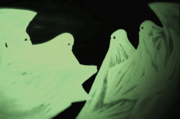
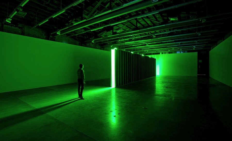
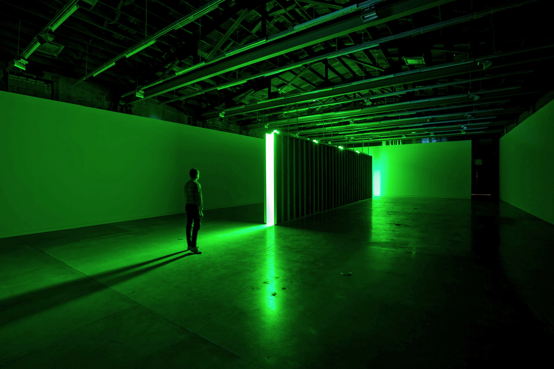 Bruce Nauman, Green Light Corridor, 1941. Courtesy, Artists Rights Society (ARS), New York
This work is an assault on the senses, brought on through management of space and color. Viewers are engulfed in a ghastly green light as they engage with this deliberately discomfiting narrow corridor. It is meant to be walked through, not just looked at, but it is barely 1 foot (30 cm) wide, so the spectator has to shimmy, usually sideways, through an alienating space that feels and looks unnatural and hostile.
Nauman's color plays a calculated role, with a stunning finish even after the experience is over. The pervasive green glow comes from overhead fluorescent tubes, and the light is claustrophoic rather than radiant or transcendent. It is an acid green that harangues the spectator. But the work plays out over time. While inside the corridor, the eye and brain accomodate the color and it almost starts to feel neutral, although in reality, the brain's visual system is becoming fatigued by the stimulus. When you exit the corridor, you experience an optical phenomenon called "after-image," the illusory sensation of a complementary color. Having been over-exposed to such an abundance of green, now the eye "sees" a rosy, pinkish glow. The time immersed in Nauman's unnerving green results in an alteration of the viewer's perceptions.
Artists have exploited such surprising effects of color vision for centuries, and theorists have developed theses to explain the interaction of colors with eye and brain. Goethe described in detail the phenomenon of after-images in 1810: "Every decided color does a certain violence to the eye, and forces the organ to opposition."
Nauman's green corridor is a space for individual sensory exploration, which viewers don't fully "see" until they exit it and experience the results of Goethe's "violence to the eye."
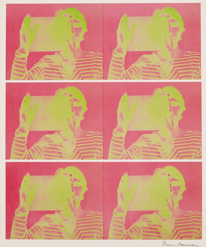 Bruce Nauman's Untitled (2-color lithograph) (1969) is available on Artspace for $5,000
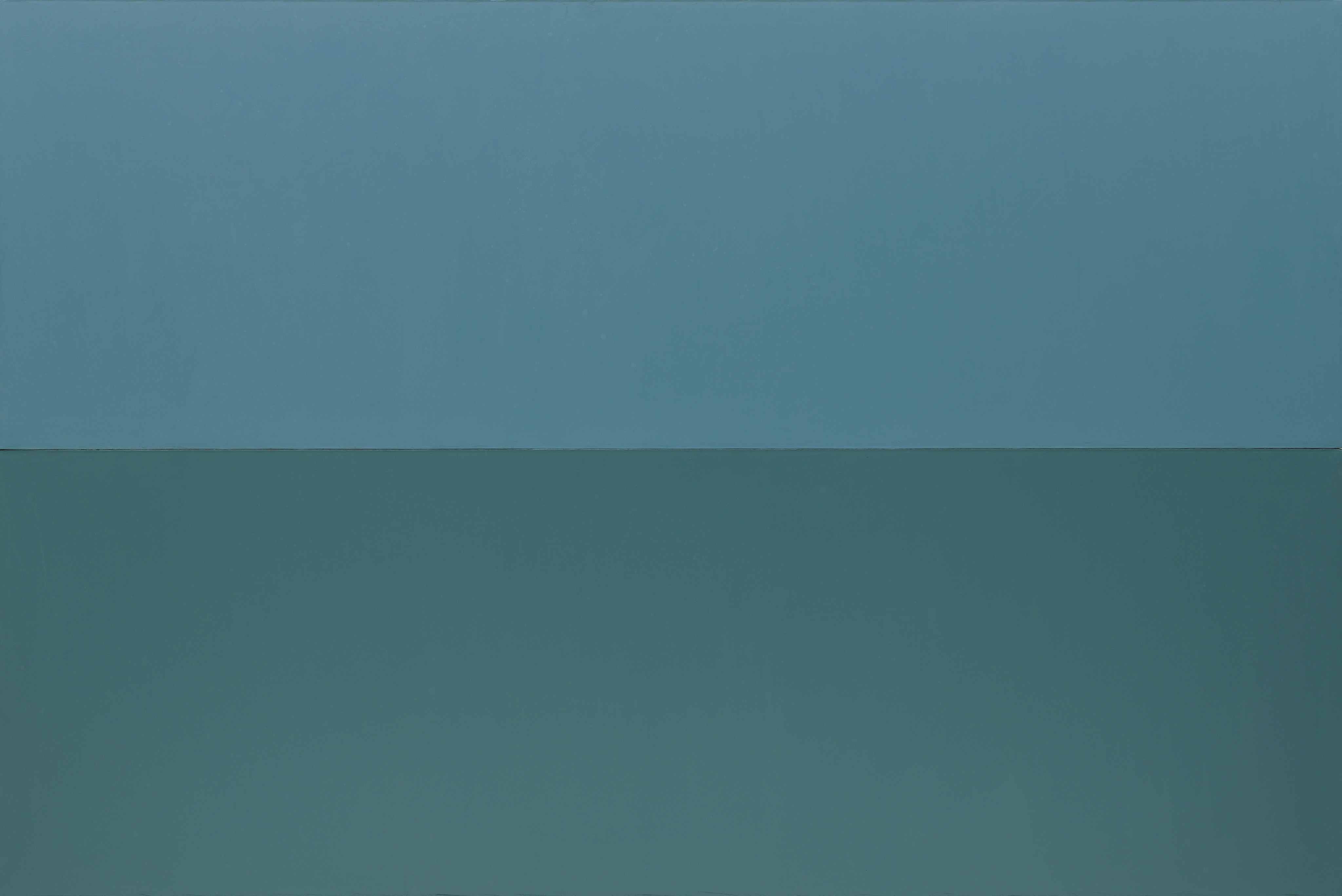 Brice Marden, Grove IV, 1976
In a series of five highly distilled paintings, Marden uses monochromatic color fields to present his ideas about a place and its effects on him. As the title suggests, the subject of this work is a stand of olive trees on the Mediterranean island of Hydra, an intimate place for Marden, who spent a lot of time there and thought much about it. His reduction of formal means to color condenses this universe of sustained perception. Positing that "nature is correct," Marden advises that when "We look at nature, we understand what is real in the world." But to make valid art around this experience required a remove from nature's form to a language of purely artistic idiom.
The paintings were made after the fact, as meditative ideas about nature, derived not from replicating the landscape but from working with what Marden describes as the information that nature has provided. He kept notebooks to record his impressions of the subtle colors: carefully documenting the evasive, silvery grayish-greens and other guts—various shades of colors that were only identifiable as nuanced compounds, such as blue-gray-green. Separate colors were applied to individual abutting panels, interrelating as Marden observed them in the grove—but now as ideas rather than as elements of the landscape. The leaves of the olive trees shimmered in a breeze, oscillating between warm and cool effects and revealing the different hues of their undersides. This was captured in edge-to-edge expanses of oil paint mixed with beeswax. The result is a matte surface that is dense yet not flat. The paint takes on luminosity, and careful looking reveals undercurrents of complex color substrates.
Marden calls these "high intensity paintings"; the more you look at the works and think about them, the more you see and feel. Within a seemingly uninflected monochrome, there is a great deal of complexity. Writing about color, he noted: "A color should turn back into itself. It should reveal itself to you while, at the same time, it evades you."
 Brice Marden's Ten Days (1971) is available on Artspace for $14,000
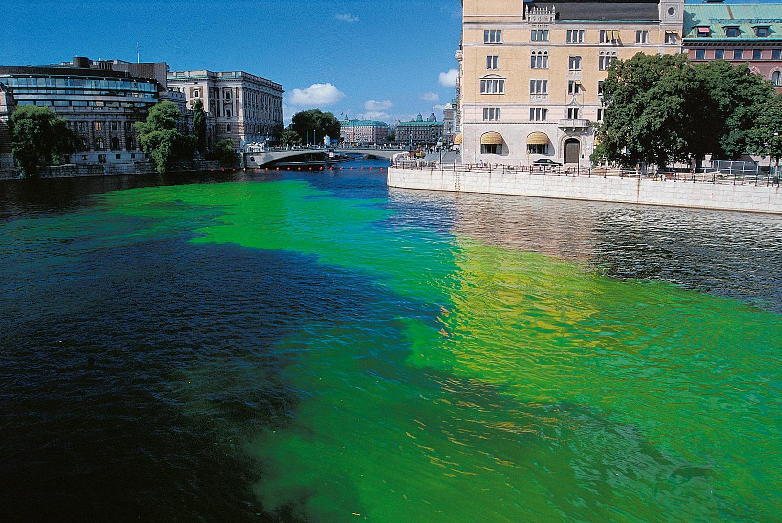 Olafur Eliasson, Green River Project (Stockholm), 2000
Green is a catalyst in this series of ephemeral public art projects. Introducing a radical change in hue causes radical rethinking about representation, reality, and what actually constitutes a subject for art. Is the subject the thing that has been re-colored—a river artificially made temporarily green? Or is the subject of this work, instead, the spectator's newfound perceptions on seeing a familiar environment with fresh eyes? By making works that Eliasson called "phenomena-producers," he offers us an altered engagement with the world.
Eliasson used colorant in this work to draw viewers unwittingly into a new relationship with their surroundings. He noted that many individuals are completely disconnected from their environments, particularly urban spaces, which users perceive almost as a blank, external image of no personal consequence. The customary becomes static and near caricature, a codified representation of itself. Downtown Stockholm is an example of this phenomenon, according to Eliasson, so immutable and idyllic that it seems like an artificial display. The downtown river appears to inhabitants as picture-postcard perfect, not a flowing, dynamic natural force. The artist set out to make people take notice, expressing a goal of making the river present again. A particularly intense green dye made it hyper-real, as Eliasson has described the jolt of encountering something familiar but wholly changed.
The Green River Project has been enacted in several cities, always anonymously and without advance notice. The point is to avoid "pre-knowledge" that would inflect public perception. To observe phenomena in the world at large is different from observing "art" in a prescribed setting. Eliasson wants to capture that difference, and to bring in new viewers unfamiliar with art's special contexts and subtexts. Public involvement, central to the piece, is itself dynamic and unfolds differently in each installation. Individual, legal, and media responses all come into play. In Stockholm, newspapers featured the intensely green river on front pages, with a fabricated but reassuring explanation for the color change. Reporters blamed leaking fluid from a government heating system and assured the public there was nothing to worry about. Of course, the green (formed from a nontoxic powder like that used by biologists to track water currents) had nothing to do with leaks, and everything to do with art.
"For a moment, the city... became real," Eliasson said. "The point was not even the Green River; the point was how it looked before and after." So understanding of past and future has been transformed, and the vehicle for this re-thinking is green.
 Olafur Eliasson's Your Reversed Berlin Sphere (2016) is Available on Artspace for $20–30,000
RELATED ARTICLE:
"Color Is Never Unimportant": The History of Red and the Work of Judd, Bourgeois, and Kapoor
[related-works-module]