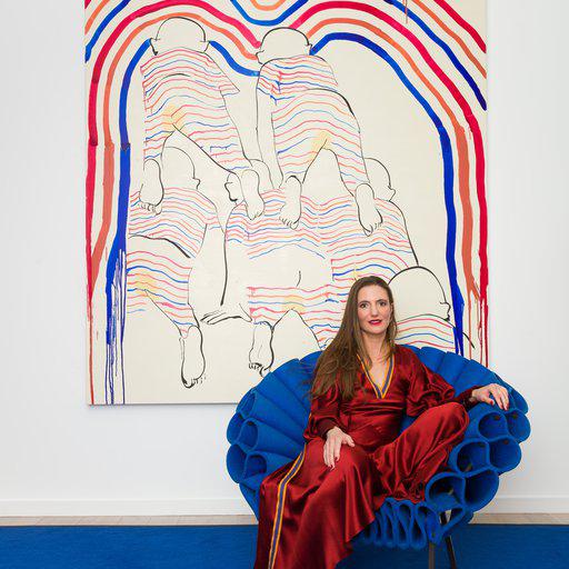

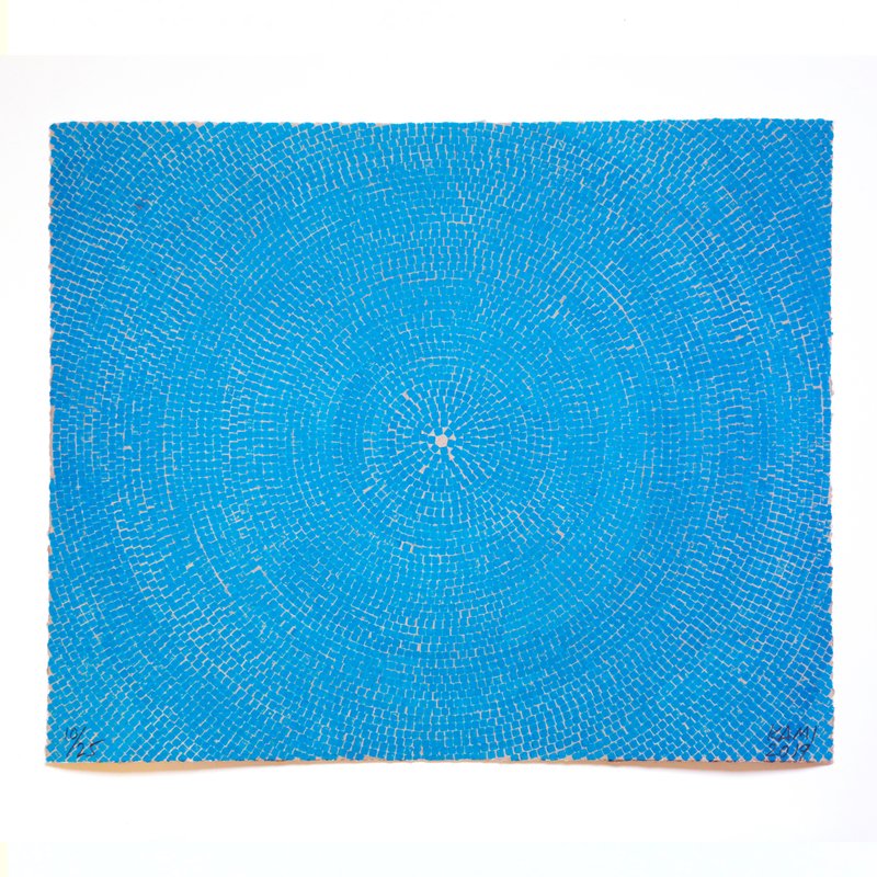
I first discovered the work of Y.Z. Kami in a show at London Parasol Unit about 10 years ago. It’s a place that has introduced me to lots of artists I might not otherwise have known about. I’ve been looking out for his work ever since. I think it’s interesting that he paints both very figurative works and very abstract works. This is from a series of Dome paintings so it also puts me in mind of architecture. I could imagine living with this workand getting lost looking up at a domed cuppola. I'd hang it in my bedroom so I could stare at it for long periods rather than walk past it in a hall. It also reminds me of the paintings of Alma Thomas, a very underappreciated African American artist in
Great
Women
Artists
who uses similar motifs - circular geometry and color. So i would enjoy being reminded of her work!
blue blue blue clock , 2012
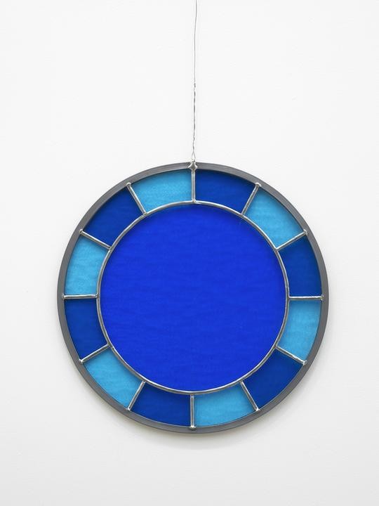
I’ve been intrigued by the work of this artist ever since I saw the glaring rainbow lettering of Hell, Yes! on the facade of Fa Projects in London back in 2001. I became became a firm fan when I saw his show at the Whitechapel Gallery some five years later. I think one of the reasons I like this is because I have a fixation on clocks in contemporary art (I managed 10 hours straight at the last showing of Christian Marclay’s The Clock at Tate Britain). So this combines my appreciation of his work, my love of blue, and my enjoyment of clocks.
Number Two Green and Blue, 1997
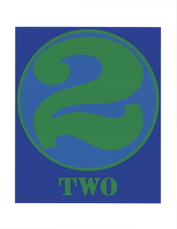
I think Robert Indiana is a really underrated artist. He suffers from the fact that he did that one really famous work, Love , which he didn’t even copyright. I’ve always been more interested in his number works displayed in the Frieze London Sculpture Park last year. 22 is also my lucky number. I like the term ‘22 - two little ducks’ in bingo and the phrase ‘getting your ducks in a row’ is one of my favorites. I even bought my house because it was number 22, and when I buy editions I always buy number 22 if I can. This technically is a number 2, but it has a figure and a word, so I read it as 22.
Kinetic Composition, Blue Sphere, 19751980
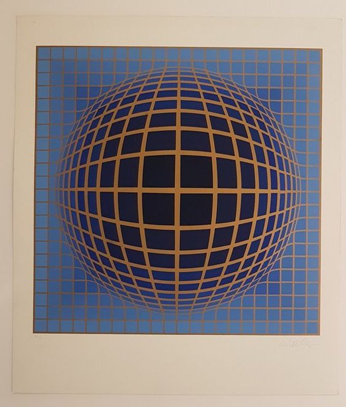
I suppose Victor Vasarely is a rare example of an artist from a movement – Op Art, sometimes known as Kinetic Art - where I knew a female artist - Bridget Riley - before I knew a male artist. I’m desperate to see one of his shows - he had a big show at Pompidou last year that I missed. There’s an artist called Melissa Gordon who makes similar optical works and I bought a print of hers, which I enjoy spending hours looking at. It’s essentially two sets of lines and every print was slightly different so the moiré effect is different in each one. Owning that has made me appreciate how joyous op art is. In this Vasarely work it’s not just about the effects of colour and line that create the movement in a picture, it’s also the three dimensionality of it.
I KNOW THINGS AND YOU'RE WRONG [cerulean blue] , 2014
![I KNOW THINGS AND YOU'RE WRONG [cerulean blue], 2014 by Michelle Vaughan](https://d5wt70d4gnm1t.cloudfront.net/media/a-s/artworks/michelle-vaughan/66264-635696002281/michelle-vaughan-i-know-things-and-youre-wrong-cerulean-blue-800x800.jpg)
I don’t know her as an artist but I came across this on Artspace and I think it’s brilliant. I’m getting quite interested in the use of text in art. I think it’s intriguing because you’re reading art in two ways - in terms of what the text says and how it works as an artwork which is very different to how you read text in a book and there are an increasing number of artists working like this. I also like this work because it’s very representative of something I myself might say (and at the same time I know it’s ridiculous, so I think of it as me taking the piss out of myself). I would love to have it hanging above my desk.
Untitled, (from the 4 x 4 portfolio), 1991
Where to start? He’s kind of like the lynchpin for so much of the art that I enjoy and love. I went to an interesting talk about conceptual drawing of the Sixties and Seventies in which the writer Anna Lovatt talked about how various minimalist sculptors including Sol Lewitt and Mel Bochner moved from three dimensional objects to conceptual drawings as artworks in themselves, as opposed to preparatory sketches that paved the way for artists to consider drawing as a legitimate medium. I would love to own anything by Sol Lewitt.
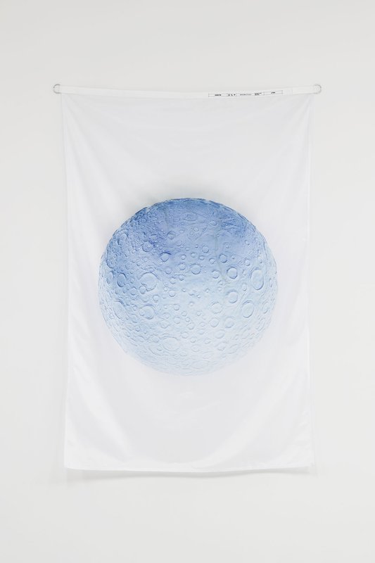
DANIEL ARSHAM
Moon Flag, 2017