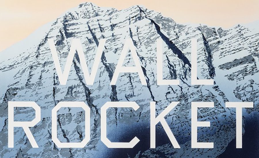
Since he first gained recognition in the 1960s, Ed Ruscha has been considered one of the most iconic American artists due to his deceptively simplistic weaving of elliptical phrases, Hollywood iconography, and wide, natural vistas of American landscapes. Ruscha began his famous series of word paintings in the '60s, depicting various views of the Hollywood sign and the logos of studios like 20th Century Fox, but also roadside views like the Standard Oil stations dotting L.A.'s freeways. Over time these became more abstracted, pinning ambiguous, free-floating phrases ("Wall Rockets" is a famous example) to natural vistas, scenes of highways, or monochrome backgrounds. Beginning in about 1980, the artist began using a sharp font he designed himself, called Boy Scout Utility Modern.
Opening this week at Gagosian Gallery's Madison Avenue location, "Custum-Built Intrigue: Drawings 1974–1984" exhibits a collection of drawings made in the middle of Ruscha's career, when his word works matured following the artist's exploration of language and experimentation with unconventional pigmentation—such as syrup and gunpowder. Excerpted from Phaidon's definitive Ed Ruschamonograph, essays on "Single Words" and "Thoughts & Phrases" shed light on this segment of the artist's prolific, multi-faceted, and ongoing career.
...
Single Words
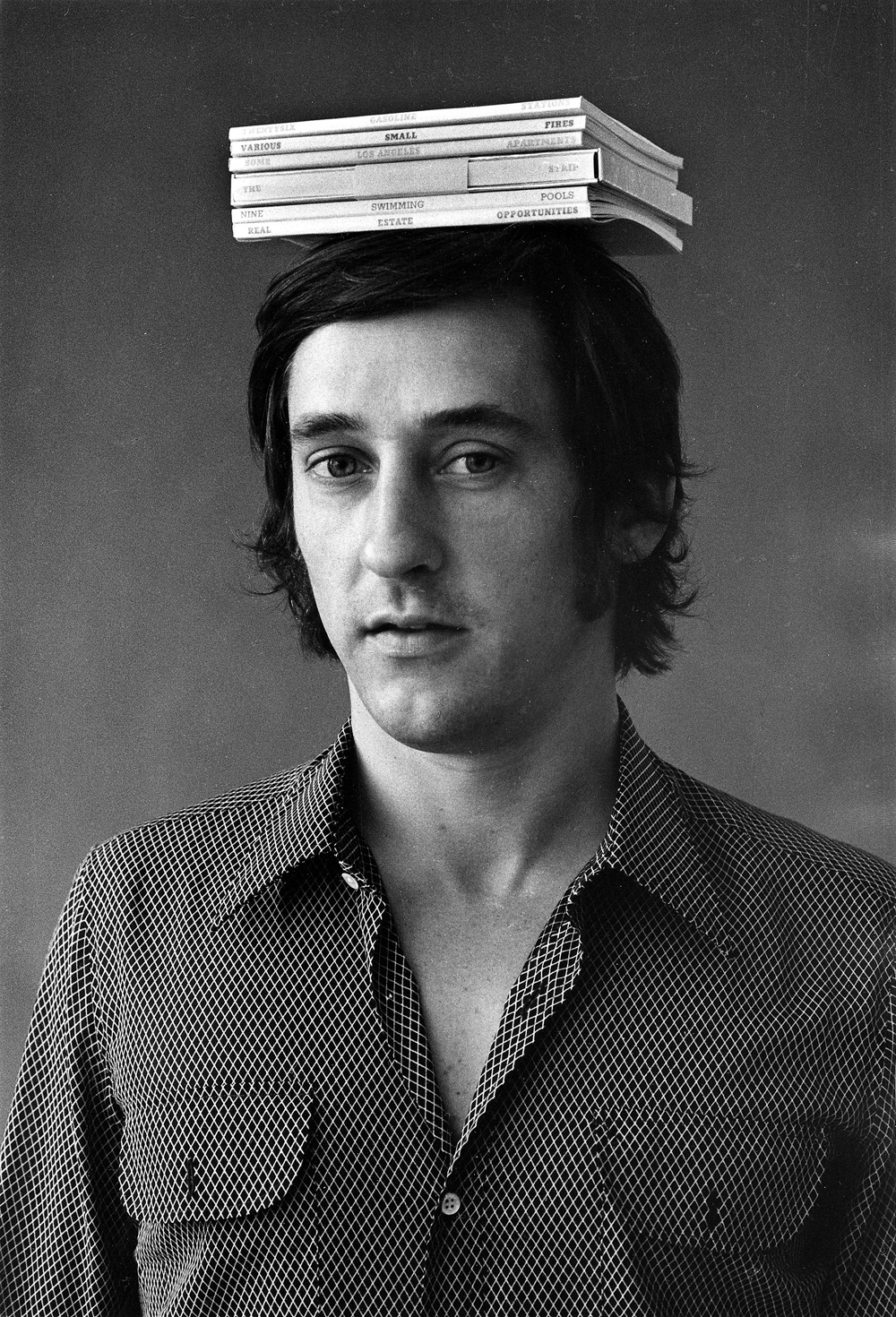 Jerry McMillan, Ed Ruscha With Six of His Books on His Head, 1970
Ed Ruscha succeeded in making the word the work. The single word, with its unique visual, graphic, and auditory characteristics, became the sole subject of a number of the artist's paintings and drawings. "Words are pattern-like, and in their horizontality they answer my investigation into landscape. They're almost not words—they are objects that become words."
During the first half of the twentieth century, many artists used letters and words in their work. Among them—to name just two—were Walker Evans, who photographed a word, actually a three-dimensional sign of a word ("damaged"), in Truck and Sign (1930), and Stuart Davis, who used the brightly colored word "champions" as the primary subject of his painting Visa (1951). These explorations presaged the use of common words in the work of later generations of artists, including Ruscha's.
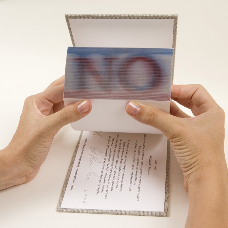
Artists of the post–World War II era who drew inspiration from popular culture considered printed words as a legitimate subject for a work of art in the same way that they appropriated comic-strip heroes and commercial products. The two artists who most strongly influenced Ruscha's early development, Jasper Johns and Robert Rauschenberg, were initially referred to as neo-Dada because they revived the Dadaist spirit of elevating images that had nothing more to recommend them than their flagrant insignificance. A number of Johns's paintings of the late 1950s depict single words—"tango," "no," "liar," "the," or even "Tennyson." Similarly, Roy Lichtenstein made the ubiquitous sign usually located on a door the subject of a painting, In (1962). Conceptual artists of the 1960s, like John Baldessari, Joseph Kosuth, Bruce Nauman, and Lawrence Weiner, created work that consisted only of words. These artists, however, used words for narrative purposes or as humorous visual puns, as seen in Nauman's Waxing Hot (1966–67).
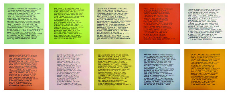
A younger generation of artists working in the 1980s and 1990s has been influenced by Conceptual Art's use of words for their narrative possibilities as well as Ruscha's attraction to the look of printed words. Diverse practitioners, such as Felix Gonzalez-Torres, Jenny Holzer, Jack Pierson, and Christopher Wool, have employed words for both their visual and their psychological impact. Pierson's use of letters salvaged from old commercial signs, as seen in Paradise (1993), resembles a three-dimensional realization of a Walker Evans photograph that has been crossbred with a Ruscha word painting. Ruscha, however, strives to use words differently. He explains: "If you isolate a word for just a moment and repeat it ten, fifteen times, you can easily drive the meaning from the word and from the sound of the word."
By the late 1960s, Ruscha was intentionally using single words that were divorced from any meaning or context. It was sufficient for a word to appeal to Ruscha simply for its graphic design or sound. The sources of words held special interest for the artist: "A lot of my ideas for my art come from the radio.... I like the texture.... It's best when it's music overlapping talk, or talk over talk." "You can turn on the radio and the radio becomes the soundtrack for what you see out the window!" In fact, the word "radio" is the title and the subject of three paintings, executed in three consecutive years, from 1962 to 1964. Almost all the single words Ruscha uses are monosyllabic, quick, and evocative: "When I began painting, all my paintings were of words which were guttural utterances like 'smash,' 'boss,' and 'eat.' I didn't see that as literature, because it didn't complete thoughts.... The words have these abstract shapes, they live in a world of no size. You can make them any size, and what's the real size? Nobody knows.... It wasn't until later that I was interested in combinations of words making thoughts, sentences, and things like that."
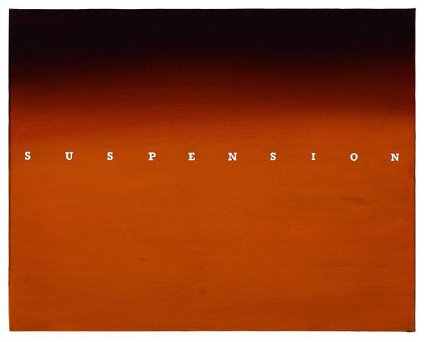 Ed Ruscha, Suspension, 1969
Ruscha shifted easily between painting on canvas and drawing on paper, and the same word would often appear in both mediums. An early group of pencil-on-paper works that he completed in 1966 are unique in writing style, composition, and size. Each of these drawings consists of a single word written in longhand script—similar to the style of penmanship Ruscha had learned in elementary school—diagonally across a small sheet of paper. In Pussy (1966), the word appears to have been written in a heavy-gauge pencil that was then smeared, giving the word a sense of motion or depth. Lisp (1966) depicts droplets of saliva deposited on the paper as if by a wet pronunciation of the word—a device the artist would use in a number of later pieces, including another work of the same title.
Other works completed the same year feature one word centered on a canvas, with each of the white letters equally spaced across a single, graduated color ground. The letters are formed in a generic typescript and spell out words like "chemical," "Vaseline," and "automatic." Although the words, removed from any context, are seemingly meaningless, they may contain self-referential observations: In Suspension (1969), the word that forms the subject appears literally suspended in the ambiguous space of the painted surface; Pressures (1967) depicts the individual letters spaced across a canvas rectangle so that they push against its edges; the widely spaced, italicized letters of Vanish (1972) almost disappear; and Liquids (1966) was completed during the same year the artist began his poured-word paintings.
Ruscha was experimenting with a new direction in his presentation of single words. He felt restricted by the angularity of traditional lettering and wanted something more ambiguous and visually engaging. The result is a number of works featuring words that seem to have been poured rather than printed or painted: "My 'romance with liquids' came about because I was looking for some sort of alternative entertainment for myself—an alternative from the rigid, hard-edge painting of words that had to respect some typographical design. These [liquid words] didn't have rules about how a letter had to be formed." Ruscha was excited by the idea of creating his own typography, one in which the liquid determined the style of each letter. He pursued this "romance" for three or four years. The type of liquid depicted is usually anonymous, although the artist specifies it in the title of one of his first wet paintings, Annie, Poured from Maple Syrup (1966). The association that comes to mind—reading the comic strip "Little Orphan Annie" in the Sunday morning Los Angeles Times accompanied by a breakfast of pancakes with maple syrup—was perhaps an inspiration for the painting.
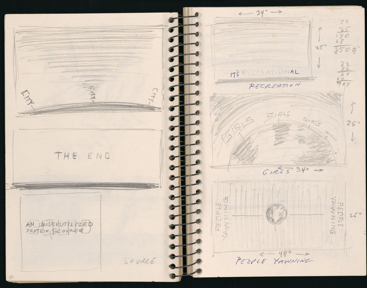 Pages from Ruscha's journals, undated
Consonant with his fascination with words, Ruscha kept notebooks in which he recorded every word that he used as the subject of an artwork from 1959 through 1972. Of the approximately four hundred words, only twenty entries contain more than a single word.
Although the scores of words that Ruscha used over fourteen years seem random and unrelated, certain clusters of subject matter begin to emerge, reflecting the interests of the artist. Ruscha's self-proclaimed romance with liquids is apparent in words like "brews," "cream," "dew," "fog," "jelly," "juice," "liquids," "mud," "pool," "oily," "pee pee," "rain," "sauce," "soda," "squirt," "stains," "suds," and "water." His Catholic childhood is acknowledged by "church," "evil," "mercy," "respect," "sin," and "trust;" and his appreciation of sensual pleasures is revealed through the use of words such as "jazz," "music," "poetry," and "opera." In addition, Ruscha's longstanding fascination with cars, beginning with the 1950 Ford that he drove to Los Angeles from his home in Oklahoma City, can be discerned in "automatic," "engine," "Ford," "gas," "honk," "hydraulic," "motor," "oil," "radio," "suspension," and "wax."
By the late 1960s, Ruscha had become bored with painting—not bored with the subject of words, but impatient with the task of applying a skin of oil or acrylic paint with a brush to a canvas surface. He stopped painting on December 12, 1969, and would not resume again until February 29, 1972. Ruscha began to explore the use of different organic materials as viable mediums for a work of art, studying the absorption reactions and color characteristics of foods and commercial products. The portfolio News, Mews, Pews, Brews, Stews & Dues presents British words inspired by Ruscha's stay in London that have been screened onto paper using an assortment of liquefied materials. In Pews (1970) the word is spelled out in Hershey's chocolate syrup, coffee, and squid ink; while the ingredients for Stews (1970) include crushed baked beans, caviar, strawberries, cherry-pie filling, mango chutney, tomato paste, leaves, and crushed daffodils and tulips. Ruscha extended his investigation of unconventional materials with two works of 1973, Mercy and Evil (1973), that use the medium of blood—presumably the artist's own. The subjects of Satin (1971) and Dept. (1976) are spelled out, respectively, in rose-petal stain and smeared spinach.
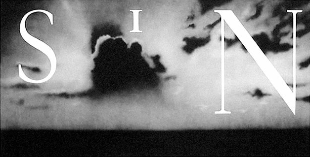 Ed Ruscha's Sin – Without (2012) is available on Artspace for $50,000
Another unorthodox medium Ruscha frequently used in his drawings on paper during the late 1960s and early 1970s was gunpowder, sometimes combined with pastel. According to the artist, "I soaked some gunpowder in water once, and I saw it separated all the salt out of it. I just did it as an experiment. The gunpowder itself is in granules. I could see it would make a good choice of materials; it could actually impregnate on paper. You could use it almost like charcoal—which it is, it's part charcoal.... [I apply it] just with a sponge ... with a piece of cotton. It was a more fluid and a faster medium than charcoal or graphite. Graphite was much more laborious, but it has a different feel altogether, a different appearance.... So gunpowder was simple, it was easy to get going. It became a fluid medium for that reason." The fluidity permitted by the medium of gunpowder complements the style of lettering the artist employs, often a ribbonlike script, as seen in Juice (1967) and Tulsa (1967). In the latter drawing, Ruscha celebrates and advertises Tulsa, a city in his home state, in the same manner that he glorifies his new residence in Hollywood (1970), which in turn closely resembles a popular postcard in format and intent. These single words appear to float in an ambiguous space, casting faint shadows and seemingly in danger of being swept away by a gust of wind. Other words, such as in LA and Eye (1970), are formed with what look like rigid strips of toilet paper that sit solidly on the surface, held upright by their angles and curves. The word in Pool (1967) is accompanied by carefully rendered drops of water, and the double "o's" at the center of the word are depicted as a single continuous strip shaped like a figure eight.
Ruscha's word-subjects, and the mediums in which they are executed, commingle, overlap, and frequently reappear. For instance, the word in Royal (1970) is presented in a rippling typeface that mimics the logo emblazoned on the Royal typewriter Ruscha immortalized (and destroyed) in his 1967 book Royal Road Test. Ruscha, however, insists that a word is just a word: "A lot of times the words are unimportant, their definitions are unimportant. They become almost abstract objects.... I've never been able to look at my work as though the words I use can be used for anything more than what I've done with them."
Thoughts & Phrases
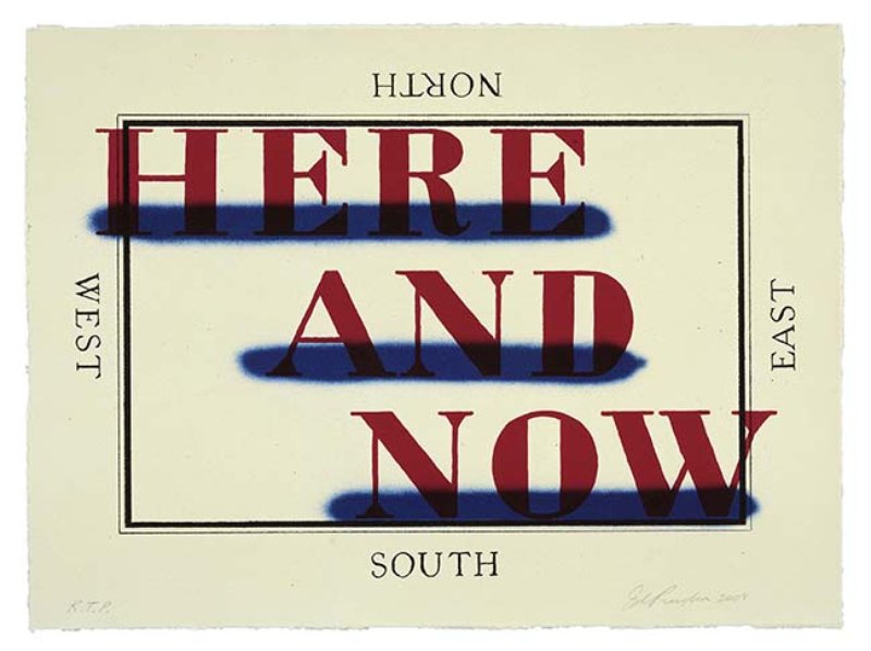 Ruscha's Here and Now (2008) is available on Artspace for $7,500
The single words that formed the subject of many of Ruscha's artworks during the 1960s gradually grew into phrases, thoughts, and complete sentences. The artist's earliest experiments contain collage elements and lettering, for example, Su (1958), which incorporates a piece of torn fabric, and Comics (1961), which contains pieces of newspaper comic strips and lettering. These works introduced written words into Ruscha's artistic vocabulary, a direction that would be pursued and expanded on with vigor and variety: "Some [words] are found ready-made, some are dreams, some come from newspapers.... I don't stand in front of a blank canvas waiting for inspiration."
Ruscha's use of letters and words incorporated from various sources has a precedent in the work of Picasso, who in 1912 introduced a major develop-ment in the Cubist language: collage. For Table with Bottle, Wineglass, and Newspaper (1912), he glued a piece of newspaper to his work. With this action Picasso not only violated the integrity of the medium—a drawing of charcoal and gouache on paper—but also used material that had no previous connection with high art. By adding a newspaper fragment with legible words, Picasso offered artistic permission for any material, however ordinary, to be included in, or even replace, a work of art. The letters that spell out "urnal," a portion of the French word for newspaper, "journal," and the incomplete phrase "un coup de the ..." force the viewer to both observe the composition and peruse the writing. This combination of visual and verbal references merges high art with popular culture and had important consequences for later-twentieth-century artists, Ruscha in particular.
Ruscha's first multiple-word paintings appeared in the early 1970s. These featured punchy two-word phrases, as in Cotton Puffs and Baby Cakes, both from 1974. The unexpected words were painted on equally unexpected materials: "I wanted to expand my ideas about materials and the value they have.... I used backgrounds of taffeta and silk, rayon, and those kinds of materials and just painted these materials on with a brush." Cotton Puffs, for example, is spelled out in egg yolk on green moire, and Baby Cakes uses blueberry extract and egg yolk on cream colored moire. Other paintings from the same year present phrases of five and six syllables that share similar rhythmic patterns. Created with shellac on taffeta or satin, they evoke irritating allusions to sound, sight, and texture: Screaming in Spanish, Scratches on the Film, and Sand in the Vaseline (1974). Sand in the Vaseline seems to be an idiom of the artist's own invention, and its power-ful suggestion of an unwanted abrasive element mixed into a substance meant to smooth and lubri-cate brings to mind vivid associations, further enhanced by its unexpected execution in the soft and subtle mediums of egg yolk and satin.
Ruscha's printed thoughts and phrases, as seen in many of his works from the mid-1970s, often seem to be clues for unknown answers or, conversely, answers for unknown questions. In this they recall Andy Warhol's 1960 painting Crossword, in which the artist appropriated a crossword puzzle from a newspaper and enlarged and transferred it onto canvas, including the "across" and "down" clues for the missing answers. Warhol's puzzle phrases, such as "Large Monkey," "Clock Face," and "Opposite North," could easily be exchanged for the mysterious word groupings that appear in Ruscha's art.
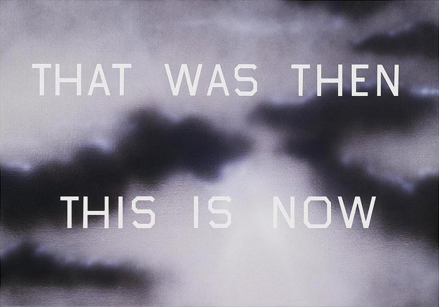 Ruscha's That Was Then This is Now (2014) is available on Artspace for $60,000
Dave Hickey, an astute observer of Ruscha's work and its resonance in popular culture, compares the artist's word pieces to the television game show Jeopardy!, which asks contestants to select a category of "answers" and attempt to construct applicable "questions" for them. Imagining a game of Jeopardy! with one of Ruscha's phrases, Hickey says, "Even the simplest 'answer' posits a spinning infinity of questions. Answer, provided by Ruscha: 'I LIVE OVER IN VALLEY VIEW.' Questions: 'Uh, where do you live?' 'Why are you so late?' 'Why are you so strangely attired?' 'How do you know Suzanne Pleshette?' 'Why does your license plate say VAL E VU?' 'What does that sign say?' 'What is a simple six-word English sentence with four i's, four e's, and four v's in which all the words are elided?' 'What part of this drawing is not drawn?' Et cetera, ad infinitum." Ruscha's casual, visual utterances or truly mundane groups of words dissolve into mystery and confusion and expand into an infinity of potential references. What is Guacamole Airlines (and where does it fly)? What happens to Those of Us Who Have Double Parked? How was Another Hollywood Dream Bubble Popped (and did it hurt)? (All 1976.) Ruscha does not offer the answers, but simply presents the words as objects.
Ruscha's wordworks have similarities with those of other artists who began working in the 1960s in California, especially the Conceptual artists John Baldessari and Bruce Nauman. Like Ruscha, Baldessari reduced his painting to little more than the words themselves and also used commercial photographers or designers to execute parts of his pieces. His Terms Most Useful in Describing Creative Works of Art (1966–68) conceptualizes expectations about art and its dependence on language by displaying simple columns of randomly arranged words that suggest a shopping list or the boring monologue of an art-history lecture. Nauman's later work One Hundred Live and Die (1984) presents in colorful neon one hundred three-word phrases, reminiscent of Ruscha's lists of words. The phrases are each different, and combine a verb with either "Live" or "Die," as in "Fuck and Die," "Fuck and Live," and "Smell and Live," "Smell and Die." Whereas the phrases used by Nauman, or Jenny Holzer—another Conceptual artist interested in words—evoke strong physiological and emotional states relating to life and death, as seen in her piece The Living SeriesL You're Home Gree As Soon As No One ... (1980–82), Ruscha's similarly constructed phrases are not concerned with opinionated content. Ruscha explains, "My work can also be appreciated for the starkness of the shapes and not necessarily for the dictionary definition." As expressed in Nice, Hot Vegetables (1976), and other three-word phrases that appear in drawings like Crispy and Specific, Devil or Angel, Everything vs. Nothing, and Punching and Drilling, his combinations of words have a more indefinite and illogical quality.
Not all of Ruscha's phrases are meaningless, however. In certain of his pastel word drawings, the phrases can be self-referential and contain allusions to actual things. Artists Who Do Books (1976) is an obvious reference to the artist's own production of books, and Malibu = Sliding Glass Doors (1976) echoes Ruscha's familiarity with this common architectural feature of southern California beach houses. Ruscha chose I Don't Want No Retro Spective (1979) as the cover of the catalogue for his 1982 retrospective exhibition organized by the San Francisco Museum of Modern Art. The phrase is a riff on the title of the 1965 Rolling Stones song "(I Can't Get No) Satisfaction," whose lyrics describe a situation that Ruscha would also experience: "When I'm drivin' in my car / And that man comes on the radio /And he's tellin' me more and more / About some useless information / Supposed to fire my imagination ..." In Ruscha's case, of course, the radio did fire his imagination and supplied him with material for his art.
Ruscha admired the music of the Rolling Stones, along with the work of numerous other musicians, and included a photograph of the group's 1968 record album Beggars Banquet in the book documenting his personal collection, Records (1971). Another Rolling Stones song found its way into Ruscha's art in the 1973 gunpowder-and-pastel drawing Mother's Little Helper (1973). This drawing shares a title with a 1967 Stones song that immortalizes the widespread consumption of the tranquilizer Valium, especially by overstressed housewives of the era: "Mother needs something today to calm her down / And though she's not really ill / There's a little yellow pill / She goes running for the shelter of a mother's little helper / And it helps her on her way, gets her through her busy day ..." This work was one of a number of drawings and paintings Ruscha was producing during this time that depicted disengaged floating pharmaceuticals and reveals the interwoven nature of his work in different styles and mediums. Not coincidentally, in 1967, Ruscha had created several drawings whose only image was the single date 1984, referring to the title of George Orwell's 1949 book and its tale of a controlled society overmedicated with "soma." By 1976—fifteen years after Valium's first appearance, eleven years after the Rolling Stones song, and five years after Ruscha made Mother's Little Helper—Valium was consumed by a record 2.3 billion Americans.
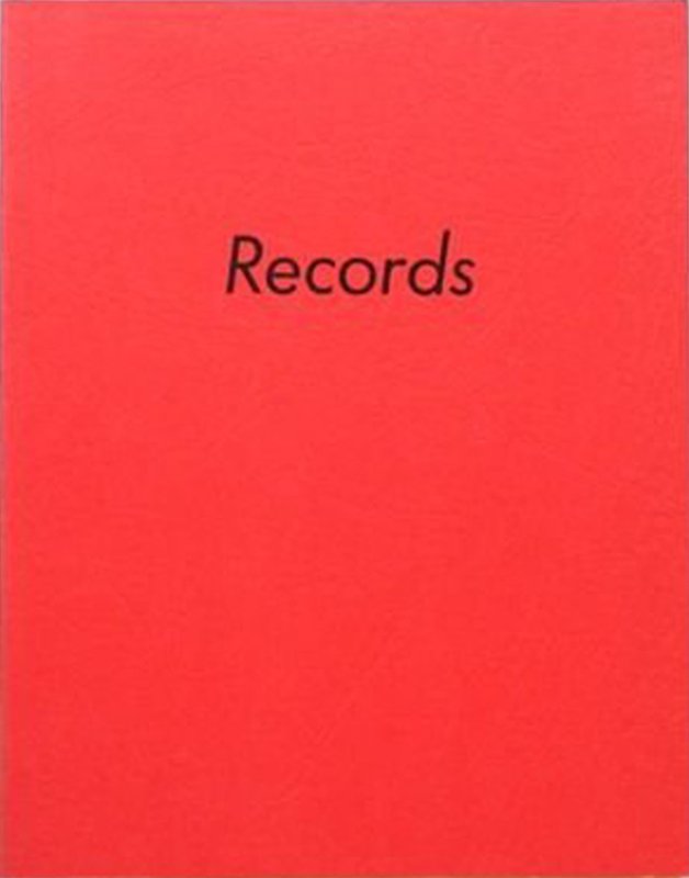 Ed Ruscha's Records (1971) is available on Artspace for $1,800
Ruscha's ode to Valium uses a style and technique that differs from the more familiar block letters dominating the artist's other word drawings. The three words are composed of diminutive letters strung in a diagonal line that floats in an atmosphere of pink and blue pastel, as if they were being pulled across the sky by an airplane. Visually similar works, such as Quick, Passionate, Noisy and She Broiled a Chicken, both from 1976, reinforce the three-dimensionality of the words, which are seen in perspective and from a skewed angle, hovering in space like lost objects that have been released from the printed page and now inhabit their own realm.
Ruscha also began to explore more lengthy phrases in this vein: "Single words kept my int-erest for a while and then, later, there was only one thing to do—heap more words in. Until finally, I found myself doing a painting which says, Study of Friction and Wear on Mating Surfaces." The phrase could be an imaginary book title, a scholarly thesis, or merely a random combination of a few words that appealed to the artist. Ruscha's work is insistent and imaginative in its exploitation of words, and the title of one of his drawings might encapsulate the artist's visual manipulation of the language—I Think There Is Something Dangerous Going On Here (1976).
Sea of Desire (1976) and Dirty Baby (1977) display another variation on the visual depiction of words. Here, the individual letters appear as if they have been cut from paper, crumpled in the hand, and then placed on a flat surface, where they rest in an uneven and disorganized fashion. The source of the phrases is typically oblique: "Sometimes found words are the most pure because they have nothing to do with you. I take things as I find them. A lot of these things come from the noise of everyday life." Sea of Desire is a melodious phrase that could have been heard on the radio. Ruscha's title, in fact, is very similar to that of a popular rhythm-and-blues song of the 1950s, performed by the Honeydrippers, called "Sea of Love," which the artist probably had in his collection of 45 rpm records. Ruscha liked the phrase and used it again in two lithographs and a painting completed in the 1980s. Sea of Desire also proved to be a popular phrase in the public consciousness and was the title of a 1989 movie starring Al Pacino and Ellen Barkin, a 1991 pornographic video with Sharon Kane, a 1993 romance novel by Christine Dorsey and a 1999 CD by the hard-rock band Shotgun Symphony.
Although he continued to use word phrases in his work, in the late 1990s Ruscha abruptly reversed direction in a group of paintings that completely eliminated the words, instead leaving empty spaces that urged the viewer to fill in the blanks. The work titled I Might Just Act Ugly If You Get Up on That Stand and Say Something Unpleasant to My Ears presents nineteen empty horizontal bars, one for each of the nineteen words of the title, arranged in eight lines. As Ruscha explains, "The newer works I'm doing seem to come from their asking to be titled—the titles are sort of glaring. I've always felt a title is extremely crucial. They're missing from the images in some respect." The absent titles are emphasized by the fact that the artist has made them disappear, using bleach to extract the color from the rayon fabric on which the work is made. Rather than apply paint to spell out words, he has erased the location where the words would appear. This aggressive act of negation is consistent with the content of the title and its implied threat. The phrase reads as if it were extracted from a B-grade gangster movie, as does the title of a related painting, Better Get Your Ass Some Protection (1997). These wordless word paintings underscore Ruscha's affinity for Conceptual Art in the same manner as his invisible Stains, but they also confirm Ruscha's position as an artist concerned with color, form, and content: "The idea of pure Conceptualism puzzled me, because I felt like it was impossible to make a statement with a work of art that didn't have something to do with the visual."
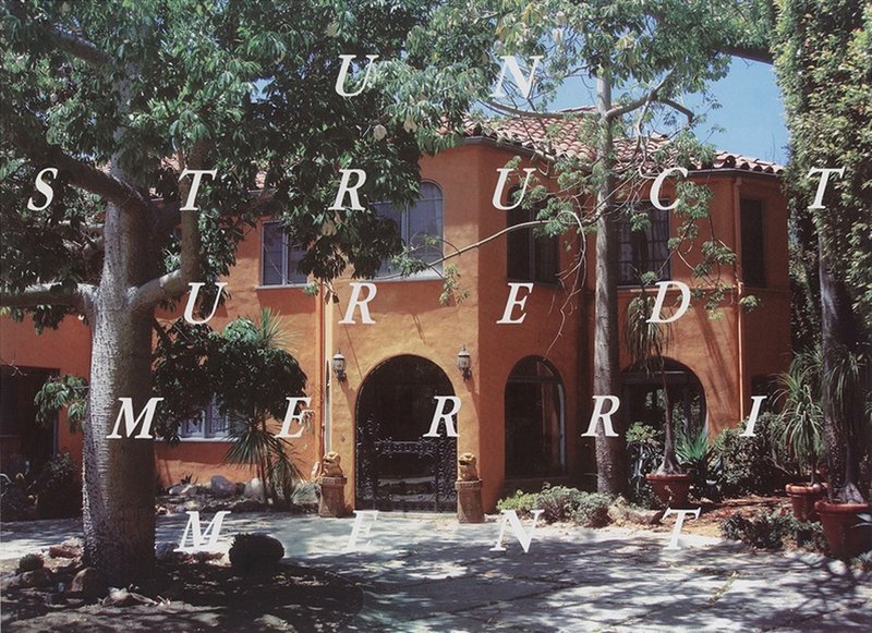 Ruscha's Unstructured Merriment is available on Artspace for $20–30,000
Ruscha has said, "I love the language," and this sentiment has allowed even the word "word" to become his subject. The painting Words ... (1987) depicts the phrase "Words without thoughts never to heaven go," which the artist selected from Shakespeare's Hamlet. The phrase emerges at the end of act three when King Claudius bemoans the ineffectiveness of his prayers: "My words fly up, my thoughts remain below: Words without thoughts never to heaven go." Ruscha considered this literary reference ideally suited for this work, which was commissioned for the Miami-Dade Public Library under construction in Florida in 1985.
The phrase is formatted in a circular configuration that mirrors the skylit rotunda in the library's main entrance. The words progress clockwise, and the letters diminish in size against a glowing ring of light, so that the viewer must turn 360 degrees before reaching the last word, "go," which encourages a cyclical rereading of the quotation and orients the viewer to the vast and dizzying amount of language contained in the library. Ruscha continued his interest in words about words with the painting Words in Their Best Order (2001). In this work, each of the five words of the title recede in size as they progress to the right against a graduated background dominated by red orange. The declarative phrase reinforces itself, in that the artist has pointedly specified the order in which the words are placed. Ruscha has also physically dictated its accuracy by executing the painting on three separate but contiguous canvases, so that any rearrangement of the three panels would disrupt the sequence of sizes and disturb the panoramic, horizontal background. Yet the individuality of each word and panel demonstrates Ruscha's proclamation—one that characterizes all of his work with words, phrases, and even thoughts: "I'm not combining words to make word gestures. Each word is an excursion unto itself."
[related-works-module]