
Cartoons are often regarded as less than ‘proper’ art, sometimes even something juvenile. Originally, they were rooted in utility – a rough sketch on heavy paper (from the Italian, cartone , describing the material), drawn at scale as guide models for frescoes, stained glass or tapestry production. From the mid-19th Century onwards, and as printing developed, these rough sketches had come to be used for satirical purposes, appearing in pages of scurrilous magazines where they could be used to satirise and prick political figures of the day. Cartoons were quick to produce, less material-intensive and easy to understand.
These qualities led to their global ubiquity throughout the 20th Century, from the weekly periodicals of the UK to Japanese Manga and the rich American tradition in its entirety - from Mad to Marvel. And it’s this history that has given the form such a long and healthy second life in the world of art.
Entire generations of artists had their visual sensibilities shaped, refined and influenced by the cartoon art they consumed as children and echoes of this have recurred in work from Keith Haring ’s dancing babies to Tom of Finland ’s erotic bikers.
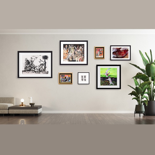
And just as artists have a connection to a style that influenced them as children, so do viewers. For most of us, cartoons and comics are the first visual art that we actively consume, often before we can read or write. Without even realising it, it’s a visual language that we’re familiar with and are attracted to in the same way that artists are. Here are some of our favourite pieces from the Artspace archive that draw on the tradition, and might bring some of the anarchic vitality of the comic book to your walls.
Check Fest, 1998, Kenny Scharf
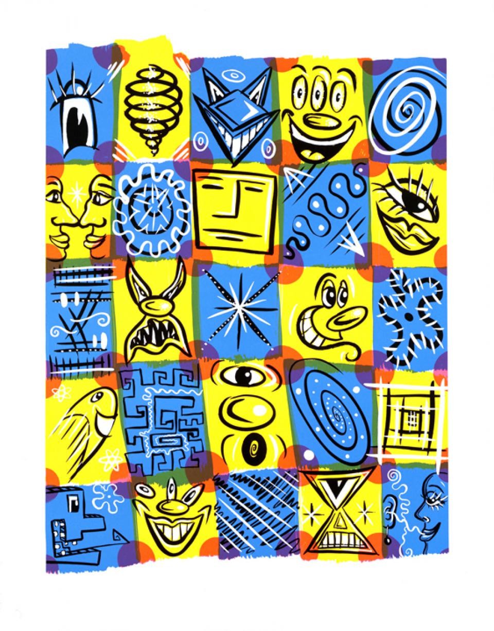
In Ben Anthony’s recent Keith Haring documentary, Street Art Boy, the star turn among the talking heads was his peer and collaborator Kenny Scharf. Forged in the same early Eighties East Village scene as Haring and Basquiat, Scharf’s colorful, optimistic work sucked in elements of Pop art, Surrealism and science fiction and allied them to the fantastical cartoons of his childhood like The Jetsons and The Flintstones. Scharf himself saw the use of the cartoon style as something of a political act: “One very important and guiding principle to my work is to reach out beyond the elitist boundaries of fine art and connect to popular culture through my art,” he says. “My personal ambition has always been to live the example. I believe the artist has a social responsibility to engage others in a thought process that ultimately brings the creative process into everyday life thereby enhancing the quality of our experience.” This signed and numbered screenprint – with its popping squares, one-eyed beauties, monsters and geometry – does exactly that.
20/20 Vision, 2017, Keith Young
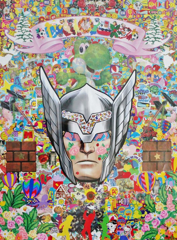
For maximum wall impact, it’s hard to beat this unique piece by Keith Young, a mixed media work carefully assembled from layers of stickers. The deeper you go into the work, the more details are revealed – layers of promotional images, arrangements of flags, delicate ladybirds and shimmering flowers, bouncing Tiggers, fragments of text, cats, bears and tiny lines of reappropriated copyright control text. All are built up into one geometrically complex image by Young. The end result is a sort of vast survey of the American pop culture that Young was immersed in as a child in Kansas City, in what his gallery describes as a “creative family nourished by free thought and conversation.” Despite being colorblind, Young’s technique of working with found objects, discarded materials, fragments and repurposed media builds images of layered depths and pattern. This piece is signed by the artist and comes framed.
Tired of This Shit, 2019, Canyon Castator
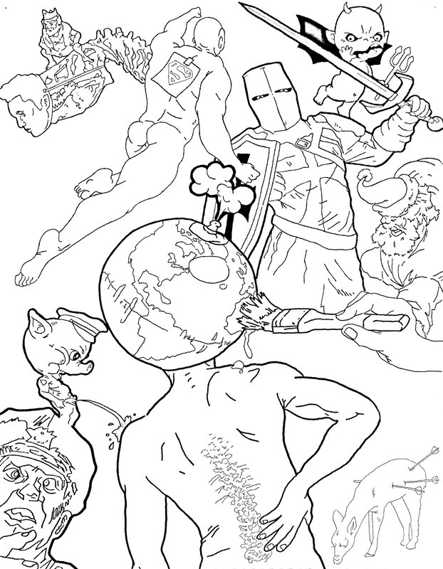
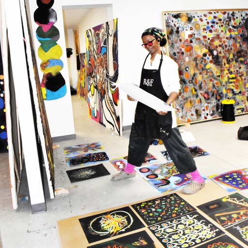
Born in rural Texas and with an adolescence spent traveling with the skateboard scene, 30-year-old Canyon Castator is now an artist working in LA, but is operating as something more like a gallery, studio and artist incubator. The studio he set up in Downtown five years ago has had several of its floors converted into working spaces for other artists, the building becoming a readymade hub for artists (“We’ve kind of just wanted serious artists only. No vanity-project-bullshit. No DJs," he says), while he recently partnered with Carl Kostyal gallery to establish a month-long residency in the studios. This sense of chaos and community bleeds over into his work, with complex arrangements of competing figures filling the frame. “A lot of the characters – yes, they are people or animals and they’re closely compacted – but they’re all kinds of symbolic icons for this relationship of ideas, jumping from one to another,” he told Interview recently. “You know, one character might represent this idea to me, another character represents another thing. So I’ve kind of dehumanised them in a way, so that they can, in my mind, represent these themes and play off one another.” This unique work on paper is initialed by the artist in pencil.
Another Bluto, 2017, Erik Hanson
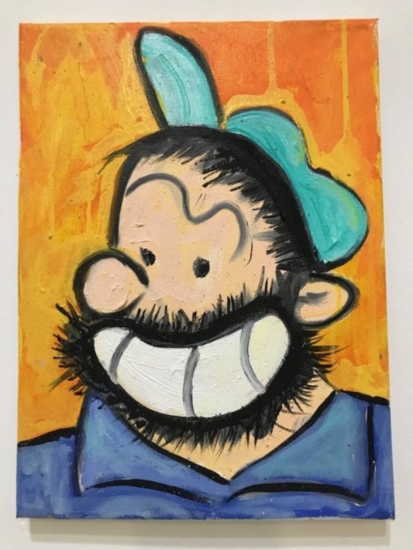
Originally created in 1932 by Elsie Crisler Segar, Bluto is one of the archetypal bad guys of American cartoon art (originally conceived as a one-time appearance, his full moniker ‘Bluto The Terrible’ was a giveaway). As a bad-tempered, aggressive, bearded bully, Bluto was the perfect antagonist, constantly battling Popeye for Olive Oyl’s affections, double the sailor’s size and often edging out of the frame due to his size. This left an impression on the self-taught artist Erik Hanson, and inspired his project, 2 Years of Bluto, “a record of me learning to paint as I was never formally trained.” In total, Hanson produced 240 studies of the character during this period. In his hands, Popeye’s nemesis becomes something softer and more nuanced, and Hanson talks of how as much as a process of painting, the series was about “learning how to forgive… Bluto, is often thought of a ‘Bad Guy’, as was my aggressive, angry and long deceased dad. So spending two years painting this cartoon character over and over turned into a way to meditate on my dad’s dual nature as good and bad as well as my own.” This oil on canvas work is a perfect example of how the frivolity of a cartoon can often contain a deceptive emotional punch.
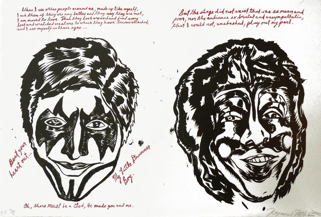
Raymond Pettibon is one of the most significant artists to have come through the violent, ramshackle world around LA’s punk scene of the late 1970s. A phenomenally prolific artist, his artworks – ranging from the clean lines of old-school detective cartoons to the ragged edges of Goya’s sketches of war and the Trashcan school – meshed pop culture imagery and brutally observed figurative sketches with philosophical quotes and snatches of dialogue. His drawings were used by much of the SST Records roster, Sonic Youth and, most famously, his brother Greg Ginn’s group Black Flag, his pitch-black humour, genuine grasp of tragedy and anti-authoritarian menace chiming perfectly with the music of the time. In this edition of 35, an off-kilter version of KISS leers out, framed by quotes form Søren Kierkergaard, the Danish philosopher and father of existentialism.
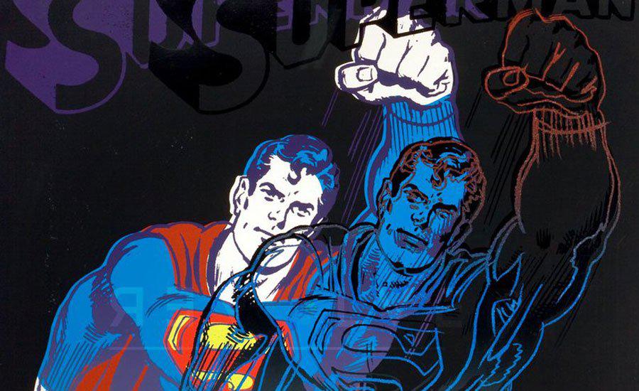
Superman (FS II.260), Andy Warhol, 1981
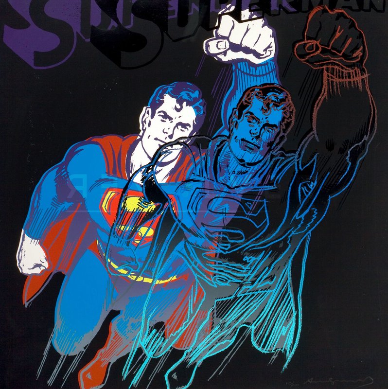
Andy Warhol’s ability to repurpose the key images of American pop culture was unrivalled. But one of its most interesting expressions was in Myths, his series from 1981, which drew on the characters that populated his childhood. First shown at Ronald Feldman Fine Arts Gallery that year, the portfolio of 10 prints focused on one fictional American icon per image, usually on a black or shadowed background, with images recoloured, flipped to negative or overprinted, some embellished with diamond dust. The Star, The Witch, Howdy Doody, Uncle Sam, Superman, Mammy, Dracula, Santa Claus, The Shadow, and Mickey Mouse are featured, ‘The Shadow’ being Warhol himself. Lacking the repetition or scale of Warhol’s better-known works, the tighter focus of these portraits maximises their impact, especially in his portrait of Superman. Warhol had spoken of the comfort he found in the character’s comicbooks that he read while immobolised during a debilitating childhood bout of Sydenham’s chorea. This screenprint is an edition of 200, with smaller numbers of artist’s proofs, printer’s proofs and exhibition proofs also available.