
In his new book Painting Beyond Pollock ( Phaidon , April), the Sotheby's Institute lecturer Morgan Falconer charts a smooth, remarkably direct course through the choppy waters of postwar painting. As he told Artspace in a recent interview , "There hasn’t been a comprehensive history of modern painting after Pollock, mainly because after the 1980s painting became very disreputable and people didn’t really want to go back and look at the whole history. So there was space to write this narrative and try to think about the links between contemporary painting and the past."
That same kind of big-picture thinking informs Falconer's Artspace Collection , as does his sensitivity to the medium of painting (see below).
PETER DOIG
Masqueraders
, 2006

I chose this Peter Doig because it reminds me of quite a lot of recent figurative painting which seems like a return to late-19 th century painting—to symbolist works by artists like Gauguin and Munch. It’s similar to some of the things Doig has been doing very recently. It’s got a wonderfully dreamlike, melancholic quality, and I find it strange and striking that imagery from what is the dawn of modern painting seems so appealing to contemporary painters. This imagery looks so old, and yet it’s clearly so seductive to painters in the here and now.

This work, in my mind, ties together two interests of Chuck Close—photography and painting, although I know that Close has said he’s not that interested in the photograph itself. Close is a hinge between pop and photorealism, and his work is really deeply rooted in thinking about the idea of the real in the 1960s. And photography was important to that. I also like the fact that this is a contemporary politician. Painters, more recently, have not really depicted politicians in quite this way—very direct and straightforward, without any apparent commentary.
KEITH HARING
Best Buddies
, 1990

When I was at college everybody had a Keith Haring poster on their wall, and that made him very boring to me. I’ve only become interested in him in recent years. And although his painting has become very sought-after on the market, I actually admire the ephemera a bit more. His designs are very striking, but what really makes Haring appealing to me is the cheap availability of his work. At one point there were posters, badges, caps—all of the stuff he sold through the Pop Shop. I like the way he had a foot in fine painting and a foot in a democratic version of Pop. People used to think of Haring as coming up from the streets, but I don’t think that’s true. The very bold graphic style he has clearly comes from artists like Léger, and his interest in bold motifs derives a little bit from theories of semiotics which he picked up in college when he was studying. So I think it’s a myth that he was a graffiti artist, but he really did bring the streets to the galleries in some real way.
VICTOR VASARELY
Zebra Box (based on work from 1939)

I have a chapter in Painting beyond Pollock about geometric abstraction and the fact that it was a declining and dying and fragmenting tradition in the postwar years. It was born in 1910 and flourished in the '20s and '30s, but after that it declined. Victor Vasarely, though, was one of the most important exponents of it in the postwar period, and I really like what he did. He tried to make a public art form out of painting. He was very influential and was the crucial influence on people like Bridget Riley. I picked this because it’s one of his earliest motifs, the two zebras. It crops up in designs which he made when he was working as a commercial artist in Paris in the thirties. It's essentially a form of Op art, made before the movement took off.
MARTIN KIPPENBERGER
Eierman
, 1996

Martin Kippenberger reminds me of just how diverse Neo-Expressionism was in the 1980s. People tend to think of it now as a very muscular style practiced by macho artists like Julian Schnabel and romantics like Francesco Clemente. But the Germans who practiced it in the same period were really very varied – some of them were satirical and some of them technically innovative. So I picked Kippenberger to remember that period, and again this is a great example of aspects of that style. It’s about Kippenberger himself, it’s about painting, and it has a foot in history—and a lot of Neo-Expressionism was very self-consciously historical. And yet, in true Kippenberger fashion, it’s very funny.
KAREN KILIMNIK
The Sparkly Lippazanner at the Battle of Austerlitz
, 2008

I really like Karen Kilimnik, and I hadn’t really given her much thought until I started writing about her. She's very representative of how women in the '90s have responded to Neo-Expressionist and romantic strains in art in the '80s and sort of done strange and interesting things with it. Kilimnik’s work is romantic, but not in the grand way that artists like Clemente’s was. Instead, her work tends to be quite sentimental – sometimes in a self-consciously girlish way. She absorbs influences from pop culture as much as she does from high art, and I think sometimes she feels a bit divorced and distanced from the grand tradition of painting. So her work has an emotional aspect, but also a cold and conceptual quality as well. You’re not meant to put glitter on works of grand manner, or academic painting, but she’s happy to do that.

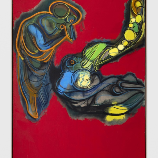
There wouldn’t be a lot of contemporary painting without Gerhard Richter, and this is really a great example of how he brings high modernist painting into some sort of dialogue and relationship with photography. It’s wonderful that this piece is ambiguous (as so much of Richter’s work is). The paint seems to cancel out the photograph. It seems to suggest some powerful emotional force in the photograph, but doesn’t specify what it is. It sums up Richter’s twin investment in those mediums, photography and painting. When he first emerged as an artist he was rather scornful of painting, but as he’s grown older he’s become more invested in its possibilities. Some critics have framed Richter as the period’s great critic of painting, but I don’t think that’s true. A lot of people would like for there to be such an artist, who is recognized as a great painter yet is critical of it. But Richter clearly loves painting, and he’s someone who is interested in extending the tradition.