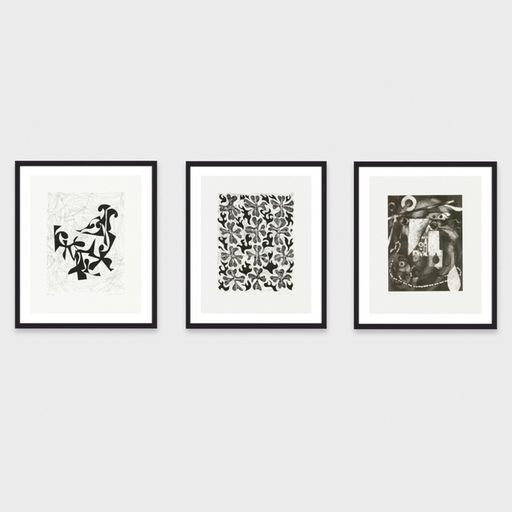
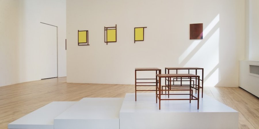
When you stand in front of a great work of sculpture, it's not usually your first instinct to sit on it. With his most recent work, however, Paul P. hopes to tantalize you into doing just that. His current show at Broadway 1602 in Manhattan constitutes what the Canadian-born artist—who formerly worked primarily as a painter—calls an "aesthetic interior," floating somewhere in between interior design and installation art. The show includes P.'s custom-built mahogany writing desks, tables, and stools inspired by the Victorian Anglo-Japanese furniture designs of E.W. Godwin , as well as woven wool rugs based on collages of torn-up paper.
Behind it all is a keen eye for the coded aesthetics of everyday interiors and an expansive notion of the utility of a work of art. We spoke to the artist about his conceptually-invigorated decorative bent, the lack of love in contemporary art, and his work in the current Whitney Biennial.
Your earlier work consists of portraits that are painted from gay erotica magazines from the 1970s and early ’80s that you find primarily at the Toronto Lesbian and Gay Archive. The exhibition at Broadway 1602 includes abstract and monochrome paintings, woven rugs, and mahogany furniture, seems to be a complete departure from that earlier work. But its title—"The Homosexual Lovers Throughout the Ages Party"—seems to harken back to those earlier paintings. Could you explain the show’s title?
I’ve been very interested in the “Bright Young People,” the interwar phenomenon in London. They were kids, too young to have died in the First World War, but with a sort of premonitory energy ahead of the Second World War. One in particular, Brian Howard was typical of his milieu in that he was a really precocious youth. The “Bright Young People,” as they were coined by the tabloids, were publishing poems and novels from a very young age—they were extravagant, and they were party animals—and Howard was an impresario in this thematic party circuit. There was one party at the height of that period that was going to be called “The Homosexual Lovers Throughout the Ages Party.” It didn’t happen, for whatever reason—there were more extravagant parties that certainly happened—but the title, and the fact that it never happened, appealed to me.
Semantically, the title in itself also struck me as a use of words that are not so common today; “homosexual” has largely been exchanged for “gay,” and “lovers” is not really the word used any more, “party” has taken on another sort of sense, other than the celebratory, and can refer to drug taking and generally risky behavior. While this title may evoke the feeling of my previous work, my previous exhibitions were titled to conjur the aesthetic world that this exhibition refers to in its works directly. And while these works may seem like a departure, there is total continuity in my mind, including the use of art historical materials, the abstractions that refer still to the erotic, albeit in terms of the sensual charge of locations, and the furniture work, which I design with an allegorical purpose, alluding to eras and certain lives lived. They are an evolution of my impulse for portraiture.

You've called this newest installation an "aesthetic interior," and I believe you've also used the term "climate of sensuality." Clearly you're thinking about the gallery context and ways of investigating its impact on the reception of the artwork. This carried over to your presentation in the Whitney Biennial, where you have a series of drawings shown in relationship to one of your new mahogany tables. But there's also a hint of this idea in your 2010 show at Daniel Reich Gallery, where paintings were hung on top of walls that had been painted different colors and the windows were tiled with Japanese paper. Could you explain this concept?
Over the past few years my practice has moved increasingly outside of the studio and from appropriated material towards recording the aspects of the world that are both my world and the world of those who I’m fascinated by. I like the slipperiness between time periods that drawing can create. I went to the physical source of my fascinations and as I moved about and drew I began to feel the want for something within the gallery that reflected—more that the works from the studio could—the ineffable sense of movement through spaces. The furniture pieces, which are sculptures made of delicate lines, unfold temporally as one moves around them. The gallery is a set-up in which this can happen. And in this way the interior has become aesthetic.
I like the idea of thinking of climates, or atmospheres, and how they can be analogous to bracketed periods, whether it’s the post-Stonewall pre-AIDS-crisis era of pornographic imagery that I’m looking at or the
belle époque
, the late Victorian period of the ultramodern reformer and dandy like Whistler and Proust, or the “Bright Young People,” all moments of temperamental aestheticism before a fall. I’m seeing temperament and climate as things inextricable to aesthetics. In this exhibition, I think, more than ever, that which has previously been held within the paintings is being extrapolated throughout the room, and is therefore a little bit closer to illustrating atmosphere.
You painted your portraits from photographs, and your landscapes are from drawings "in the field," as you've said, and also photographs. What about these newest paintings?
It’s a process of zooming out. From the portrait to the figure to the figure in landscape to just the landscape and finally to a focus on its architecture. Though throughout this movement I feel as if the figure, at least in his eroticism, remains present. The gaze has been directed not away from him, but rather to the space just beside him. These paintings are not purely abstract; they’re abstractions, they are depictions still, in my mind, of the effects of atmosphere in Venice, and of their relationship to the body.
Right, the famous light in Venice, which you've treated in a series depicting the Italian city as well as Los Angeles beach district of the same name.
The light in Venice is a recurring motif. I’ve always been captivated by the laundry hanging over the canal, or what is made by its shapes and shadows. You can see this in the paintings, and also, a little further imbedded, in the designs of the collages, and the collages in turn become the designs for the rugs.

The rugs are based on paper collages that are overlaid with gouache and ink and the translated into weaving. They almost look like they could be digitally printed, like the large Persian rugs that were digitally printed in
Rudolf Stingel
's show at the Palazzo Grassi; but in fact your rugs are hand-woven. Is it important for you that they're manually produced?
My choice of materials and their execution are part of the content. The rugs originate in torn fibrous paper collages, which become the maquettes for what is woven by hand. As my paintings moved into a more prismatic or refracted image of perception, I looked for a work-on-paper equivalent. I found that in tearing up pieces of paper, instead of drawing, and these works, in turn, immediately spurred me to make textiles. The hand is a uniting factor.
I noticed the size of the tables—they seem to be smaller than life-sized—is amplified by their placement on these plinths. At the same time, the stairs built into the plinth suggest an invitation to interact with them, to use them. I was reminded of
Richard Artschwager
's sculptures, which seem to invite functional usage but are actually functionless, or that are based on the Platonic idea of a chair or a table. There was also a photo of you in the
New York Times
where you’re sitting on one of your stools at the desk that's in the Whitney Biennial.
Do you imagine that these objects would be used as functional objects, or is it enough that the suggestion of use is there—what you call their "attitude of expectancy?"
I do think of them as being functional, and part of the interest is in the fact that they hover between the functional and the sculptural. The desk is usable, the stool is strong enough to sit on, though their proportions are based on a lady’s writing desk from the late 19th century. There are limitations. They refer you to a more delicate placement of your body, different from most furniture. The small tables are ready for the placement of some object, though I’ve built them to an exaggerated degree of fragility, tapering the legs to one centimeter at the bottom, for example, so that they seem to also defy use. I don’t wish to evoke the domestic. They float, they’re more portable than the furniture that you associate with the immutable dining table, the working table—these are liminal.
Could you talk about the process of fabricating them?
I worked with a craftsman, who spent a great deal of time and attention making them. They’re mahogany, and mahogany is extremely light, so the materiality and also the construction have this synergy based on lightness.
I read these asymmetrical details as being in reference to the Godwin-esque Anglo-Japanese influence from 19th-century design, which you mention in the press release.
I’ve extracted certain details in E. W. Godwin’s design and simplified them further according to what I presumed would be his trajectory. Godwin was Victorian, but he was moving contrary to his epoch; his was a very clean design that was actually meant to be hygienic, against accumulation of dust and the stoic heaviness that is so Victorian. His designs prefigure Bauhaus, which came over 50 years later. He called a period of his work “Anglo-Japanese.” He, along with Whistler and other artists and aesthetes in London at the time, became frenzied collectors of the amazing china, scroll painting, and Japanese design, which became available as the ports in Japan opened to trade. I’m fascinated by the transmutation of the Japanese aesthetics into Western art, beginning at first as reference, a motif, and then later, as the artists matured in their study, as sensibility.
And I see that sort of visual reference in the monochromatic yellow paintings as well, which, in the context of the aesthetic interior, appear like
trompe l’oeil
windows, or screens.
The window is something I was thinking about. Windows, doors or other sorts of apertures for movement—canals, alleyways—interest me. I’ve often thought that these paintings could refer to the window of a lighted interior seen from without; or the opposite, looking from the dark interior out to the sunny exterior.
As a gay man, I of course think of the stereotype of the gay interior designer. Is that something you’re purposefully engaging with?
I do feel that there are certain authentic clichés that are essential. I’ve referenced so much from Whistler, and Whistler wasn’t homosexual—but there was something very queer about him. He was extremely dandified—he was small, thin, effete with a famously stinging personality. He was a friend and enemy of Oscar Wilde, and together with Count Robert de Montesquiou they were the most flamboyant in their scene. I’ve often thought that some of our powers [as gay men] are to consider spaces and aesthetics, and to continue that trajectory throughout history. Especially in periods like now, when people have become more and more negligent about what constitutes an aesthetic interior, I think it’s worthwhile to summon those powers for emotional good. Though I’m also conjuring histories outside of interior decoration, like the lives of Brian Howard, or Stephen Tenant, or Nancy Midford, who is interesting to me as a female dandy and as a reporter allied to homosexual lives. These people, all of them, had very specific aesthetic requirements for the rooms they inhabited. With the strategy of arranging my art objects within the gallery I feel that I’m referring to, and interconnecting, them. I’m using the visual vocabulary of interior design, but it’s not an ultimate end—it’s a means of illustration.

How do you see the other abstract paintings fitting in to this larger arrangement? Is it fair to call them, in a way, paintings of paintings?
Yes, the abstracted paintings “are” the paintings and everything else circles around them, everything else is meant to create the attitude of reception. The paintings are the heart of the exhibition’s organization. They are paintings of places, moments caught.
The drawings you have in the Whitney Biennial are done in fountain pen, which is a "romantic” way of working in and of itself, and they’re drawings of neoclassical sculptures in the Metropolitan Museum of Art. You've said in the past that you want to "advance our own version of the 'classical'," too, so I was wondering, in invoking this classical idea of aesthetics, since it’s sort of a 19th century way of drawing....
It’s epistolary, as well.
Yeah, I was wondering if you are reacting to what you see as a deficiency in romance or sensuality in contemporary art.
I’m happy to have my work represent ideas that aren’t that prominent right now, but I’m not reacting to a deficiency. Though I admit I may highlight certain deficiencies. The word romance has also been sullied—my impulse comes from a place of fascination, and I think that’s my preferred term: deep fascination, fascinations that are inextricable from the idea of death—and I think fascination is also deeply allied to the idea of love. Love in contemporary art might be one of the hardest things to reconcile as a motivation, but love and fascination are the motivation in everything I do.
And the desk at the Whitney is dedicated, right? Why did you title it
Writing Table for Nancy Mitford (Blitz Era)
?
Here the allegorical nature of the furniture pieces is most direct. I’m imagining a desk for Nancy Midford—for her, for her successor, her ghost. I’m not creating something to carry the illusion of having belonged to her, but an object suited to a mood that I’m trying to get close to. I’ve still used Godwin’s lines, which wouldn’t be unfamiliar to Nancy, as they come from an aesthetic world that she would have understood. I find it amazing to imagine what it would have been like to live through the bombing of London, the nightly air raids. The bombings were incessant, people continued on with their lives, with their writing, with their romances though with an electric undercurrent you can only get from the proximity to death—it’s an incredible atmosphere to imagine, the end of the world as a daily routine.
I see parallels with gay lives lived in the early years of the AIDS crisis. With the writing table I wanted to make something that would recognize those extraordinary conditions of living and the restless emotional life of the artist. I wrote a text in the catalogue explaining why I think Mitford is important, which is that in her postwar novel
Love in a Cold Climate
, she created a character called Cedric Hampton, who I believe to be the first unpunished homosexual character in mainstream literature. It’s a book that’s never gone out of print, too. He’s not only unpunished, but he’s victorious. He wins everything, love and money, and not at the expense of others—he’s actually creating happiness for people around him as he pursues what he wants. His presence permits people to have all the varieties of love that they want. Cedric Hampton is also important as an amalgam of Midford’s friends from that interwar period, most of who didn’t survive or fulfill their potentials the way they might have, due to war, decadence, or the unrelenting stress of a homophobic world.

You moved from Paris to New York, has your work, or your way of working, changed by moving between the two cities?
I learned when I moved to Paris how affected I could be by light. Influences that I thought I could only get from the effects within the paintings of other artists—the drama of light and atmosphere—suddenly were real and unfolding for me in Paris, and it changed my work. That sensitivity hasn’t been lost by coming back to New York, even thought the quality of light is very different here; more subtle, there’s a cleaner, whiter, clearer light. I’m attuned to it now wherever I go.