
Textbooks tend to organize art history chronologically. But what if we re-told art history through color instead? Artspace is publishing a series of articles excerpted from Phaidon's Chromaphilia: The Story of Color in Art, each one offering a close look into the history of a single color in its relation to art. We've already looked at green and red, and in this iteration, we look at art history against the grain of blue, and the color's conceptual, psychological and cultural significance in the works of Helen Frankenthaler, Pablo Picasso, and Yves Klein.
...
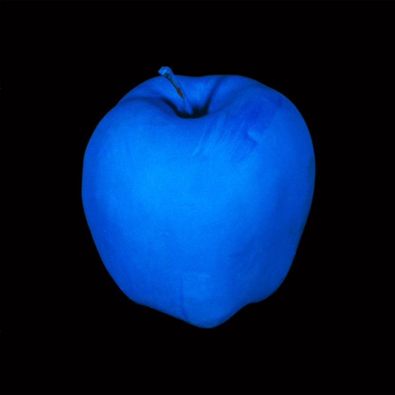
There are many kinds of blue—all the same hue, yet with in-exhaustive permutations of appearance, effect, origin, and meaning.
Exploration of blue prompts an examination of why the sources of artists' pigments matter. New blues crop up at many junctures. Blue is the first hue we can associate with artificial synthesis, in ancient Egypt, where it appears to have held particular cultural significance. Ultramarine is of major importance in the history of art, and other blues also have their own stories. From a fifteenth-century manuscript illumination to Canaletto, four essays about pigment history highlight the flow of technology and material development that underpins color in art. Holbein's use of several different blues enables discussion of color behavior, particularly the vicissitudes of color shifts over time. From Giotto to Klein to Hiorns, the diverse substances that make up color resonate from the distant past to the present.
The language of color can be elusive and occasionally misunderstood, as revealed by the nineteenth-century argument that ancient Greeks could not see blue. Indeed, color has often been the subject of heated debate. The ambient blue light of Abbot Suger's church of Saint Denis in Paris reflects a theology of color and its generation, one with which not all medieval theologians concurred. In Renaissance Italy, color arguments roiled around the concept of disegno e colore, design and color, asserting priority for one or the other as it related to the philosophy of artistic practice rather than theology. Painted passages in works by Michelangelo and Titian show how each artist manipulated blue areas in a process that reveals his approach to all color.
Blue's purely formal attributes include its unique power to denote space and distance, as shown in works by Patinir, Hofmann, Diebenkorn, and Frankenthaler. It is also used to create the illusion of volume, manipulated to suggest three-dimensionality by artists such as Fra Filippo Lippi, contrasted with Nardo di Cione.
These blue details offer insights about all colors, including ideas regarding symbolic meaning. Symbolic references changed according to time and circumstance: the Virgin Mary's robe was not always blue, for example. Time and circumstance are also explored in discussions of Picasso's and Kandinsky's gravitation toward blue certain points in their lives, and in Klein's development of his own proprietary, signature blue.
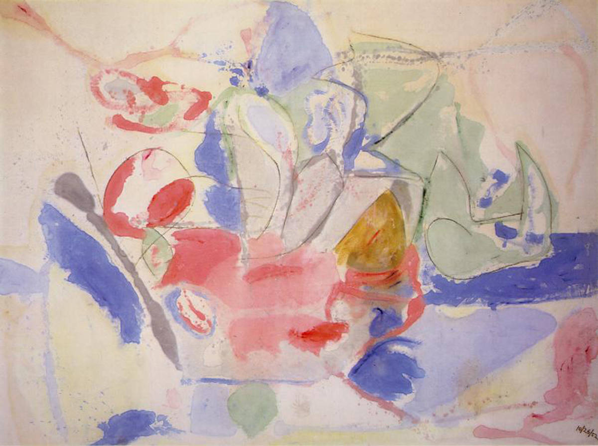 Helen Frankenthaler, Mountains and Sea, 1952
Color's power to define space, understood from antiquity, persists in the contemporary world. But some artists have shifted the terms from explicit representation toward an evocative re-presentation of form that is redolent of landscape without using figurative imagery. Color is crucial in conjuring up those associations.
Patinir's aerial blue expresses spatial depth, and his elevated vantage point provides a limitless panorama. Richard Diebenkorn had an aerial epiphany while viewing the abstracted patchwork of topography seen from a low-flying plane. The bird's-eye view helped him translate something literal into something notional. Berkeley No. 22 is not a conventional landscape, although it reflects an attitude about the land and it is associated with the specific place stipulated in its title. A comment by the artist about color supports the powerful alignment of specific hues and their persistent tendencies to signify images. Looking back on his career, Diebenkorn discussed periods in which he was "fighting the landscape feeling," noting: "For years I didn't have the color blue on my palette because it reminded me too much of the spatial qualities in conventional landscapes." Among other insights, Diebenkorn's experience with a bird's-eye view allowed landscape back into his work and eventually reintroduced the color blue associated with his sense of place.
RELATED: "Color Is Never Unimportant": The History of Red and the Work of Judd, Bourgeois, and Kapoor
In Frankenthaler's Mountains and Sea, color has been handled in a new way to change the relationship of figure to ground and to evoke a specific landscape in chromatic, non-figurative terms. Having returned to her New York studio from an interlude in Nova Scotia, Frankenthaler later recalled that she had internalized the Canadian landscape, which had become embedded not just in her mind but also in her shoulder and her wrist. With that backdrop of mind and body, she created a lyrical, pastoral abstraction to summon a memory of a place through color. She thinned her oil paint to liquid with turpentine or kerosene, pouring and spilling it on raw cotton canvas. The paint pooled, puddled, soaked, and stained the support; color merged with the canvas fibers rather than resting on top. The thinned oil paint performed almost like transparent watercolor, but the oil/turpentine mix caused a faint aura to emerge around the edges of the blots of color. Frankenthaler left a lot of raw canvas as well, and there is no separation between figure and ground. Patches of blues and greens give a sensation of depth and an impression of topography, although there is no illusionism and no perspective in this closely observed yet abstract evocation of the land.
 Helen Frankenthaler's Un Poco Más (1987) is available on Artspace for $9,368
PABLO PICASSO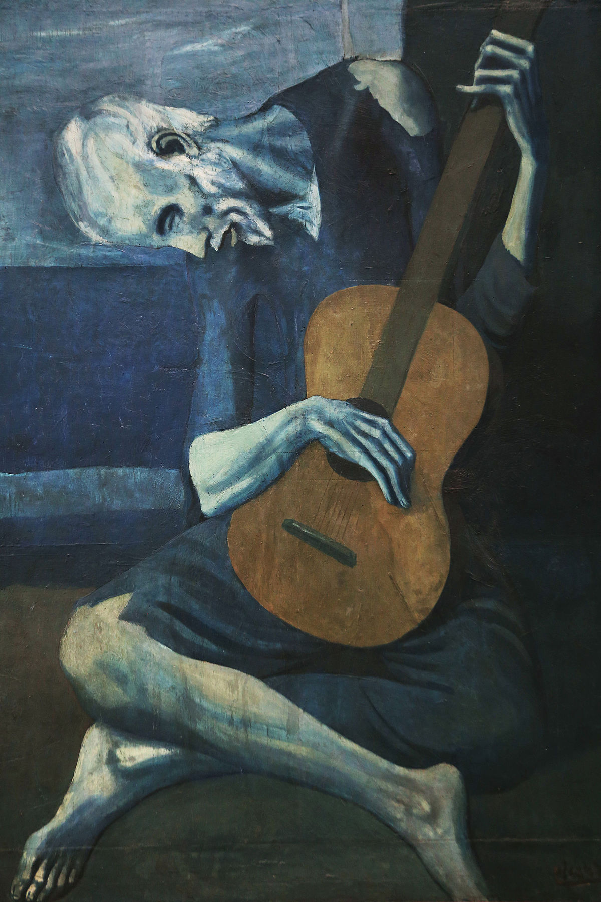 Pablo Picasso, The Old Guitarist, 1903–04
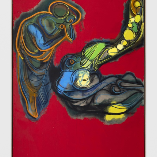
Pablo Picasso went through phases devoted almost exclusively to a single dominant color, stimulated by emotional responses to human incident or by more intellectualized analyses of spatial perceptions, among other catalysts. The blue period occurred first, after which his palette changed to focus on rose. At other intervals in a long life of spectacular creativity, Picasso stripped away color intensities to create subdued earth-toned paintings, and he periodically reduced painting to a simple range of grays ranging from black to white. Of course, there were also periods of full-throttle color. "Colors, like features, follow the changes of the emotions," he reflected mid-career, in the 1930s.
The pervasive blue of The Old Guitarist is the material expression of something sad, disenfranchised, and marginal. A twilight mood of low spirits is cast over the subject's unnatural blue-tinted flesh, his garments, and the ambient encompassing space. The angular gestures and attenuated limbs and features of this downcast, blind musician reinforce impressions established by the insistent blue color. There may have been a connection to the struggling circumstances of Picasso's own life at the time. He was not yet successful, but rather unsettled and poor. Personal dramas included the shocking loss of a good friend, Carlos Casagemas, who committed suicide publicly as a result of unrequited love. "It was thinking about Casagemas that got me started painting in blue," Picasso later remarked to friend and biographer Pierre Daix.
Picasso painted in blue from 1901 to 1904, depicting destitute figures in various states of extremity, resignation, and despair. Musicians, beggars, imprisoned prostitutes, and other dispossessed individuals were his subjects, all bathed in the painter's phosphorescent, cold blue half-light. Inspired by past art as well as by personal experience, Picasso described an artist as a kind of capacious receptacle, ever ready to cherry-pick whatever sparked his attention to create his own expression. There were times when one overriding color set the terms. "A painter goes through states of fullness and evacuation," he said. "That is the whole secret of art. I go for a walk in the forest of Fontainebleau, I get 'green' indigestion. I must get rid of this sensation into a picture. Green rules it." When he painted The Old Guitarist, blue ruled.
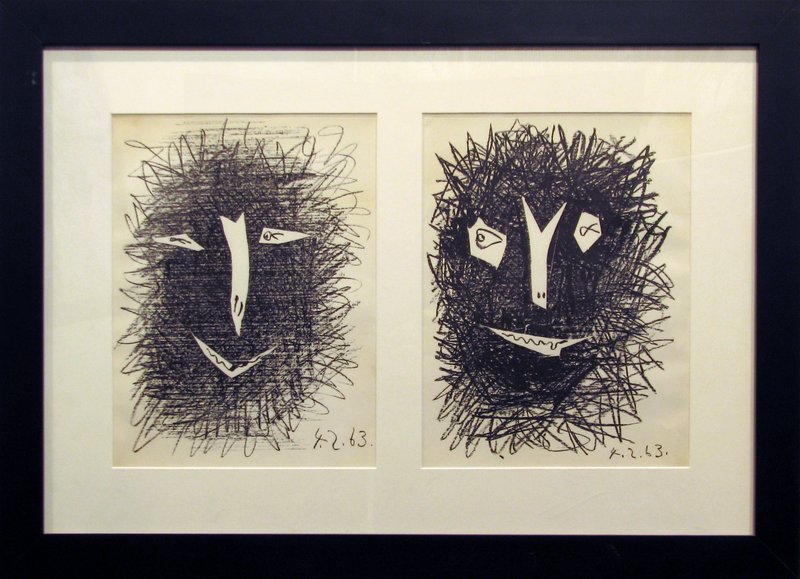 Pablo Picasso's Deux Masques (1963) is available on Artspace for $3,900
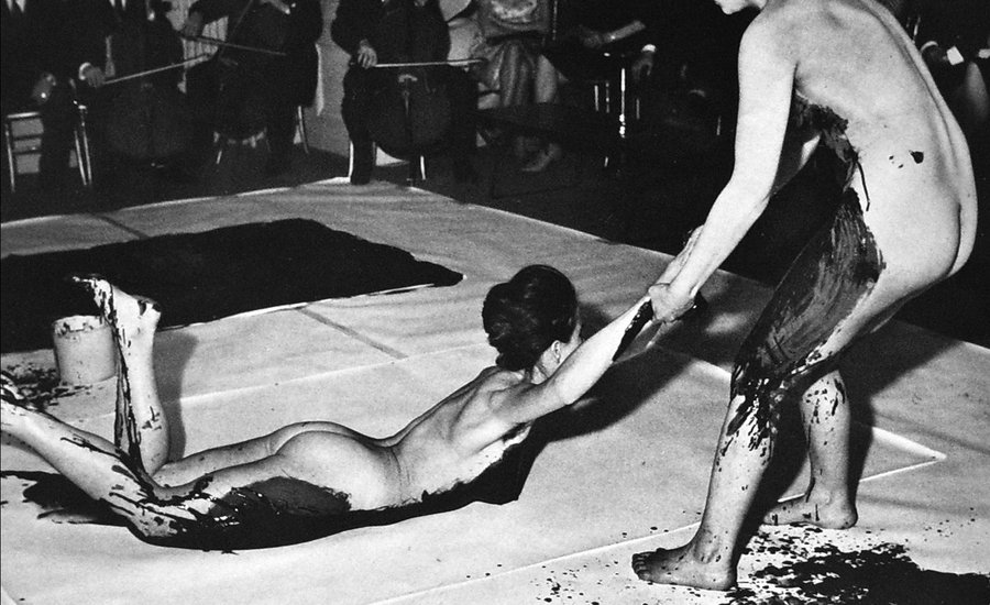
YVES KLEIN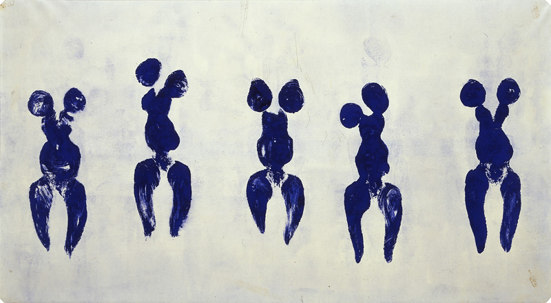 Yves Klein, Untitled Anthropometry (ANT 82), 1960
Few artists in history have been as closely linked to one specific color, or have made color so directly palpable in their art, than Yves Klein. Yet Klein called his blue monochromes "the leftovers from the creative process, the ashes." These emphatically physical objects—unmodulated, intensely saturated ultramarine fields of velvety pigment—were, for Klein, a conduit toward an idea about immaterial terrain, bridges into a great void. He called himself the painter of space.
In Klein's case, medium was crucial to message, and his medium is ultramarine blue both like and unlike the color that resonated through medieval and Renaissance art. Centuries later, the hue still held a tantalizing appeal and the power to shape a new, radical art. Ultramarine pigment was "incandescent" to Klein, but the raw pigment needs a binder to become paint, and when the powder is mixed with oils it darkens and dulls. Klein's challenge was to preserve the luminosity that he considered the magic of the color. One early strategy involved exhibiting troughs of pure, loose pigment on the floor, as a brilliant carpet of blue. Later, he worked with Edouard Adam, a Parisian color vendor who consulted with chemists at Rhone-Poulenc, to create a synthetic binder in which to suspend the pigment. The result was Rhodopas M60A, which could be thinned to various levels of viscosity with ethanol and ethyl acetate. This binder preserves the magical luminescence of the pigment by the way in which long chain molecules enfold the pigment, not smothering or "killing" the individual particles. The material, which is toxic and unforgiving, dries extremely quickly to a velvet finish, allowing no touch ups.
Klein commissioned his own customized synthetic paint using this new binder, which he patented as IKB (International Klein Blue); from 1957 onward he used this pigment almost exclusively. With IKB, Klein entered what he called his epoca blu, a transcendent vision of the boundlessness of space and dreams. He was inspired by the French philosopher Gaston Bachelard, whom he quoted: "First there is nothing, then a depth of nothingness, then a profundity of blue." Klein focused on one color at a time, unencumbered by color juxtapositions, and zealously avoided the interplay of color relations. His blue monochromes achieved a single vibrant expanse of color with infinite fathom but no center or hierarchy, and no form to sully the experience. Surfaces of dense, plush, powdery color possessed what Klein understood as pure energy: the paintings almost vibrate. Paint was applied with rollers, not brushes that would show strokes made by an individual hand. Later, Klein would say that brushes were too psychological: testaments to personal gesture. He demanded active viewer engagement, wanting each observer to be immersed, even impregnated, with color, experiencing and internalizing its effects. He wanted to convey to every spectator his view that color is a palpable character, a personality.
The Anthropométries, including ANT 82, provocatively combine theater and blue paint. The works were created in performance, with nude women playing the role of human brushes commanded by Klein. Some of the performances were accompanied by Klein's Monotone Symphony: twenty minutes of one continuous sound, "deprived" of beginning and end, and twenty minutes of silence. Under Klein's direction and before his eyes, the artworks took shape without his touch. He was conductor or director as much as painter, as the blue paint covering the women's bodies transferred to the canvas with no intervening brush, roller, or other artists' tool.
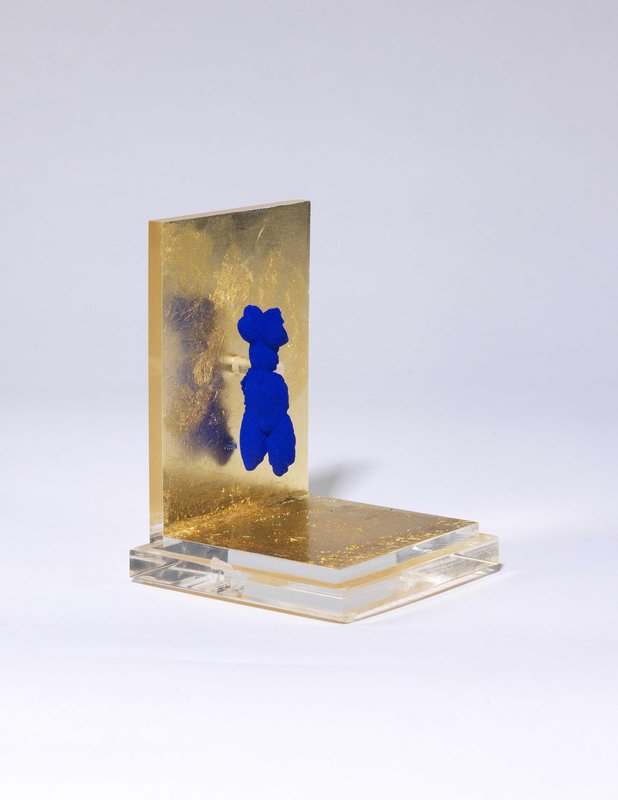 Yves Klein's Petite Vénus Bleue (1956–57) is available on Artspace for $9,500
[related-works-module]