


What makes graphic design good? For one thing, withstanding the test of time. Here, ten of the world's most foremost design practitioners and critics each select a design classic—a work that, years after its creation, continues to shape the way these leaders think about their craft—and explains why, in their opinion, it checks off all the boxes of "good" design. Published for the first time online, these excerpts were initially published in Phaidon 's 2008 definitive resource on contemporary graphic design, Area 2.
De Unie
by J.J.P. Oud
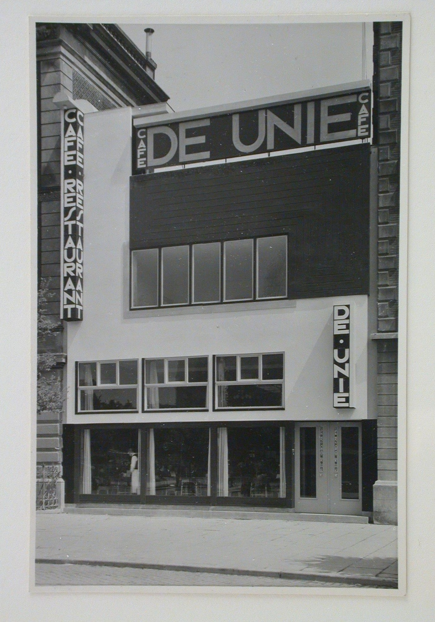
De Unie restaurant, built in Rotterdam in 1925, embodies my own attitude toward design. There is a joy of experimentation evident in this project—an expression of the time when the avant-garde was not yet governed by universal models or contrained by global visual uniformity.
De Unie tands out in its precision. It is marked by its relationship to its surroundings, by the harmony that it achieves between intention and reality, and by the freedom of its form. Above all, De Unie remains exceptional and unique, rather than a stock solution to be imitatable and reproduced.
The restaurant is remarkable in part because it was born out of the chaotic interdisciplinary exchanges that symbolized the arly-twentieth-century avant-garde movement. The paln for the Du Unie dealt simultaneously with questions of art, architecture, and design. This approach required the work of a unified team that refused to accomodate the weaker notions put forth by the kind of cautious and unimaginative strategists who try to regulate the visual world. With this process built into its design, De Unie is othing short of an ode to the steadfast individualism that is so often replaced by standardized, interchangeable, and frequently less interesting design.
– Ruedi Baur
Turks Fruit
by Jan Vermeulen
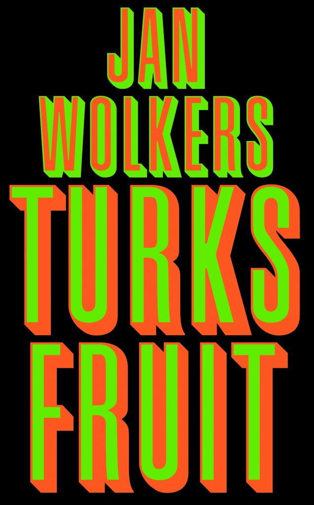
When I had to read literature in high school, I always chose books by Jan Wolkers. I didn’t know a thing about the author; I picked the books solely because of their covers.
In the 1960s new things were happening in art and pop culture, but book design was still dusty and old-fashioned. Jan Vermeulen’s covers for Wolkers, designed between 1961 and 1983, were revolutionary. They are all striking, but the cover for Turks Fruit , from 1969, is the most famous. It has heavy, condensed type in green and red with a drop shadow, centered on a black background. For me, though, it means much more. This cover marks by first acquantance with both graphic design and avant-garde literature. With its contrasting flourescent colors, a cover like this is hard to hide, and my parents were not amused that I was reading what they called a “vulgar” book.
Besides being a typographer, Jan Vermeulen was also a publisher, teacher, and poet. A true man of letters, he thoroughly understood the content of the books he designed and was able to translate that content into graphics. Wolkers’s success depended in large part of these expressive covers, and it’s not surprising that he had Vermeulen design all of his books.
– Irma Boom
Formosa
by Enzo Mari
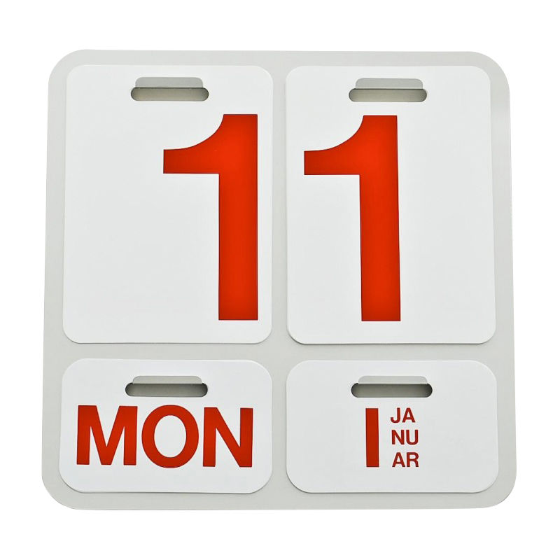
The Italian artist and designer Enzo Mari is known for his products and furniture. But like many of his contemporaries, such as Bruno Munari, Robin Day, and Charles and Ray Eames, he was also accomplished in related fields, particularly graphic design. Mari defined visual communication as “the elimination of the superfluous,” and he aimed at conveying a maximum amount of imformation with a minimum of elements.
His 1962 Formosa perpetual caldendar is both his best-known product and his best piece of graphic design. Where many graphic designers succumb to superfluous decoration, Mari is tied to objectivity and function, and this calendar is elegant in its economy. It is made of black anodized aluminum and white PVC cards lithographed with bright red Helvetica letters and numbers. Timless both in design and function, the PVC cards are endlessly configurable by the user, year after year.
When the Formosa was released, Mari participated in a group show of technical art in Milan. Umberto Eco called the work there “programmed art,” and this might be the perfect description of the Formosa: a piece of programmed art that functions only by engaging its user in a daily physical experience of the perpetual march of time.
– James Goggin
Nella nebbia di Milano
by Bruno Munari
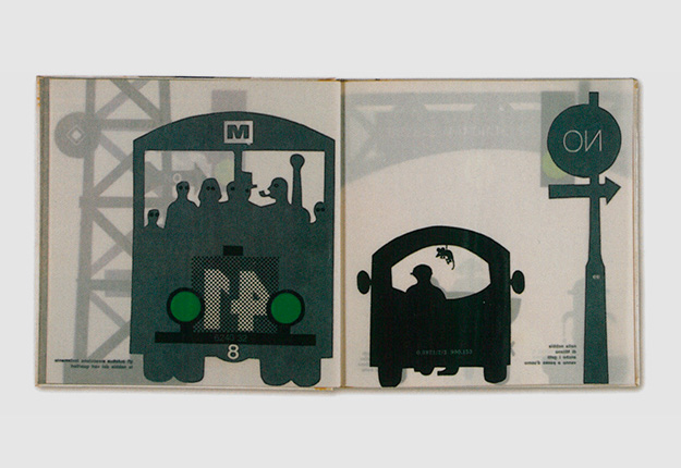
We all love using tracing paper to elevate type or imagery to a different level, to overlay one piece of information with another, or to collage two elements with a filter. In his book Nella nebbia di Milano , Bruno Munari uses the material in a unique way: as an illustrative element. The tracing paper itself becomes the medium—it is the “mist” in his story.
This intuitive idea communicates in a poetic way the short, magical journey through the misty streets of a city. In turning the pages of fragile tracing paper, the reader encounters black silhouettes of city traffic, signage, people, and a bird. The pages turn slowly, and we explore surprising little details and events in this calm setting. Step by step we approach the circus, as colors and lights become more and more apparent and the mist rises. On arrival, a very colorful, thicker paper stock juxtaposes with the previously calm setting and underlines the loud, joyful dynamic of the faster-paced performances in the circus. Abstract die-cut shapes change in meaning and link one level of information to the next. On the way home, tracing paper again sets the mood for a beautiful misty park at night. Silence—we hear only the night bird sing.
Munari’s choice of materials, drawings, and typography is spontaneous, light, unquetionable, natural, poetic, and sensational. Applause! – Julia Hasting
La lutte continue
by Jan van Toorn
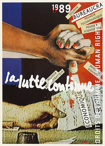
Born in Tiel, The Netherlands, in 1932, Jan van Toorn is a designer who mobilizes visual form in ways both personal and public. Through his roles as a practitioner, educator, writer, and design leader, he has sharpened the intelligence of our collective visual discourse.
In “La lutte continue” (The Flight Continues), his ideas converge. Published in 1989 to commemorate the bicentennial of the French Declaration of Human Rights, this poster employs diverse design strategies to convey both the universality and the particularity of human experience. Van Toorn mixes hand-drawn imagery with photographs textures by the video grain of mass media. Scaps of paper radiate like energy from the central handshake. The layers of type and image seem casual and thrown together at first glance, but this is an illusion. Each juxtaposition has been crafted to build the overall visual concept and political message of the piece.
Using cut-and-paste techniques and photochemical processes, van Toorn makes his own hand present in his work, not to assert his ego but to emphasize the manufactured character of human expression. Jan van Toorn will not let us forget that there is no neutral typography, no neutral media, and no neutral voice.
– Ellen Lupton
Mask
by Bradbury Thompson
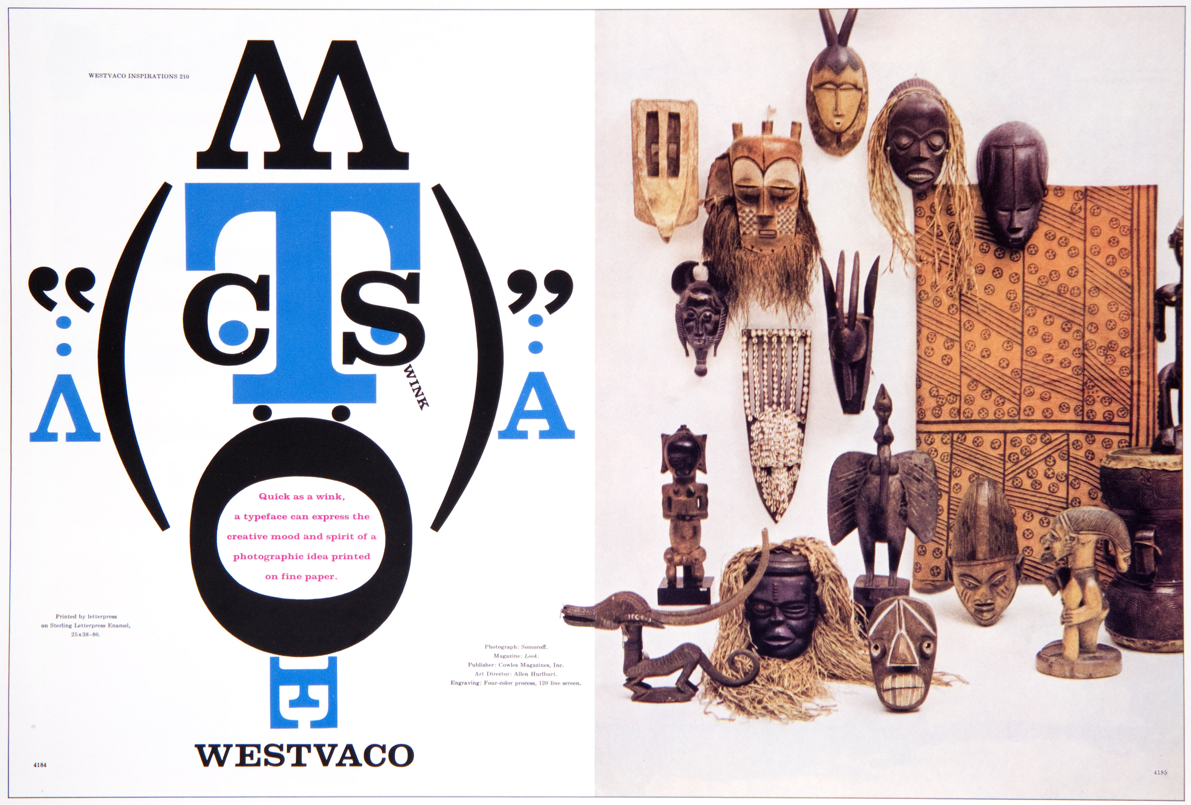
Bradbury Thompson taught graphic design at the Yale School of Art, where I got my MFA in 1985. I studied under such design luminaries as Paul Rand, Armin Hoffman, and Alvin Eisenman, but of all these great designers and teachers, Thompson made the greatest impact-not only on my own work, but on my life in general. Devoid of any ego whatsoever, Bradbury Thompson was the gental giant of graphic design—a true American original.
“Mask,” printed in Look magazine in 1958, was number 210 in the Westvaco “Inspiration” ad series. I can safely say that this is the pice that opened my eyes to the illustrative possibilities of type and led me to choose typography as my area of specialization. Thompson was a father figure to all his students, and so it is no surprise that the idea for this piece came from a drawing by his six-year-old daughter of a large face, with her first printed words in its mouth.
In 1984 my classmates and I bought autographed copies of Thompson’s Washburn College Bible (a limited-edition publication—fewer than four hundred copies were printed). I looked at it again the other day and shed a tear of joy. It dawned on me that I am indeed very fortunate to have studied under such a legend, and to own this masterpiece.
– Saki Mafundikwa
Posters
by Alexander Rodchenko
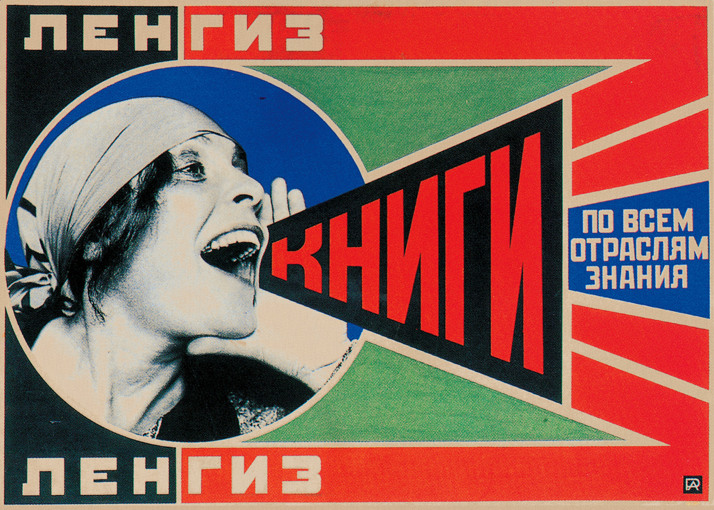
The story of my appreciation for Alexander Rodchenko is a very personal one. In 1982, while living in Italy, I saw a performance by the Swedish theater company Shahrazad. Full of vivid images and fast action, it told the story of the revolutionary Russian theater director Vsevolod Meyerhold and his fall from grace following Stalin’s rise to power. Many scenes in the play referred directly to Constructivist imagery, such as the shouting young woman on Rodchenko’s famous poster advertising “Lengiz- Books in All Branches of Knowledge.” Not only did I end up organizing the production’s tour of The Netherlands, but I was also alerted to a body of graphic work—and entire genre—about which I had known little up to then.
My favorite of Rodchenko’s posters is the one advertising rubber teats, probably because it’s so bizarre. The poet Vladimir Mayakovsky wrote the text: “Our pacifiers are the best. They remain so soft and flexible that you can keep sucking on them until you reach old age.” Rodchenko and Mayakovsky collaborated on dozens, maybe hundresds, of projects. They invented a new and director form of advertising for the young nation’s state-owned companies, creating agitprop posters and book covers. I often wondder if their passionate, over-the-top slogans were pure expressions of revolutionary enthusiasm, or if there was a hint of irony about them—and, if so, whether the proletariat go it. Curiously, this particular poster was priginally produced by hand, as a single copy, to be displayed in a shop window.
It wasn’t printed until 196 1 , after having been retored by Rodchenko’s daughter. Graphic design as we know it today can be traced back to a few specific places where it was first defined. Rodchenko’s work is certainly one of those places.
– Jan Middendorp
Is It In
by Peter Palombi
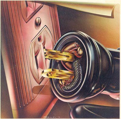
Airbrush art dominated the visual landscape of the 1970s America. Its high-sheen surfaces and curvaceous, oversexed formes reflected the coked-out, sexed-up ‘70s (and signaled the end of the genter ‘60s and that decade’s “big idea” design boom). The ‘70s were all image, all surface, all the time. No piece of design is more repreentative of the era than airbrush giant Peter Palombi’s cover for electric saxophonist Eddie Harris’s record Is It In .
The album’s title came out of a conversation the two men had about sex, and Palombi’s nervous question of his first partner, “Is it in?” Palombi, following the mode of easy metaphor often used in airbursh art (and commercial illustration in general), created the image of a plug being inserted into an electrical outlet, its mechanics drawn to look as organic as possible and its desination purposefully colored to resemble female genetalia. The plug and the outlet are hyperrealistic (as all airbrush art is), as if seen in a dream or on a cocaine binge. And so, in one fell swoop, Palombi combines the “electricity” of Harris’s music, the sex and sex appeal of a honking and crooning saxophone, and, of course, the visceral, stop-you-in-your-tracks power of a brilliantly perverse and meticulously rendered image.
– Dan Nadel
CHet Nederlandse affiche
by Wim Crouwel
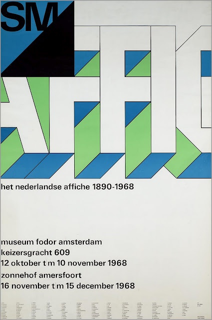
I sat and thought for weeks about what I could possibily write about Wim Crouwel that could have any impact on you in the context of the work shown here, or more rightly in the context of all he has done since graduationg from Academie Minerva in 1949. I scribbled note after note on his unwavering commitment to experimentation, typographic innovation, and research—that is, unti I reread his 1977 book Typography and realized that in my hope of summing up Crouwel was in vain. In it, Crouwel writes, “The designer, with his awareness of and appreciation for the contemporary cultural atmosphere, is inclined to use overstatement to emphasize his findings.”
It would not be an overstatement to recall Crouwel’s enourmous contributions or to speak about the nuances of his work, but the reality is that you have to take time to study it in the flesh, to engage with it, and to understand its context to truly appreciate its power. Crouwel has contributed as much to the world of design outside his Dutch borders as he has within them. His work is simply timeless—if not from the future—and it is for this reason that our generation of designers should be humbled and grateful.
– Brett Phillips
Akarui ankoku
by Tsunehisa Kimura
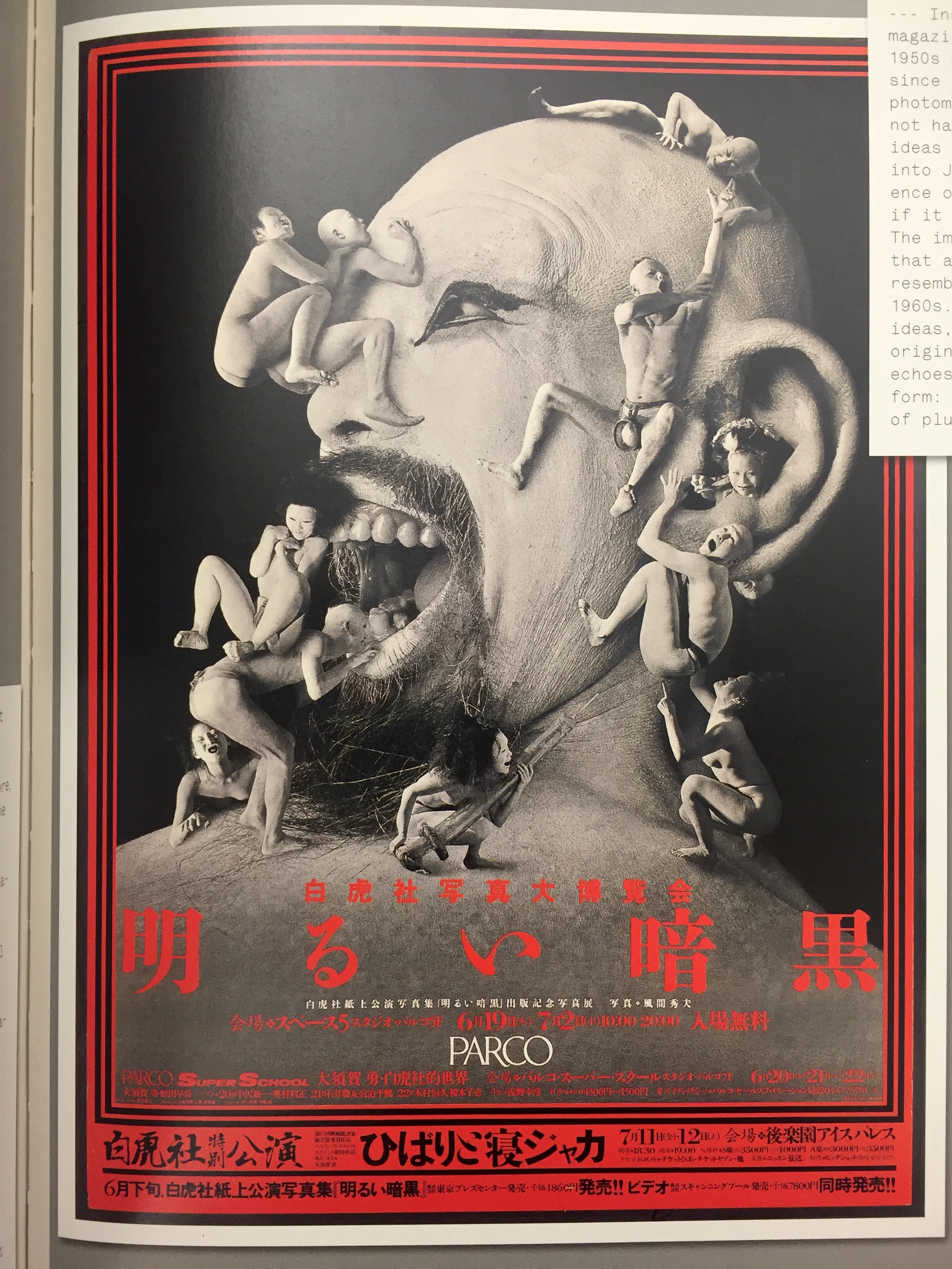
A man, laughing out loud, his face in profile and painted white, swarmed by dancers from Ankoku Butoh (the dance of Utter Darkness). No one needs a deeper explanation to appreciate this work, but it may come as a surprise tht it was created in 1985 using entirely analog techniques. Whereas Dadaists and Surrealists used photomontage as a tool for criticism, Tsunehisa Kimura’s work has a pure visual intensity that makes an imprint on the viewer’s mind as powerfully as any “real” image.
Inspired as a teenager by avant-garde design magazines, Kimura became a graphic designer in the 1950ss and has consistently worked in photomontage since the 1960s. He is the only master of Japanese photomontage in the postwar era, and though he may not have any direct successors, the techniques and ideas of photomontage itself have percolated down into Japanese digital culture.
Kimura’s influence on younger generations is undeniable, even if it takes place on a mostly subconscious level. The images of the collapse of urban civilization that are seen today in films and comics clearly resemble ideas that Kimura first expressed in the 1960s. But, like Japan’s appropriation of Kimura’s ideas, the practice of photomontage nullifies the original’s donimant position over its copies. This echoes what Kimura himself explained about the art form: It is an activity that asks for the approval of pluralism from monists.
– Keiichi Tanaami