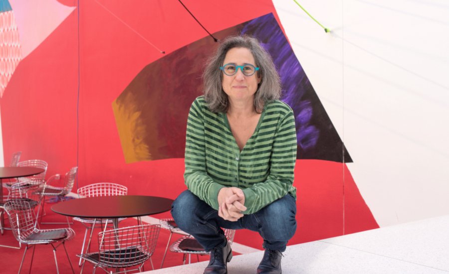
Recognized since the early 1990s as a pioneer of contemporary installation art, Jessica Stockholder uses a combination of paint, found objects, and architectural interventions. Her work erodes the boundaries between mediums, echoing color field painting and post-painterly abstraction even as they defy flatness. A contemporary legend with an extensive CV, she's currently in group shows at Chicago's Kavi Gupta and Detroit's Museum of Contemporary Art .
In this excerpt from Phaidon’s 1995 monograph Jessica Stockholder , the artist sits down with critic and novelist Lynne Tillman to discuss her intuitive process, the problem with reading too much into her work, and how her oeuvre is not about the nature of junk but more about the "architectural uncanny."
...
In Installation in My Father’s Backyard you hung a red mattress on the side of a barn—
Garage.
Garage, sorry. The garage wall, part of it is grey and there’s some blue. You’ve painted the grass and flowers, or shrubs, in front of that wall. It’s a real mattress?
It’s a double or queen-sized mattress spray painted with fluorescent paint—a little bit transparent so the markings of the mattress show through. There is a blue, or purple, cupboard door that’s mounted on top of the garage with a roll of chicken wire.
It’s compelling and weird for many different reasons.
Let’s hear.
 Jessica Stockholder,
Installation in My Father's Backyard
, 1983
Jessica Stockholder,
Installation in My Father's Backyard
, 1983
You make a mattress red which underscores sex and sexuality. Then you confound the built, the garage, with the object itself; and the ground is grass which you paint. You put something on the grass which makes it unnatural. That seems to have some reference to a family structure, to the idea that the family is considered a natural unit, though each unit is different—has its own color. But it has a basic structure we recognize; father, mother—or lack of—and children. Then your use of the blue on the roof and door are in relation, reflecting each other: blue grass, blue door. A door opens and shuts and could be an obstacle. Also an entrance or an exit. Many meanings. Then there’s wire, which is an aggressive element. If you landed on it, if it touched you it wouldn’t—
It would not feel good.
The piece is also deeply site specific.
I enjoy your reading but I can’t say whether I agree or disagree. The way I came to making this piece has none of that conscious information in it.
Tell me how you did it.
I found this mattress in the garage and painted it red as the complement to the grass. The backyard is more or less rectangular, so it’s similar in shape to the mattress and garage. The lawn is brought into a dialogue with the mattress, and with the history of painting, because paintings are rectangular too. Here I’m making a painting—only it’s also a backyard. The red of the mattress called to the color of the berries in the tree, heightening color that’s already there. I painted the grass with a hard-edged form, kind of rectangular so it has a formal relationship to the door, and to the mattress. I never know exactly why I choose materials. Your analysis makes sense, but part of my interest is to work with materials that are in some way randomly selected—to put them together so that they speak for me. I have some faith that I will be able to speak through what is at hand.
A mattress is so redolent. One couldn’t go to one’s father’s house, take a queen-size mattress out of the garage and hang it without having some awareness that it referred to a father-daughter relationship, the Oedipal, the family.
I can see why you might say that, but I don’t think about that stuff when I’m working. In order to avoid having my personal history, which drives the work, making the work cliché or diminished, I don’t spend a lot of time thinking about it. I think about the form that the work takes. I make sure that in the end the experience is right—that the work is active.
The formal elements are first what one’s conscious of: you’ve used two rectangles—all of that is there. But I think what makes the work have resonance is that the formal is logged into this narrative, through its metaphors…
I don’t mean to say that I’m not aware of the psychological. But I don’t feel as if I can control it or the narrative.
I don’t think one can—not control one’s being drawn to, driven to, taking up the material. Why one’s driven to tackle a particular formal problem—there are psychological issues involved that formal concerns don’t conceal.
And formal concerns are not interesting unless they carry this other information.
In some way, for me.
For me also.
It seems that you use two kinds of titles, one kind seems to refer more to narrative.
Narrative is something I’m trying to find a way to talk about now, though I’m not sure ‘narrative’ is the right word. There is a kind of building or layering of meaning that results from the literary content of the objects I use, but the structure is not linear. There is no beginning, middle or end. My aim is to throw the net as wide as possible, even while there are focused areas of literary meaning that develop here and there.
Some of your titles are long and specific, about the thing itself, about naming itself. For example, Yellow sponges, Plexiglas, small piece of furniture, newspaper maché, plastic, oil and acrylic paint, cloth, small blue light and fixture, glass on the wall, 1990. All the elements are named, yet the piece is not merely an aggregate of those elements. The pieces with the long titles are more, it seems to me, object oriented and can be taken in by standing in front of them. They seem to be more about painting, the limits and possibilities of painting.
The titles consisting of a long list of objects are titles by default. My intention was to leave these pieces untitled. I always request that there be no title—and that the word ‘untitled’ not be used. In many cases the list of materials is used instead of a title. People just can’t get their heads around the space being blank where they’re used to seeing a title. But I’m not unhappy about the conversation this has given rise to. When I do use titles, I often work with the words in a way that feels parallel to the way I work with objects. I like the title to work alongside the piece rather than lead you down a path.
My interpretation’s by default then, too, I guess. Some of the titles signal that the piece will be more narrative, about time and space, like The Lion, The Witch and the Wardrobe. That long ramp seems to be about space as well as about the time it might take to walk on it, if you were to walk on it.
Even walking alongside of it, that takes time.
Even if it’s immediate in the feeling, it also requires duration, which is about narrative, so that if you want the viewer to be physically in that space with that piece, the viewer must be active. To go from point A to point B.
And the process of going from point A to point B, there are places where the work becomes very ordered and static, as a painting is static and separate from you. In that process, the memory of one side, or one view, of the work informs the viewing of the next side. If I’m looking at something that’s red, and I know the other side of it is black, my memory of the black art functions in my forming of the composition, as if that black were visible. Do you understand?
I think so. It relates to issues about narrative and psychology. If black is in the memory, the unseen color in back of the memory, it’s present no matter if it’s in the past or if it’s visually present in the moment.
That your memory is equal to what you’re viewing in the present is fascinating.
…[Tillman and Stockholder are now at Stockholder’s studio in Williamsburg. The two are looking at photographs].
 Jessica Stockholder,
House Beautiful
, 1994
Jessica Stockholder,
House Beautiful
, 1994
These are photos of a piece I made in the spring (1994), House Beautiful. The white is the wall of the gallery; the work spans three rooms. The carpets are stretched with cables to the walls, floor and ceiling.
You couldn’t take one photograph of the piece?
No.
Craig Owens once said that the history of art was the history of slides of art. This piece would need at least two to represent it. I don’t know immediately where the work begins or ends, or if, in the photograph, it is right side up or upside down. It returns me to the place we left, or left off, last week. Even though you use brightly colored materials, which are often supposed to mean ‘happy,’ you very contradictorily propose to this happiness a discomforting sense of disorientation and dislocation. You’re not using the ramp in this one, but you are taking the viewer on an excursion. And there isn’t a single, unified form.
Spatially, this isn’t one of the most difficult pieces I’ve made. There is a green carpet on the floor; it is similar to the ground; you can walk over or along it. The rectangular volume of yarn is a literal volume of color; we know that the color goes right through; it’s not like a painted surface, or an object that has been painted. The yarn is a solid volume of color contrasted to the flat areas of color; we know the flat areas of color are flat skins of paint on top of the carpets but they have an illusion of volume. Color seems to project into the air in front of it. The fan which I painted green—like this green on the carpet—blows the air filled with color.
House Beautiful contains puns. Carpet/ground, a household fan/audience. Hanging the carpet so that it refers to background/foreground, craft, laundry. To women’s work and again to a stage set. Is it a Persian carpet?
It is a one hundred percent polypropylene Persian carpet. I used it because it was easily available and inexpensive. I would love to use real Persian carpets.
What would be the difference for you?
A real Persian carpet is a truly rich experience.
If it were a real Persian carpet, you’d be aware of that. You hang it now like laundry. Persian carpets are a form of art, people hang them on walls. If you had a real Persian carpet, it would have a different valance, wouldn’t it?
The other day Jay (Gorney) asked me, ‘if you had a lot of money, would you use expensive things instead of cheap things?’ We were talking about the fact that my work isn’t about junk. This is an issue because critics have often written about my work that way. It’s about things—some of them are junky, some of them are new and some of them are old.
Why isn’t it about junk? It’s not that I thought of it as junk. Why do you think people see it that way?
Because I take objects out of their normal context, and there’s a disheveled, jumbled quality to the way I use them. Things are jumbled when they are thrown out. Perhaps that’s how people arrive at that.
Is it because you take everyday, ordinary material, and then don’t use it in its expected way? In other words, because you make things no longer have their necessity, their function?
Perhaps that combines with the fact that the way in which I put things together doesn’t adhere to a standard craft. When I use wood and nails and glue, the craft doesn’t match the craft that one uses making cabinets. When I sew, the craft isn’t the same as when you put together a garment. The work isn’t about being well crafted, but the way the thing is made is important. Ways of making are meaningful—as significant as the meaning we attach to objects.
That’s different from the issue of junk. When John Chamberlain , in the sixties, took a car and crumpled it up, was it about junk or disaster?
People have discussed his work in terms of disaster and also more formally. In contrast to my work, his is formally very consistent; he lays out a formal language using one material. It’s easy to forget that he is using crushed cars and sees his work in terms of volume and shape. In my work the formal language is much more varied, and there is a question as to whether or not one should look at what the objects are. They are much more in your face than in his work. I don’t think he invites you to think very much about cars.
If those carpets had been ancient Persian carpets, would you have done the same thing? Ancient Persian carpets are valuable in and of themselves.
They have two kinds of value, a value in terms of the pleasure they give and a monetary value. If I were to use them instead of polypropylene we would be very aware of how I had taken away their previous value. This brings up all kinds of questions that I haven’t had to deal with.
Hard questions, whether one would take something rare and ruin it—but you’re not doing that.
I feel curious about what you said a while back about the colors all being upbeat and happy in contrast to this structure that leaves you in a place of discomfort.
That’s one of the most peculiar aspects of your work—you construct a controlled situation that recreates the discomfort of being disoriented within and by the familiar stuff of our lives.
I’ve been reading Anthony Vidler’s book on the architectural uncanny; I think that is what he would call uncanny, to take these familiar objects and make something unfamiliar with them.
‘Uncanny,’ from unheimlich, ‘unhomed by’—great word. One could also say your work is about de-familiarizing ordinary objects or feeling unfamiliar in familiar circumstances. I don’t see junk in relation to your work. The word ‘junket,’ going on a junket, comes up. Or junking certain notions about familiar objects, loosening them from the familiar grip. Many of your materials are ‘traditional’ women’s materials: cloth, bright colors, wool. You use objects from a domestic space, couches, for example.
Things from a domestic space are associated with women, that’s perfectly standard but it’s a little odd. Men inhabit domestic spaces too.
Too often the divide is women/domestic or private space, men/public space. Your work isn’t traditional ‘women’s work’; but you take risks by using what some might consider benighted materials—junk to some, maybe because it’s from the home. You do it in such an aggressive, peculiar, uncanny way, it’s not about protecting the home or simply valorizing that space. It allows the domestic other interpretations. Your use of ramps, rooms, carpets, raised floors—things spill over and out. It’s not a contained or containable world. In your play with the domestic, the so-called private sphere is always either threatened by or merging with the public, and the distinctions between public and private are blurred.
And between femininity and masculinity.
When one walks into House Beautiful , will she or he feel that the carpet is masking or covering anything?
No, since what you first see as you enter the room is the structure around which the carpet is wrapped. There’s nothing hidden. There are many things or actions that build on each other and inform each other, but I don’t like to create mystery about what is actually there.
It seems to say that something doesn’t have to be hidden or covered in order for it not be apprehended. This work is hard to apprehend: it builds, it moves, you have to walk with it, there are many elements. How do you apprehend this? It’s not that you’re hiding anything, not that a mystery is something hidden, but a complexity that can’t be understood even when seen. The turquoise—what did you think when you were doing that? Is that paint?
Yes. Why do you ask?
It’s like a swimming pool. It suggests many allusions, from Narcissus, to ideas about thought, art, and reflection—the green chandelier in it is a light, after all—to an art reference, David Hockney’s swimming pool.
Hockney’s pools.
The turquoise appears to be an exit, a moment of escape.
It’s more abstract, lighter than anything else.
Your work’s often concerned with exits and entrances, giving the viewer a number of them. It’s a relief here in several senses—a rectangular relief that’s on the floor, a painting on the floor, a relief from the piece and its insistence to move on. One can stop at the turquoise. Would you call it a moment?
A pause.
A pause that refreshes. Why did you title it House Beautiful?
House Beautiful the magazine is about controlling the structure and surface quality of one’s environment. The work is about that too, but from a very different point of view. The materials I use here could be from a house—in a sort of turned upside-down manner. The title refers to taste and structure.
It also challenges the idea of taste.
I think about taste a lot. House Beautiful the magazine reinforces and puffs up the notion of good taste, as if there’s a right way to do it. My work opens that up to question and proposes that there is no right way to do it, that there’s a lot of meaning apparent in the decisions that people make.
[related-works-module]