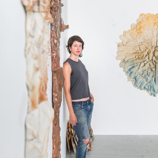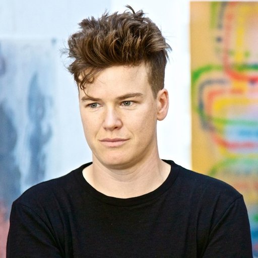
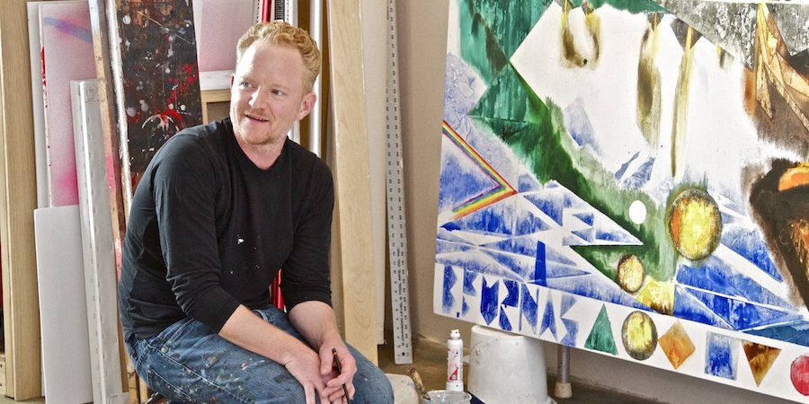
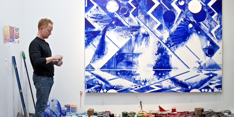
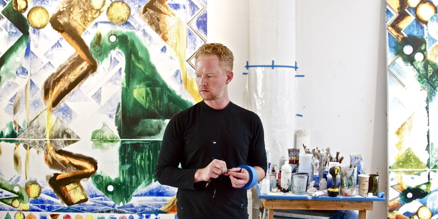
Walking into Barnaby Furnas’s studio in Chelsea, you’re enveloped in calming blues and greens—a peculiar sensation, given that Furnas is known for his liberal use of red. This, after all, is the artist known for his blood-spattered Civil War battle scenes and tidal waves of poured crimson paint.
“I’ve found this other color to explore,” he says, pointing to a painting with gentle, powdery scatterings of ultramarine blue. Behind him are two large semi-abstract compositions in various shades of green, with yellow and white bubbles floating across angular mountain ranges. All of these works are destined for his latest show with Marianne Boesky, the dealer who signed him back in 2002 when he was finishing his M.F.A. at Columbia.
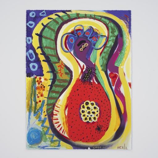
Titled “First Morning,” the exhibition (through October 10) sets the clock back to “the first morning on Earth or the first American landscape” (as the press release puts it). It strikes an unmistakably pre-lapsarian tone, building on the Genesis themes of Furnas’s 2013 show at Victoria Miro in London. Its innocence also comes from child’s play: Furnas’s rediscovery of the vinyl sticker kits known as Colorforms, via his 5-year-old son. At the same time, there are unmistakable traces of conflict and aggression, seen in a Cubo-Futurist fracturing of the picture plane, an explosive splatter effect, and, underneath it all, a rough, corrugated texture.
As he put the finishing touches on the paintings for the show, Furnas spoke to Artspace deputy editor Karen Rosenberg about moving away from red and carrying the intensity of the violent melée forward into the placid nature scene.
 All photographs: Simon Courchel for Artspace
How did you get into landscape painting? For a long time now, you’ve been focused on battles, rock concerts, Biblical “Floods,” and other scenes of violence and spectacle that have more to do with history painting.
I’ve wanted to make landscape paintings for years, but I couldn’t figure out how to do it. Then my son, who’s five now, got this set of Colorforms—vinyl stickers, from the 1950s, that come in different colored squares and triangles. To make a house, you take a square and put a triangle on top, and voila. I love that—it’s this very clean and efficient way to get from pure form to something with some sort of narrative overlay.
How did you translate that playful Colorform approach to picture-making into painting?
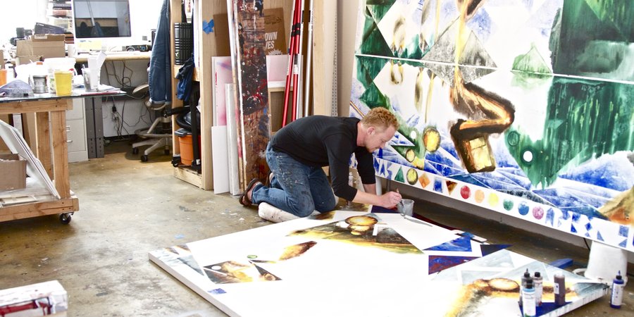
I started building these pictures out of building blocks—I’ve got these plastic shapes that I cut into geometric shapes. The paintings are made flat, on the ground. I’ve always worked flat, my whole career, ever since watercolor. They’re almost not paintings, in a way—they’re like monotypes. What I do is put a puddle down and drop the plastic shape into it and the puddle instantly conforms to the shape. It’s this elaborate use of Colorform logic.
It’s like high school science class, when you'd work with the microscopes and you’d make these little slides with the glass and the liquid. The images and cells are very crude, but they’re built with all of these accidental universes—the plastic restricts the drying of the paint, so you end up with all of this microscopic detail. I like the idea that you can make a picture out of very simple shapes, but within each shape it could be this very complicated universe.

It sounds like you’re playing with some of the chance processes beloved by Surrealists.
It’s this very natural, basic human impulse, looking at something and seeing something in it. I’ve been doing that my whole career, making some sort of mess and staring at it until it becomes something else.
These works are a big departure for you, in many ways—in addition to focusing on the landscape, you’re moving away from narrative. These aren’t history paintings.
That’s why I haven’t been able to figure out how to do landscape for so long. I’ve loved how static painting is, so my paintings have always been about things that are really flying around—it just makes the paintings more still.
For years I’ve wondered, how do I get rid of the burden of having to tell a story? When does a Civil War painting stop being a Civil War painting and start being just a formal experience?

So how did you finally shake off that burden?
Conceptually, these are sort of battle paintings. Everything is in conflict. I’m getting a lot of ideas from my son right now—he and I have been drawing landscapes. I’ll draw the sun, and he’ll draw the moon, and the moon will attack the sun.
Once I figured that out, it opened up a new approach to landscape—there are all these forces at work, clashing or harmonizing. It’s a battle—it’s just a different time sequence, an epic battle that takes place over eons. These are maybe the first landscapes, just coming into being, and they’re jostling for place. That’s how I was able to not have a central story—I opened it up to a much bigger story.

You mean that there’s some kind of personification at work, that the abstract shapes that make up the landscape are acting as figures in combat?
There are no figures, but there are these emerging prehistoric suggestions of things in the trees and in the green Pac-Man shapes that are coming out—very elemental life shapes. It’s been fun to just let those come out and try to figure out how far to take them.
Overall, the pictures themselves start to look like faces. The picture is looking back out at itself. I was in the Alps a couple of years ago on a windless day in the summer; there were lakes with no ripples, and I liked the idea of a landscape that reflects itself—that’s looking at itself.
You’re also moving away from red, in all but one of the new paintings. There are greens and browns and other typical landscape colors, and even a couple of monochromatic works in blue.
I’ve really spent a lot of time with that color. Recently I found this ultramarine blue, this incredibly deep, rich blue. It’s a highly synthetic blue—it’s not found that easily in nature. The red is such an urgent color; the blue is more tranquil. It’s a new emotional palette, one that feels much more appropriate to my life.

You’ve talked before about the importance of the physical properties of the pigments, for instance how red pigment explodes when it hits water. What are the unique properties of blue, and how are you harnessing them?
Red is very aggressive. This blue is very heavy. When it’s subjected to these puddling effects that I do, it drops below the water. The water tends to run off and you get all this detail, every little speck. The pigment doesn’t fully dissolve, and you end up with this granular dust. It’s very important that these paintings are made flat—there’s something really cool about the paint just settling to the bottom, like sediment.
Probably the biggest difference from my previous work is that the surfaces of these canvases are ridged, like corduroy. That catches things, and the puddles spread out along that line. It’s adding a kind of force that’s under the picture but dictates what it can look like. The triangles are a way of containing that spread.

You’re still controlling the flow of paint and pigments, as you did with the pours of red in your epic “Flood” paintings.
There’s usually an agreement as to what I can control and what I can’t. I like to figure out what something is, as opposed to what something should be. By subjecting the painting to all these fluid dynamics, it takes what it’s supposed to be off the table. If I had more control, I would just systematically crush the life out of everything!
It’s like I’m sitting there watching water carve out riverways through swaths of paint. There’s a kind of realism there—something is really happening. Just being in that moment, passively watching something make itself, seems to be at the heart of my art-making. It’s what I like about art, this sort of watching.
I grew up Quaker, which has a strong mystical component to it, and there’s something about the Quaker passivism and silence—I’d go to a meeting and be like, "What am I supposed to do during an hour of silence," and my dad would tell me to study something in the room. But there was nothing in the room. I think my paintings are seen as quite aggressive—they’re very intense. It has something to do with being put in a passive position, visually.

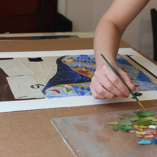
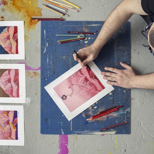
Can you tell me more about your process? It looks like you do some of your painting on the wall and some on the floor.
You make the mess on the floor and then pick it up and look at it, and hopefully you see something in it that you can help to become an image. The wall is just used for editing, really—you paint out what you don’t like, put it down again, and make another mess.
So these landscapes really come out of the studio, out of the back-and-forth of your painting process, as opposed to being rooted in the natural world.
I could see Charles Burchfield liking a tree because it fit the way he likes his brushstrokes to fit together. That feels like the things I like to do.
I heard this rumor about Burchfield—it might be a myth, but it’s been so important to me over the years. When he was working he would keep his elbows locked into a certain place, so his range of motion was cut down, and you can actually see where his arms and hands would be in order to make a full picture. I’ve always loved that idea, that he would map himself in there.

The press release for your current show mentions Burchfield as a strong influence, and also Cézanne. Those are two very different points of reference—American and European, visionary and rational. What are you taking from them, respectively?
Those Cézanne pictures, you can measure them off. These are all based on this diagonal grid—the shapes plot pretty well. With Burchfield, it’s this more mystical view of nature. Also, his pictures vibrate—they have a kind of movement to them.
Are there other important influences, besides those two?
I’ve also been looking at Constable—his landscapes are these batty maelstroms of everything. And just this year we had the Matisse cutout show [at MoMA], which was the best use of negative space I’ve ever seen. The white has been the real secret to my new paintings; the more white, the more raw canvas, the more they pop.

Speaking of white, a prominent feature of these new paintings is the white strip at the bottom of the canvas. It’s filled with geometric shapes in different colors, and looks like a kind of toolbar.
Originally I was thinking that the bottom bar was like the strip on a Polaroid, or a margin where you could make notes. But it could also be a kind of toolbar. My pictures have always had this preoccupation with time—you can see I’ve been keeping my paints lined up along the wall of my studio. I will pick up a paint and use it and then put the color on the bottom, as a way of marking my way through the picture. It’s like a key or color chart.
The further my paintings get from some sort of representation, the more there are things operating within them that are photo-based—devices that have a lot to do with photographic representation. I think that’s where the toolbar came from—it’s a way of anchoring these pictures in something real.

Were you thinking about the digital platforms that come between us and the landscape—about Instagram, as well as Polaroid?
I hate paintings that are about technology—but it’s in there, without it being what the painting’s about. When deciding on things like scale and texture, thinking about all the scenes I’ve looked at on screens was important. Texture and scale—that’s what’s left that still can’t be disseminated online.
Going back to the toolbar idea, have you used any digital art-making programs?
Photoshop was huge—that whole idea of levels was powerful. But the problem with all the technological mediums is that they don’t slip—you get what you are looking for. When you do something to a canvas with your hand or a utensil, part of it won’t be intentional. It’s very hard to program that into these digital systems.
I still think the idea of the person alone in an empty room in silence, trying to make a picture, is still a pretty good way to approach life and work.