Influenced by Clement Greenberg's theory of picture-plane flatness, and with an innate desire to reduce the medium of painting to its basic attributes, the Robert Ryman sought to do away with pictorial illusionism all together. His white-on-white paintings are minimal to the nth degree; from far away, in fact, they look invisible on a gallery wall. To Ryman, the canvas' neutral color and content allowed the viewer to appreciate the visual qualities of the brush stroke, the depth of the paint, the light that reflects it, and so forth. In this excerpt from Phaidon's brand new monograph Robert Ryman, historian Vittorio Colaizzi traces how seeing the work of Mark Rothko, at age 22, forever changed Ryman's outlook on art—and influenced the series that would later make Ryman an art-world legend.
* * *
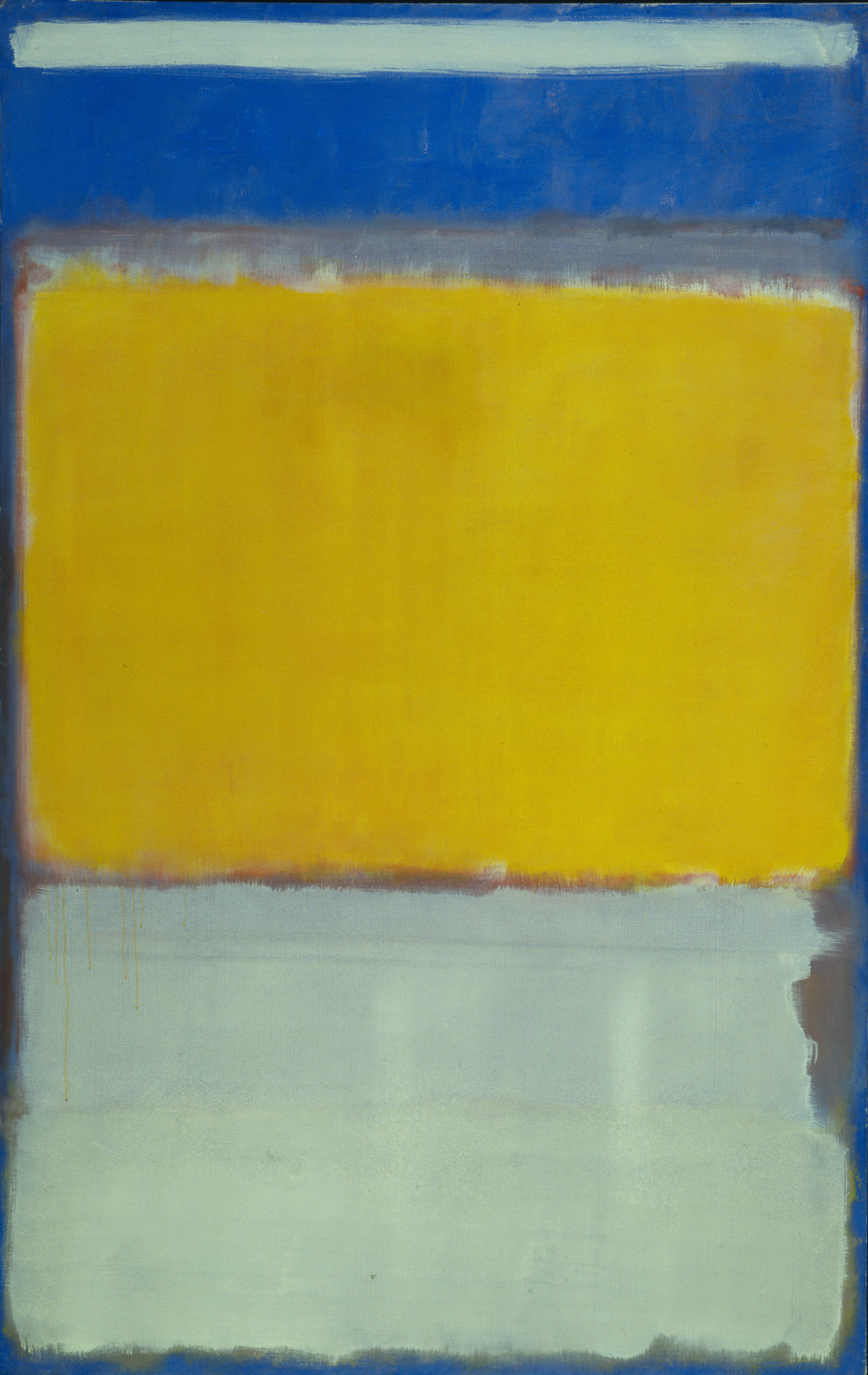 Mark Rothko, No. 10, 1950
“Wow, what is this? I don’t know what’s going on, but I like it.”
These were Robert Ryman’s thoughts in 1952 when he found himself standing before Mark Rothko’s No. 10 (1950). This was before he began his job as a guard at MoMA and while he was still, in his own words, a “tourist.” Decades later, he told Robert Storr that “Rothko was different in that his painting was not abstracted from anything representational. This was very different from what I had been looking at…His work wasn’t like a picture—like the usual pictures I had seen. That was a revelation.” This “revelation” of the possibility of painting as an obdurate presence right there in the room with the viewer, possessing the quality of complete visibility, or “nakedness,” was for Ryman a visceral feeling that conditioned his assessment of other artists in MoMA’s collection and beyond. Rothko’s ongoing impact has been due not only to his works’ configuration and format, but also to painterly technique. Looking at “what they were doing with the paint, how they worked with it,” Ryman found in Rothko a model of a painting’s capacity to exert a “realist” pressure outward upon its surrounding space, as well as within itself.
No. 10 seemed free of the illusionistic space that, for Ryman, constitutes abstraction, a term he finds inappropriate to his own work: “I don’t like this word abstract…but I use it because people…have an idea what I’m talking about.” His “revelation” before the Rothko was twofold: first, that the subtle but tenacious referentiality that he saw in abstraction could be superseded, and second, that the way to do it was to claim an existence for the painting in real space. Ryman elides these two aspects in his description:
"It projected a different experience. Looking back on it, most of the other painters…had some kind of recognizable image. This painting of Rothko’s was not like that. Here was something that was so naked, in a sense. The deep edges of the painting went back toward the wall, and the paint went around the side. You could see the staples, it was so open."
The richness of Rothko’s color was less of a concern. He explained to Storr: “It wasn’t the color that I was concerned with but the basic approach he was using,” and elaborated to curator and art critic Jeffrey Weiss that it was “not so much the color, or even the style of the painting…but the way it projected off of the wall…Actually my painting was very different, my approach was different. But that didn’t matter. It was just the presence of his paintings, and the way they worked with the light.” Here Ryman separates No. 10’s saturated color and soft rectangles (its “style”) from what he calls its “basic approach,” i.e., a palpable assertiveness that emanated from it. However, the color and style of a Rothko cannot be entirely isolated from its apparent “nakedness.”
Ryman withheld the same level of praise for other abstract painters, particularly Barnett Newman, who, as far as Ryman was concerned, did not achieve the same strict nonrepresentation. No other painter successfully united interior configuration and exterior construction into a convincingly present whole, a whole that is consistently driven by the hand. Rothko’s work is simply more painterly than that of Newman, Ad Reinhardt, or Piet Mondrian. The particulars of Rothko’s facture are as much a part of the “basic approach” as the color and configuration. Ryman reports that the painting “looks easy…as if it just happened.” A close look at Rothko’s surface will reveal that this “ease” is not a magical materialization, but rather a sequence of deliberate if anxious gestures. Because Rothko is sometimes classified in the Color Field branch of Abstract Expressionism, and because of the inherent loss in photographic reproduction, his work may be imagined as consisting of ethereal zones of color in which traces of the hand are minimized. Critic Lawrence Alloway endeavored to correct this idea:
"[Rothko’s] touch is unexpectedly abrupt; the majority of his works reveal a harder and sharper surface than I expected. Pentimenti abound; the pressures and directions of the hand are visible in dabs, trickles, and streaky patches. The wholeness of the image and the largeness of the color areas hold all these separate marks together, but they are, nonetheless, highly visible—often as curt and impatient decisions."
 Mark Rothko, No. 3/No. 13 (detail), 1949
No. 10 is richly endowed with this abruptness. Set within a narrow border of fluctuating blues that extend around to the sides, a large yellow-orange rectangle sits atop a silvery white one, which is subdivided into two horizontal zones, the lower slightly warmer than the upper. Above these two major forms are three narrower bands: first a dirty lavender, which seems a remnant of an earlier state, next a saturated blue, which is continuous with an exterior framing band, and finally a pale blue, which has been brushed across the top and left untouched. The surface is marked with pinpoint spatters, as well as light pink and deep purple underlayers that poke through the scrubbed pigment. On the left side, long rivulets dip down from the yellow zone into the white. Jagged white trails protrude from behind the yellow at the top, indicating a stiffly rendered previous layer. Stark remnants of the bristles’ activity are visible at the perimeters of most of the areas, but especially in the white, whose upper right is indented because of an incomplete horizontal stroke, coincidentally suggesting Ryman’s work of the mid-1960s. Rothko’s loose manner here suggests that the forms were not preordained, having only to be executed, but came about through the process of painting. No. 10 is among the early manifestations of Rothko’s classic style, coming on the heels of his “Multiform” paintings of the late 1940s. It is not the first, and certainly he was aware of his tendency toward large shapes at this time, but the specific forms are still dependent on the errant activity of the brush. This painting is a discovery; Rothko did not simply paint a Rothko.
Because of Ryman’s own rigorous attention to detail, his claim that the painting looks “easy” cannot be due to a misconception of a floating mirage of the kind that Alloway refuted. Instead, it is an acknowledgment of the frankness with which Rothko moved his brush in free but purposeful play. Sequential examples over time show how Rothko achieved his mature style on a technical level by blurring the Surrealist automatism that was useful but not quite sufficient to him and other burgeoning Abstract Expressionists. Throughout the 1940s, Rothko’s oils and watercolors of floating protozoan elements became less linear, a change that stemmed from the impetus to enact, and not only to picture, his ambitious content. As he wrote in 1947, his desire to express the “transcendental realm” was frustrated by the “finite associations” of specific pictorial images. He further lamented the stasis that seemed tragically fundamental to painting:
"The solitary figure could not raise its limbs in a single gesture that might indicate its concern with the fact of mortality and an insatiable appetite for ubiquitous experience in the face of this fact…I do not believe there was ever a question of being abstract or representational. It is really a matter of ending this silence and solitude, of breathing and stretching one’s arms again."
Representation’s immobility and insulation had to give way to a more immediate experience of “breathing and stretching,” which found its voice in an increasingly generalized painting act. The inadequacy of the depicted subject (his rigid subways and cold interiors) apparently extended to form itself, no matter how abstract, as if any borders obstructed the universality of his statement. In certain works of the mid-1940s, entities are defined by single brush strokes, but only by allowing the brush free play within areas whose boundaries became diffuse could he satisfactorily attain his goal. In both the above statement and in his work itself, Rothko transfers this appetite for experience from the pictured figure to the real figure; first the painter himself, painting out and over pictorial delineation, and later the viewer, who can stretch and breathe in the resulting spacious color.
Rothko’s own famous denial of the primacy of color in the interest of avoiding what he saw as trivial and decadent sensuality caused him to quip, “Since there is no line, what is there left to paint with?” The missing term of this equation, between color and line, is paint: the substance whose form is always visibly conditioned by the hand. Unlike Ryman, Rothko never divorced paint from color in the interest of pure facture, but his careful stipulation to the collector Duncan Phillips—“not color, but measures,”—makes it apparent that he saw colored paint as the medium of these “measures.” Color becomes the expedient, and paint the vehicle, through which these intuitively measured zones declare themselves in relation to one another and to the totality of the plane.
In Ryman’s Mayco (1966), the viewer can envision and perhaps “feel” the monumental stroke as it stretches across the canvas. Painted fourteen years after Ryman’s first encounter with Rothko, this painting seems to picture long white rectangles in a Rothkoesque stack. In 1993 Storr wrote that the “wide, waxing lozenges” of Mayco are “clearly informed by Ryman’s study of Rothko.” The truth of this statement lies less in morphology—the lozenges—and more in Storr’s perception of their self-generating movement—the waxing. They are not—or not only—forms in the conventional sense, but indices of the application of paint.
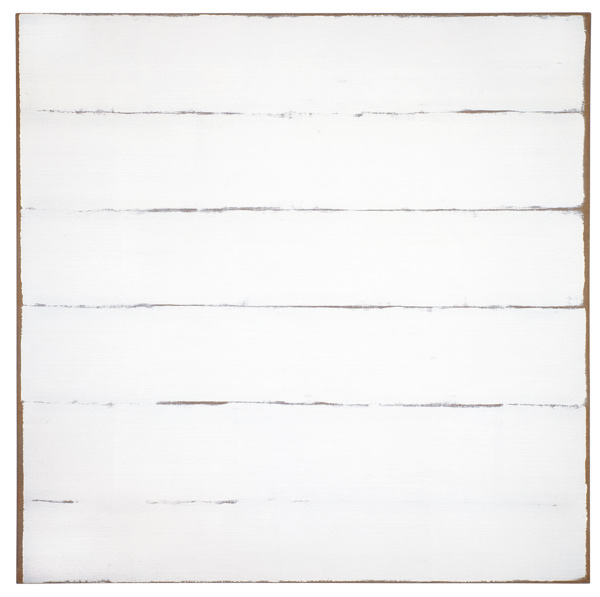
Phyllis Tuchman asked if the Delta series (whose process and format Mayco anticipated) was based on an “appreciation” of Rothko, to which Ryman answered: “No. That came about because I used a very wide brush, 12 inches. I got it specially—I went to a brush manufacturer and they had this very big brush. I wanted to pull the paint across this quite large surface, 9 feet square, with this big brush." As is often the case, he denies occupying a position or exploring a theme in favor of the nuts-and-bolts of making. This making is not only an exploitation of a new tool (the large brush), but an explicit prioritization of the act over a pre-planned design.
While a row of horizontal strokes was indeed pre-ideated as the mode of these paintings, it was chosen in the wake of the countless small strokes with which he had been covering canvases for the preceding several years, precisely in order to explore the bristles’ release of pigment. The Delta series’ configuration of massive horizontal strokes comprises a magnification and distillation of the smaller multidirectional strokes. Part of this is owed to Ryman’s understanding of Rothko, but not in terms of an imitation of his signature image. Rather, it is the direct and unrepentant painting-act, whose linearity locates itself in the same imminent present where Ryman found himself in 1952 as he stood facing No. 10.
 Robert Ryman, Mayco, 1966
Just as Ryman always prefers pervasive daylight and spare installation so Rothko labored to control the nature of the experience he proffered, favoring dim lights and close proximity between viewer and painting. In 1951 he explained that he painted large because “to paint a small picture is to place yourself outside your experience, to look upon an experience as a stereopticon view or with a reducing glass. However you paint the larger picture, you are in it. It isn’t something you command.”
But Ryman apparently had no problem commanding No. 10. Questioned about its scale, he mused, “No, that wasn’t a factor at all. I didn’t think much of that,” focusing instead on its physicality and reticent configuration. Or maybe he just didn’t think it was that big; No. 10 is relatively modest in comparison with later works. It might be more accurate, therefore, to say that he grasped its scale as a bodily scale, apprehending it as a physical thing with which he shared a space. This feeling can only have intensified after hours of standing at MoMA, as the mental decorum of pictorial looking melted away through sheer familiarity, and Rothko’s painting became not only an object, but an object against the wall. Of all the paintings on view, Rothko’s would surely put up the least resistance to this perceptual shift. The large, rectangular forms’ reiteration of the expanse of the wall, one might even say their flatness, suggested to Ryman a perpetual attention to its situation as wall-bound, and the intensification of the aesthetic experience based on this awareness.
The painted edges, in Ryman’s estimation, did not disconnect the frontal plane from the wall and initiate an unreal levitation, but connected it more firmly to quotidian space by denuding the conditions of its display. Ryman refused the absorption suggested by Rothko’s scale and insisted on recognizing the limits of the painting as integral to it. He has subsequently stressed and manipulated these limits in his own work. With the often metallic devices that emerged in the 1970s and continued into the 1980s and beyond, the physical frontiers of each painting do not signal the end of the aesthetic, but act as avenues of its extension into the room. For example, the aluminum bands at the top and bottom of Post (1981) bear rows of screws that echo the rhythm of the multiple brush strokes, while emphatically grounding the panel in physical space. Another vivid demonstration of this principle occurs in Essex (1968), a delicately painted sheet of heavy linen whose yellow border is repainted on the wall for each installation. The color of this vibrant “frame,” still distantly signifying its associations of sunlight and flesh, exchanges (or perhaps juggles) its pedigreed immateriality with the blunt fact of its paintedness.
In seeking to create experiences instead of pictures, both painters seem to believe that content can inhere directly in the facts of their work or, to dispense with spatial metaphor, that the qualities are the meaning. Although Rothko worked his way through literary and philosophical routes, he cautioned that “geometry” and “history” were among the “obstacles between the painter and the idea, and between the idea and the observer,” and ultimately hoped that his final message, that of the viewer’s confrontation with finiteness, would come about wordlessly, through the physical encounter. The same thing happens with Ryman; his paintings, when attended to, affirm the viewer’s fragile and temporary cohabitation of the space of encounter, partially because their essential irreproducibility intimates future absence.