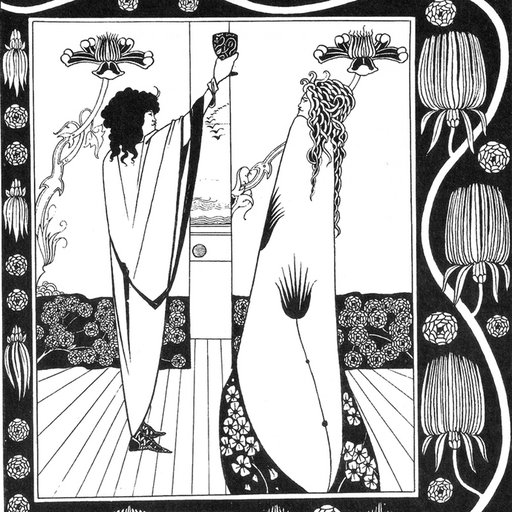
In Phaidon's groundbreaking highly visual book Beauty , world-renowned designers Stefan Sagmeister and Jessica Walsh set out on a mission: to find out what beauty is, and the many ways that it impacts our lives. They turn to philosophy, history, and science to understand why we are drawn to beauty and how it influences the way we feel and behave. Read an excerpted chapter that uses surveys and science to show how beauty might actually not be in the eye of the beholder, and browse a selection of pieces that author Stefan Sagmeister carefully chose from Artspace's collection to illustrate the highest standards of beauty in art. )
 Beauty
is available on Artspace for $39
Beauty
is available on Artspace for $39
The most damning argument against beauty as a goal is the notion that it lies in the eye of the beholder. If everyone uses different criteria and subjective experiences to define and identify beauty, setting it as a goal for design, architecture, and the arts is a fruitless endeavor. Any discussion on the subject comes to a halt.
The expression beauty is in the eye of the beholder was not minted by an ancient philosopher. It did not result from a wide-ranging survey on aesthetics. It came into our world through a romantic comedy. It was uttered by one of Margaret Wolfe Hungerford’s characters in her nineteenth-century novel Molly Bawn . But let’s not forget that novels are fiction, and this statement isn’t true, regardless of how often it is quoted, or where.
In an effort to combat fiction with fact, we have read and conducted surveys, and explored a variety of research, all of which repeatedly proves that all eyes see beauty when it is truly there.
Can Someone Explain Why They Still Sell Brown Suits?
We presented a color survey to our Instagram followers and received more than 6,500 responses! (It’s rare to receive such a high rate of response to any kind of survey.) Our followers are 50 percent female and 50 percent male.
The results correlate with a survey conducted by University of Maryland sociologist Dr. Philip Cohen, who asked two thousand of his students the same question. Blue came in first, “followed by green for men and purple for women.” His survey results include data sorted by gender, and while males prefer blue by a wider margin, women selected it for their first choice, as well. A worldwide survey by YouGov also came up with blue in first place and brown last.
We asked our Instagram group another question: Which shade of blue (Egyptian blue, light blue, electric blue, baby blue, midnight blue, or periwinkle) do you think is the most beautiful? Light blue came in first place. Can we deduce from this that light blue is the world’s favorite, and therefore most beautiful, color?
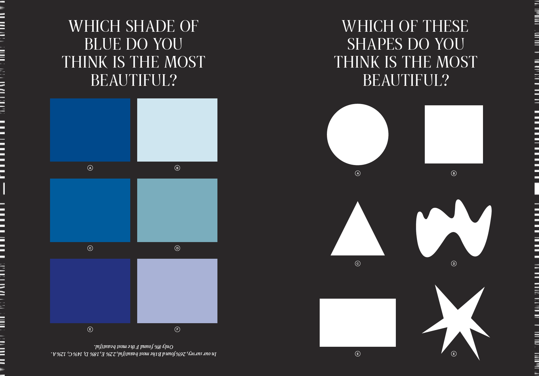 Image courtesy of Phaidon
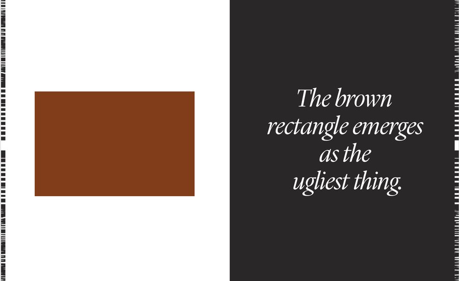
Brown, on the other hand, is the least favorite color. But can we identify the shade of brown that is the world’s least favorite (and ugliest)? We asked followers to rank six frequently used browns by preference. This survey on Instagram received 2,120 likes (as opposed to the 3,650 likes received for our shades-of-blue survey). It also attracted far fewer participants: only 4,746 people responded. Although this number is still statistically significant, it is far fewer people than the 7,624 who voted for their favorite shade of blue.
Our Instagram followers, an admittedly design-conscious crowd, voted for classic brown as their least favorite. From this we can deduce that classic brown is possibly the ugliest color in the world.
We also ran a survey on shapes. Almost every other person chose the circle as their favorite, and about a third preferred the round wiggle, while only two in one hundred preferred the rectangle. We then tested these same shapes as three-dimensional forms, and the results were essentially the same, though slightly more pronounced. Half of all participants preferred the sphere, and the rectangular volume came in last. The least popular shape is the rectangular volume. The least popular color is classic brown. So, is a classic-brown rectangular volume the ugliest thing possible?
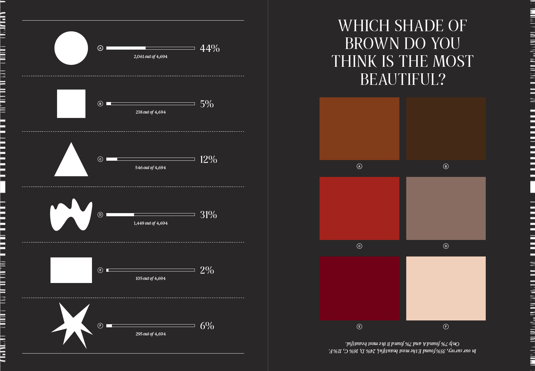 Image courtesy of Phaidon
Ironically, the brown box has been the most dominant shape in architecture over the last hundred years. Surely there are practical reasons to design and build using rectangular shapes. But if you look at historic architecture—from almost any culture—the rectangle plays a less significant role, while the more popular shapes selected in our own survey are more dominant.
Did Modernism Go Down the Wrong Path?
Dr. Helmut Leder’s research confirms that we prefer round objects over sharply angled ones. It would be difficult and impractical to build perfectly spherical structures, but the example of Edwin Lipburger’s Kugelmugel house shows that a spherical building can generate widespread admiration.
If the circle is the most beautiful, are other round shapes just as appealing? Of course we asked. Here are the results: the perfect circle rules!
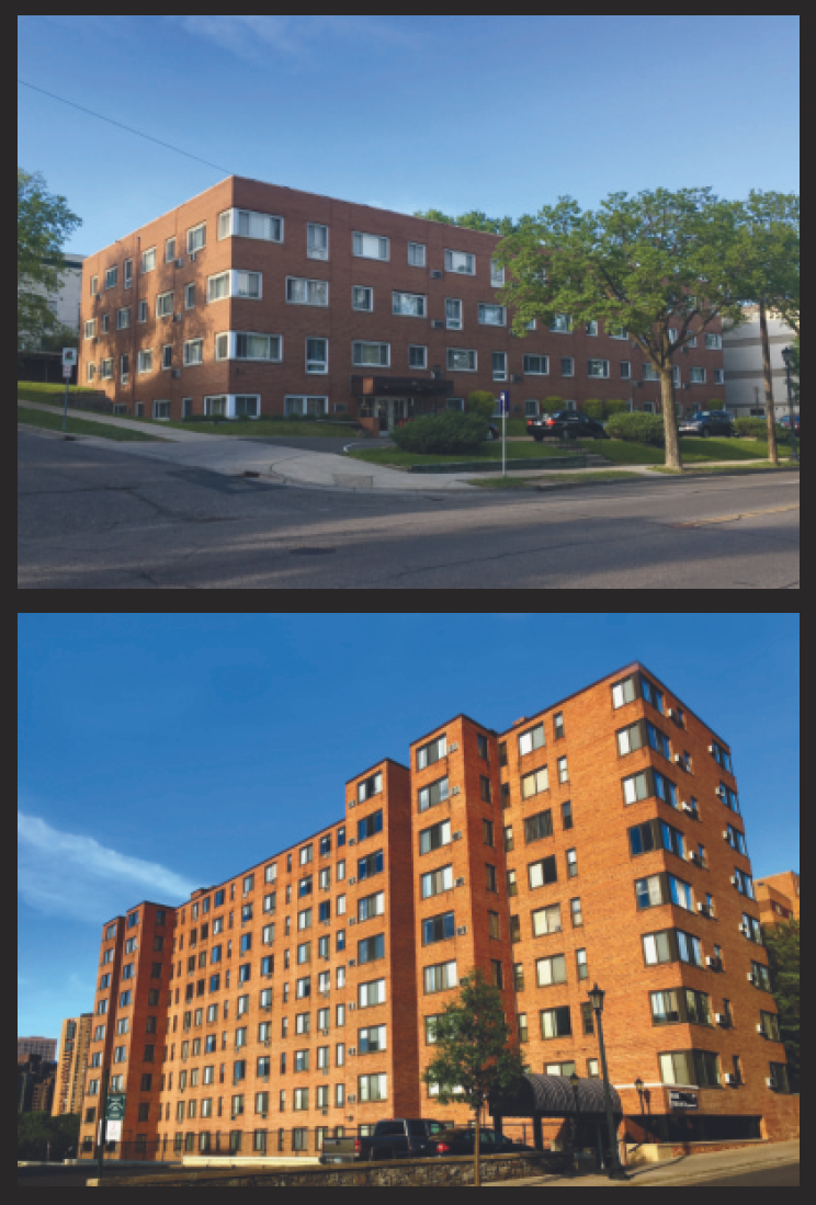 Rectangular brown buildings. Image courtesy of Phaidon.
My Beautiful Money
Our Instagram followers are equally divided between the United States and Europe. Among the nations represented, a small number of followers live in Switzerland. Familiarity with the currency and, possibly, patriotism would seem to factor into the results when we asked our Instagram community which currency they found the most beautiful.
The euro is the favorite. A scientific survey would adjust for the fact that far fewer Swiss people voted compared to participants from other parts of the eurozone and the United States. Had all three voted in equal number, the Swiss franc would likely have assumed the top position. Beauty seems to have beat out patriotism and familiarity.
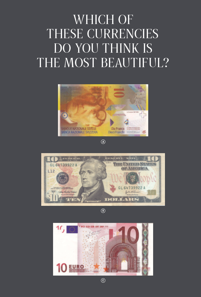 Image courtesy of Phaidon
Jessica [Walsh, the co-author of this essay] was unsure of her commitment to graphic design after her first year of study at the Rhode Island School of Design. Most of what professors taught stemmed from the International
Style; the students spent months perfecting grids and tracing modernist typography, and the examples that the design professors hailed as perfection seemed boring and lacking soul. It was Ootje Oxenaar’s class that made her hopeful about design. He would show his beautiful work and explain how he’d interject playfulness and the personal into everything he made. He designed the Dutch banknotes from the 1960s to the ’80s, which were kept in circulation until they were replaced by euros. They are beautiful, and when you look closely, each bill contains something personal from Oxenaar’s life: the imprint of his middle finger, a drawing of his girlfriend’s pet rabbit, or his granddaughter’s name. She remembers him giggling with joy at the idea that he was giving his middle finger to everyone in the Netherlands, realizing there was more to design than perfect kerning.
We also thought familiarity and patriotism would factor into voting about the relative beauty of passports, making the final results all the more remarkable. Even though we know there are few Swiss voters among our Instagram followers, the Swiss passport was considered the most attractive by more than three-quarters of all respondents. When there is international consensus, how can beauty be in the eye of the beholder?
The Ten Most Beautiful Cities in the World
When we compared surveys of which cities people consider the world’s most beautiful, the same names came up again and again. We have visited all ten of these lovely places and can confirm that the surveys are correct: these are truly beautiful cities. Some stand out for their architecture, some for how they’re situated within nature, but all are absolutely stunning. Unfortunately, whenever we visit, it turns out that people from all the ugly places in the world have also been attracted by the beauty, overcrowding these spots and considerably diminishing the enjoyment of said beauty.
“One Entered the City Like a God. One Scuttles in Now Like a Rat.”
Researchers at the New England Complex Systems Institute (NECSI), a research facility studying complex data, created a mood map of New York City using data from Twitter. They developed a simple algorithm that can detect if a tweeted message is, overall, negative or positive. Using this tool, they’re able to determine how people feel anywhere in the city. If an area is shaded green, more positive messages emit from this place; if it is red, more negative messages are sent.
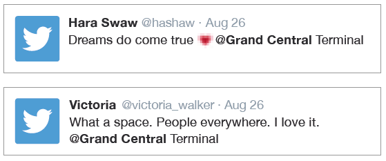
Let’s compare two transportation hubs: Grand Central Terminal, a grand, 1913 building by the architecture firms Reed & Stem and Warren & Wetmore, and Penn Station, a dark, underground hub built in the late 1960s. On the mood map, Grand Central is always green, while Penn Station is always red. But you don’t need the NECSI to come to this realization. On your next visit to Manhattan, make the brisk, twenty-minute walk from one station to the other and you’ll see the difference in the travelers’ moods. Those moving through Grand Central are always—at any time, night or day—in noticeably better moods than those in Penn Station.
We took a look at some of the individual tweets coming out of each station. Here are a few from Grand Central:
The messages coming out of Penn Station are rather different:

And people don’t just feel different in these stations, they also behave differently.

Small Is Beautiful. Diversity Is Beautiful.
Dr. Colin Ellard, a neuroscientist at the University of Waterloo and director of its Urban Realities Laboratory, asked people walking down Houston Street in New York City to wear electronic bracelets so he could measure their feelings. In front of the giant Whole Foods Market, situated in a humdrum, glass-façade building on the corner of the Bowery, participants wearing the bracelets were physiologically manifesting signs of boredom. Asked to describe their reactions to this particular spot, they used words like bland , monotonous , and passionless .
In contrast, one block east of the Whole Foods on East Houston, at the other test site— a “lively sea of restaurants with lots of open doors and windows”—people’s bracelets measured high levels of physical excitement, and participants listed words such as lively , busy , and socializing to describe the area.
Ellard’s research makes clear that we favor diversity over monotony, that we feel more alive in an environment featuring a mixture of buildings and styles.
No wonder one of our favorite parts of the city is the West Village. The winding streets have unexpected shops, restaurants, and architecture at every turn. We’re not alone in this thinking: its charming appeal makes it one of the most expensive real estate neighborhoods in the city.
Such findings could have far-reaching impacts on the commissioning and planning of architectural projects. For instance, when the campus of the new University of Economics and Business in Vienna was commissioned under the master plan of architect Laura Spinadel, the job was not given to a single architectural firm, but instead divided among six firms, each assigned a distinct section. This resulted in a dynamic feeling on campus right from the start. We visited the campus three months after its opening, and it already felt lived-in—the public spaces were teeming with students. It worked. It was alive.
Going Away and Never Leaving
If we fly from Athens to Bangkok, through Sapporo to Sofia, we’d better double-check our boarding passes to see where we are—we would not get a clue from the architecture of these airports. Considering the significant cultural differences between Greece, Thailand, Japan, and Bulgaria and the vast possibilities these travel hubs offer for creating a sense of place, it’s mind-boggling that they’re designed within the exact same parameters.
These airports make you feel as though you never left in the first place. We might have just traveled more than ten thousand miles, but aesthetically and culturally, we’re still in the same building.
In fact, we often don’t realize where we’ve landed until we try to recharge our phones and notice that the plug won’t fit! Apparently, electricians never adopted the International Style.
This problem is exacerbated in American airports, which are often value-engineered into soul-crushing environments that amplify the usual frustrations of air travel. Long lines are ubiquitous, delays the norm.
We spoke with an executive at the excellent Haneda Airport in Tokyo, who stated that if we see a long line of people at an airport today, something is wrong. Crowd prediction software has become so sophisticated that it should be possible for any airport to move people efficiently without increasing the number of staff. It turns out that the people who insist on the supremacy of sameness under the guise of functionalism frequently don’t use the software that would actually make things work.
Does Sameness Work Better?
Let’s look at subway systems. The example we’re using here is from Munich, but we could have chosen any subway system built in the mid-to-late twentieth century. Many appear to follow the same strategy of color coding within a narrow set of formal parameters. Each line is assigned a particular color for identification and signage, and every station along that route is marked with the assigned color.
When traveling from Hauptbahnhof to Karl-Preis-Platz, Theresienstraße to Messestadt Ost, or Fraunhoferstraße to Giesing, one always remains within the exact same visual system. We assumed that this universal design strategy, this sameness, would get us from A to B in the most efficient manner.
That is, until we visited Moscow. There, every station is unique—different colors, different surfaces in different materials and patterns, different structures and architectural styles. In the Moscow subway system, we can check our phones, read a book, or just daydream and we will know, intuitively, when we arrive at our destination. We don’t have to squint to figure out a fragment of Helvetica behind a column to know we’ve arrived.
The Moscow system works better.
We also noticed that at every station in Moscow a large group of people get out of the train, quickly take pictures in the station, and then get back into their compartments. They repeat this ritual at every stop. Moscow’s subway system has become a tourist attraction.
In Munich, we were the only ones with our cameras out.
RELATED ARTICLES:
Color Palettes by Decade: 10 Artworks to Give Your Home a Blast from the Past
"Color Is Never Unimportant": The History of Red and the Work of Judd, Bourgeois, and Kapoor
[related-works-module]