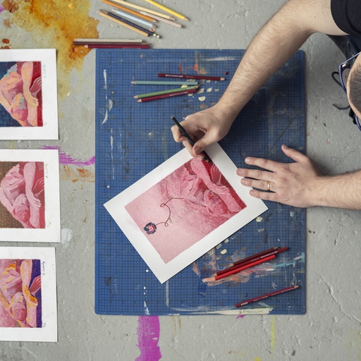

The seductively tactile physical technique involved in woodcutting – and its remarkable adaptability – has ensured its survival into the modern age. At a time when almost any effect or outcome can be digitally mimicked and created, there’s much to be said for the painstaking labor and ink-covered process of this technique.
Woodcutting is one of the earliest, simplest – but most effective – methods of printing. Essentially, it’s a basic form of ‘relief printing’: where a block is carved away so that the shapes which the artist wants to apply to paper are left raised, while the other areas are removed. Ink is then applied to the block, but only sits on the raised areas, so that when paper is applied to the block it picks up that impression and nothing else. The earliest examples of this printing date to China during the Han dynasty (before 220 AD), and depict colored flowers printed onto silk.
Around 1400 the technique spread to Europe, although the quality and detail of these prints varied wildly throughout the fifteenth Century as artists and their assistants learned their craft. As the technique gradually refined, hugely complex works of art would be produced from Japan (Hiroshige’s landscape scenes) to Germany (Albrecht Durer’s biblical scenes). Artists learned how to incorporate text, different layers of color, or use multiple blocks to create deeper contrasts of light and dark. Here are just some of our favorite examples of what contemporary artists are doing with this ancient art form. You'll find them in all in the Artspace store along with many more in the module beneath our story.
Sol Lewitt – Loopy Doopy, Blue/Red, 2000
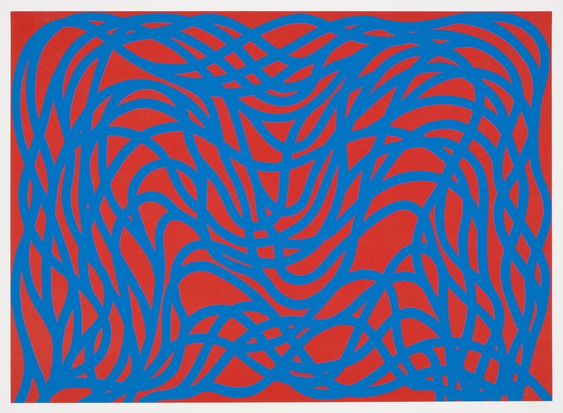
An American artist born in Connecticut in 1928 to Russian-Jewish immigrant parents, Sol Lewitt was an astonishingly prolific artist who was in exactly the right place at the right time. Beginning work as a night receptionist at MoMA New York in 1960, his fellow workers included Robert Ryman and Dan Flavin while his social circle boasted Eva Hesse and Robert Smithson. Throughout his career he ranged between creating books, painting, installations, sculpture (or as he termed them, ‘structures’), photography and printmaking. Loopy Doopy became a recurring title and pattern throughout Lewitt’s work – the original design was created by taping two pencils together and twisting them across paper, with the resulting large scale drawings shown at PaceWildenstein in 1998. The shape then reoccurred on everything from small boxes to vast large scale rooms, or – as in this case – a two-color woodcut print in red and blue. This piece is a signed and numbered edition of 50.
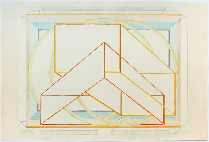
Born in New York in 1928, Al Held studied art in Paris before returning to his home city and falling in with the burgeoning abstract expressonist movement. However, in 1967 he broke with the movement’s insistence on ‘flatness’ and strict geometry. From that point on, his works became looser, with more space and depth to them, and saw him experimenting with manipulating and breaking the canvas itself. From 1978 he moved even further into experimentation, incorporating color into his work. Over his career, Held’s art evolved into something more crowded, three-dimensional and colorful, but still with the perfect grasp of geometry which had originally marked him out. This color woodcut from 1985 captures all of those impulses – to experiment with form, shape and technique while not being beholden to one formal school – in one piece and is an edition of 100 published by Crown Point Press as part of its Japanese Woodcut program.

In all the hoopla around Damien Hirst and his career, what is often forgotten is his skill with color and shape, and the simple premises upon which much of his best work rests. (see this week's work for the UK NHS as a prime example). Works like Mother and Child (Divided) had an immediate shock value but beneath this involved a simple reduction of an idea into three colors, clean lines and form. Similarly, his dot paintings and mandalas worked with simple shapes, repeating patterns and a limited color palette to maximize their impact. An extreme version of this is found in Pridinol, his pure two-tone woodcut from 2010. In a typically Hirstian flourish however, the painting is named after a heavy-duty pharmaceutical muscle relaxant.
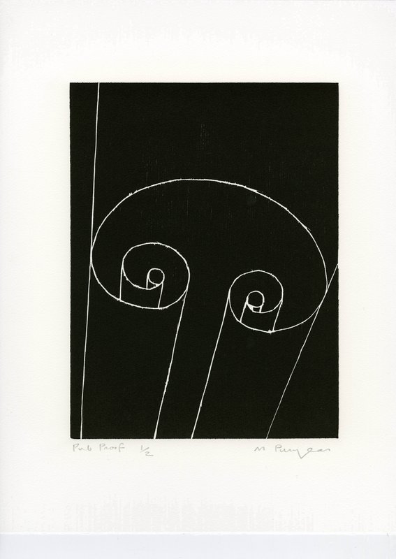
Robert Mangold – Untitled, 1989-90
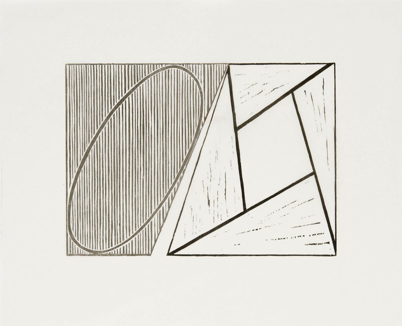
Robert Mangold (born 1937) is classed as a minimalist artist, but his work doesn’t conform to the stereotype of cold formality and hard lines that this term might conjur up. Mangold’s work is frequently a world of curves, ellipses and gently overlapping layers, made up from soft, earthy tones of terracotta, green, yellow and orange. ‘While subdued, these hues emit a certain radiance,’ wrote the New York Times in 1994. ‘While perfectly flat, they harbor intimations of a soft atmospheric space.’ This woodcut from 1989 plays hard geometric lines against gentle curves and white space against detailed shading that shows off the physicality of the printing process and comes in an edition of 35.
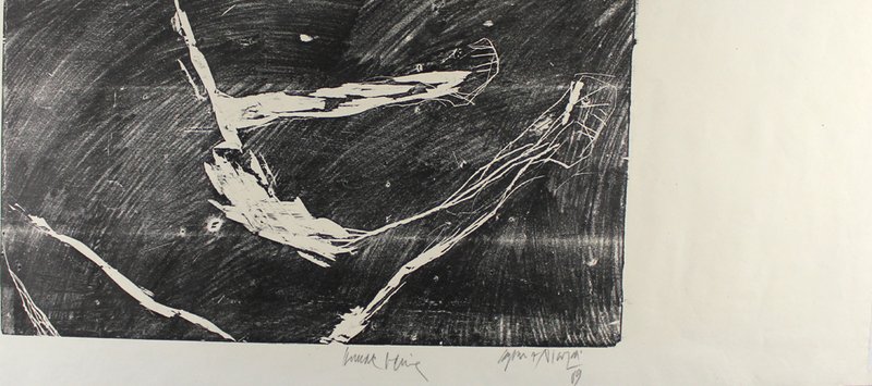
Richard Bosman – Volcano, 1989
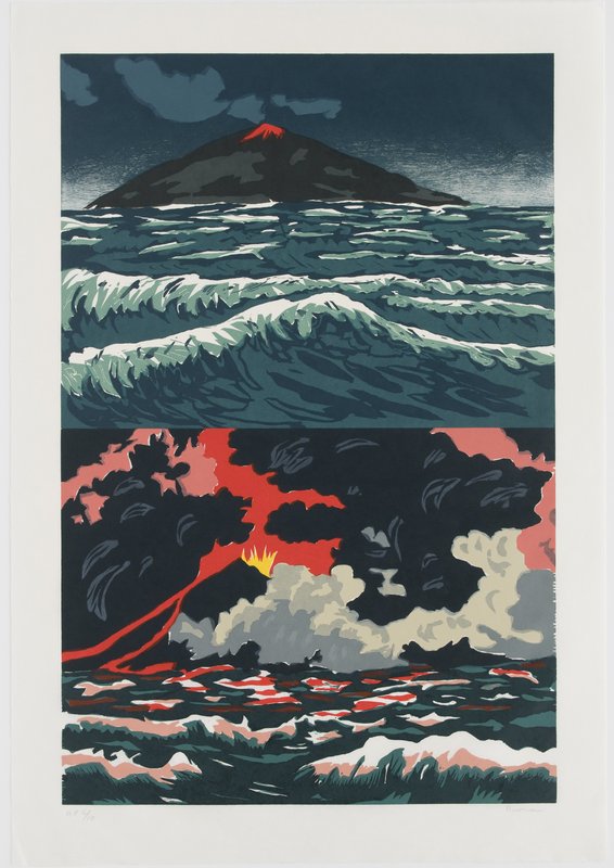
Richard Bosman came through the neo-expressionist movement of the late Seventies when he was part of the Colab art group (along with future Wild Style director Charlie Ahearn and Jenny Holzer). His early work referenced the violence, romance and drama of pulp fiction novels, creating a kind of document of the underbelly of provincial American life, from domestic accidents to furtive kisses in parked cars. His later work has gravitated more towards nature and particularly its overwhelming power – people plunging into water or being swept away, snow-bleached landscapes, burning fields. In this unique woodcut, a split scene shows the sea in the moments before a volcanic eruption and in the chaos that follows the blast. With its green-tinged sea and mountainous landscape, it references the original woodcut work of Japanese master Hiroshige.
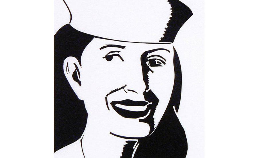
Alex Katz – The Sailor Hat, 2003
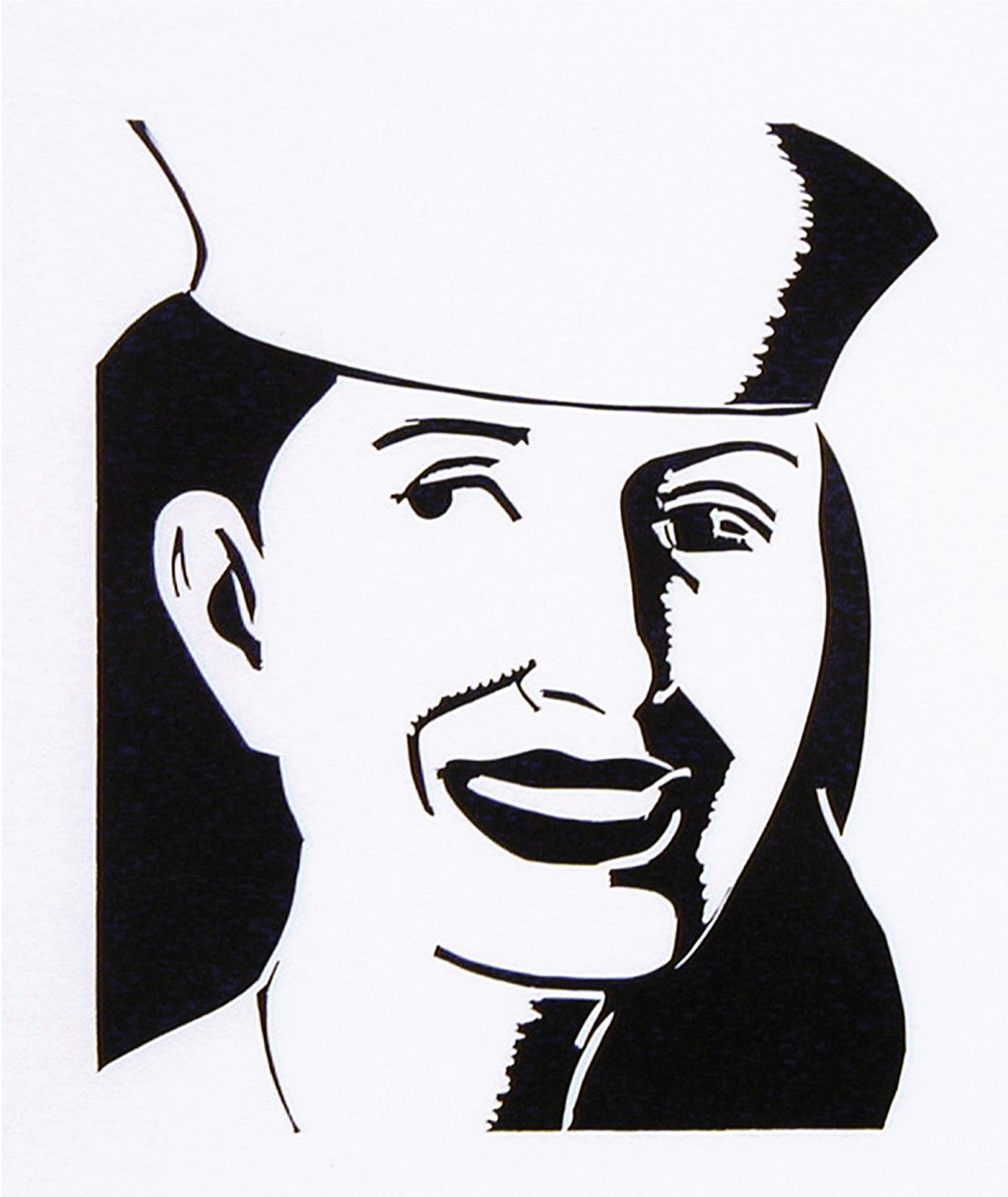
Alex Katz’s portraits have an immediately recognizable, direct clarity to them. Usually created in bold, pop colors, glowing with light, and with a direct gaze from the subject straight to the viewer, he is one of the most important figures in post-war figurative painting. ‘I like to make an image that is so simple you can't avoid it, and so complicated you can't figure it out,’ he has said, a neat encapsulation of a style which is at once both immediately understandable, but also contains depths, layers and hidden stories. ‘Realist painting has to do with leaving out a lot of detail. I think my painting can be a little shocking in all that it leaves out. But what happens is that the mind fills in what's missing. Painting is a way of making you see what I saw.’ This piece from 2003 is a perfect illustration of that idea, where almost all of Katz’s usual calling cards have been left out, but the end result is still immediately his work.
Georg Baselitz – 45-Januar, 1990
Georg Baselitz was born a year before the outbreak of World War Two in Deutschbaelitz, Germany (his peer group included Sigmar Polke, Gerhard Richter and Neo Rauch). Coming of age through the privations of the war and the destruction of the country, his entire artistic worldview was shaped by this experience. ‘I was born into a destroyed order, a destroyed landscape, a destroyed people, a destroyed society. And I didn't want to reestablish an order: I had seen enough of so-called order. I was forced to question everything, to be 'naive', to start again. At times, this attack on convention was literal – after establishing himself as a conventional figurative painter, he began to invert his canvases, painting subjects upside down. His subsequent work saw him influenced by everything from African sculptures to Soviet illustration. This woodcut on paper dates from 1990 and is part of a series of similar pieces he did depicting different months of the year. Marking a point from which his work became more abstract and linear, the restrictions of the printing process suiting this perfectly.
[woodcuts-module]
RELATED STORIES
Amazing Artists who Worked Best in Isolation
The Artspace Group Show: Contemporary Landscapes
What to Say About Your New Katherine Bernhardt Print
Protest To Portraiture - 5 Political Photos To Invest In
The New Abstraction - 8 Artists To Collect Now
Phaidon Art Editor Rebecca Morrill Picks Her Favorite (Blue) Works