


It can be considered gauche to focus to much on the color of an artwork, rather than its content—but, frankly, you would be silly not to think of how its hue will harmonize with your home. We're here to help! Learn how to use art to create custom color combinations in your home and never clash again with this quick primer on the color wheel, a handy visual cheat-sheet that artists have been using the since the 18th century to make their paintings and pictures pop . You'll discover the difference between tint and shade, the beauty of triadic color combinations, and more. Follow these pointers and fill your home with aesthetic harmony.
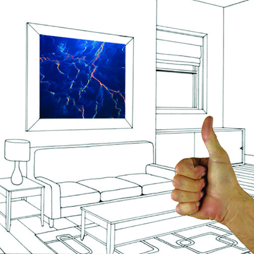
(To accentuate your color scheme, chose artworks accordingly. You can use Artspace's color filters to browse available artworks by going to the Artworks tab and scrolling town to the color filter. )
Monochromatic Color

First things first, let's start with some basic vocabulary. Tints are made by adding white to any color to lighten it. Shades are made by adding black to any color to darken it. And tones are made by adding gray to any color to make it more muted and less vibrant. Starting with your favorite color, select a range of tints, shades, and tones to combine for a dramatic monochromatic effect.

Monochrome is also a term used in art theory to describe artworks in any medium that use a single color. It's also used more specifically to describe a painting that is filled with a single solid color. The monochrome canvas became extremely important to the Minimalists of the mid 20th century, who were interested in reducing art to its essential elements and limiting signs of the artist's hand. Artists like Ellsworth Kelly , Yves Klein , Mark Rothko , Robert Rauschenberg , and Frank Stella were instrumental in theorizing the monochrome painting.
If you're choosing to go the monochrome route for your interior design scheme, go all out with Monochrome artworks on Artspace, available here.
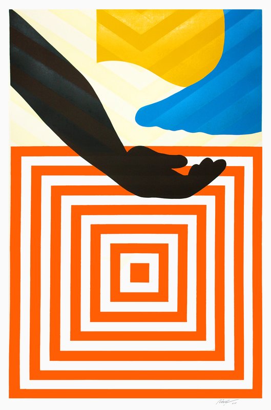
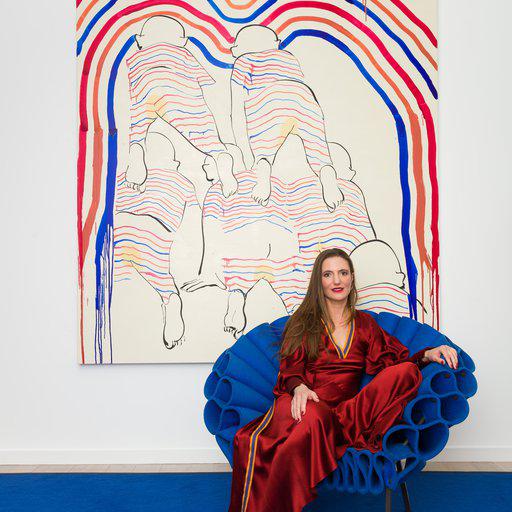
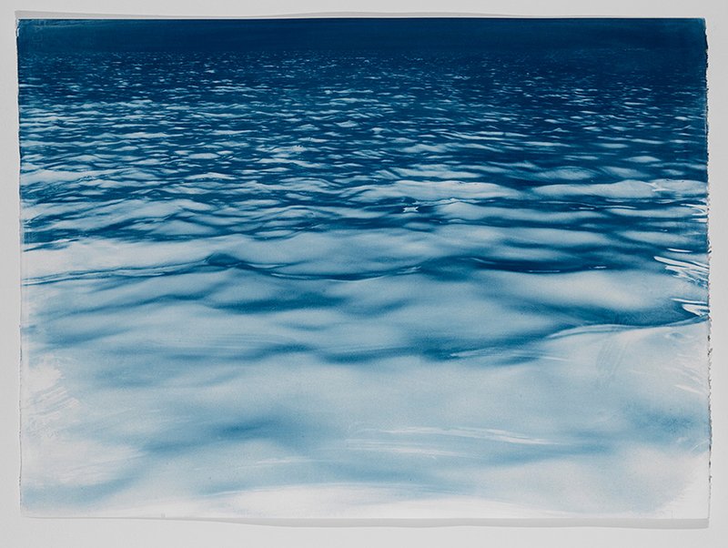 Brian Buckley's Seascape II (2015) is available on Artspace for $5,000
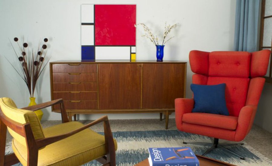
Analogous Color

Analogous colors sit directly next to each other on the color wheel, like friendly neighbors. Depending on which part of the wheel you choose, their temperatures will change, and so will the vibe of your room. Cool colors like violet, blue, and green are calming—great for living rooms and bedrooms but not for offices or workout rooms. Warm colors like red, orange, and yellow are energizing and stimulating, and even increase appetite for some (McDonald's anyone?), so use them in the kitchen and dining room.

To create an analogous color palette, choose any two or three colors that touch one another on the wheel, and you're good to go. Looking for warm colored artwork to fit a color scheme like the one above? Browse our Editor's Picks for artworks in red, orange, pink, and yellow here.
Complimentary Color

Complimentary colors sit exactly opposite each other on the color wheel. So how do they relate? When your eyes are overwhelmed with one color, they crave to see its inverse to balance it out. (This is why we see a ghostly green afterimage after staring at a red spot.) A splash of orange in a blue room, meanwhile, really pops because the two colors are stimulating different parts of the eye.

[related-works-module]
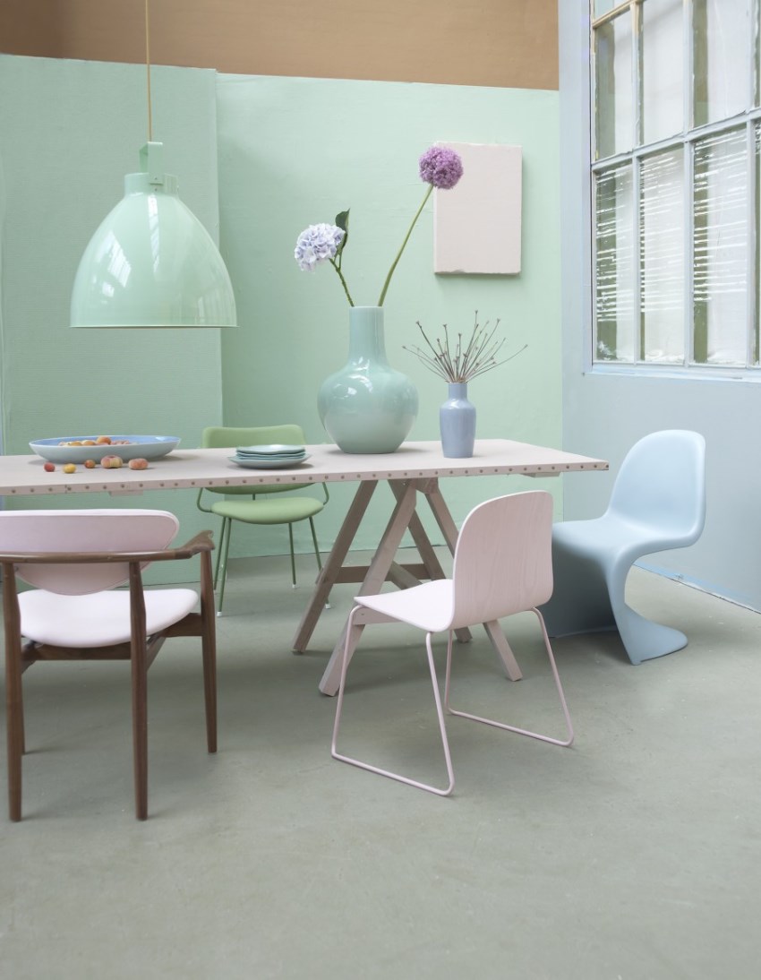
Triadic Color

Forming an equilateral triangle on the color wheel, triadic colors are very vibrant and sprightly. They can be rather intense if all three are fully saturated, so let one dominate use the other two as accents.
Unless you're decorating a children's room or playroom, t one down your colors (by adding gray) for a vintage vibe, or add white to bump them up to lighter shades for a breezy, pastel palette.
And if color just isn't your thing, opt for neutrals—colors that aren't on the color wheel, like white, black, gray, brown, and beige. Browse our Editor's Picks of neutral colored artworks here.