Album art may not be as common as it used to be (does anyone buy music anymore?) So, if you've already forgotten, before music streaming and MP3s, the art on vinyl records, CDs, and tapes were often just as memorable and defining as the music they represented.
Excerpted from Phaidon's Graphic: 500 Designs that Matter, these artists and designers pushed the envelope, and sometimes the budget, in order to free the album cover from its formulaic roots and to create a piece of compelling art for bands like the Beatles, Joy Division, and The Velvet Underground. From an interactive sticker inviting you to "peel slowly and see," to a CD case that looks like a prescription pill box, these artworks will leave you nostalgic for a time before digital audio.
Andy Warhol
The Velvet Underground & Nico
1967
Andy Warhol’s philosophy of art is crystalized in this debut record cover of the Velvet Underground, which manages to turn a meaningless object into a symbol as recognizable and easily reproduced as Marilyn Monroe’s face or a Campbell's soup can.
Warhol was at the peak of his creative powers when he designed the record sleeve, and already widely known for his brightly colored silkscreen prints depicting famous faces and newspaper clippings, produced at his “Silver Factory” (later known as the “Factory”). Before becoming an independent artist, Warhol was an established commercial designer of promotional graphics, including record sleeve designs. The Velvet Underground were members of the cultural scene that surrounded him, but their music was only modestly successful. Although this album, The Velvet Underground and Nico, was not a hit on its release, it gained in influence and reputation as the band’s musical influence grew and as the record sleeve itself gradually acquired a following of its own.
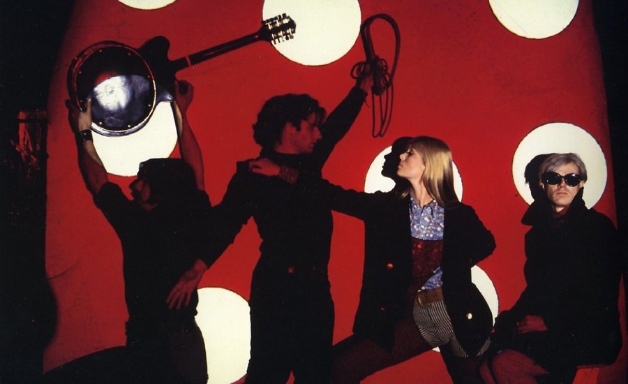
 The Velvet Underground performing at Andy Warhol's Factory
The importance attributed to the relationship between Warhol and the emerging band is conveyed by the design, which features Warhol’s name prominently, but neglects to mention that of the band—it was only on later reissues that the group was added onto the sleeve. Moreover, the original sleeve included a banana that could be peeled to reveal a second—pink—banana underneath. Warhol’s interest in the mass-produced and the banal is clearly evident here: the banana looks like any other, a mundane object writ large, and echoes the artist’s images of famous commercial objects such as Coca-Cola bottles, which represented to him the ultimate symbol of American consumer democracy. The banana is now so famous that it is regularly printed on T-shirts and other merchandise, completing its elevation to consumer icon.
Peter Blake and Jann Haworth
The Beatles, Sgt. Pepper's Lonely Hearts Club Band
1967
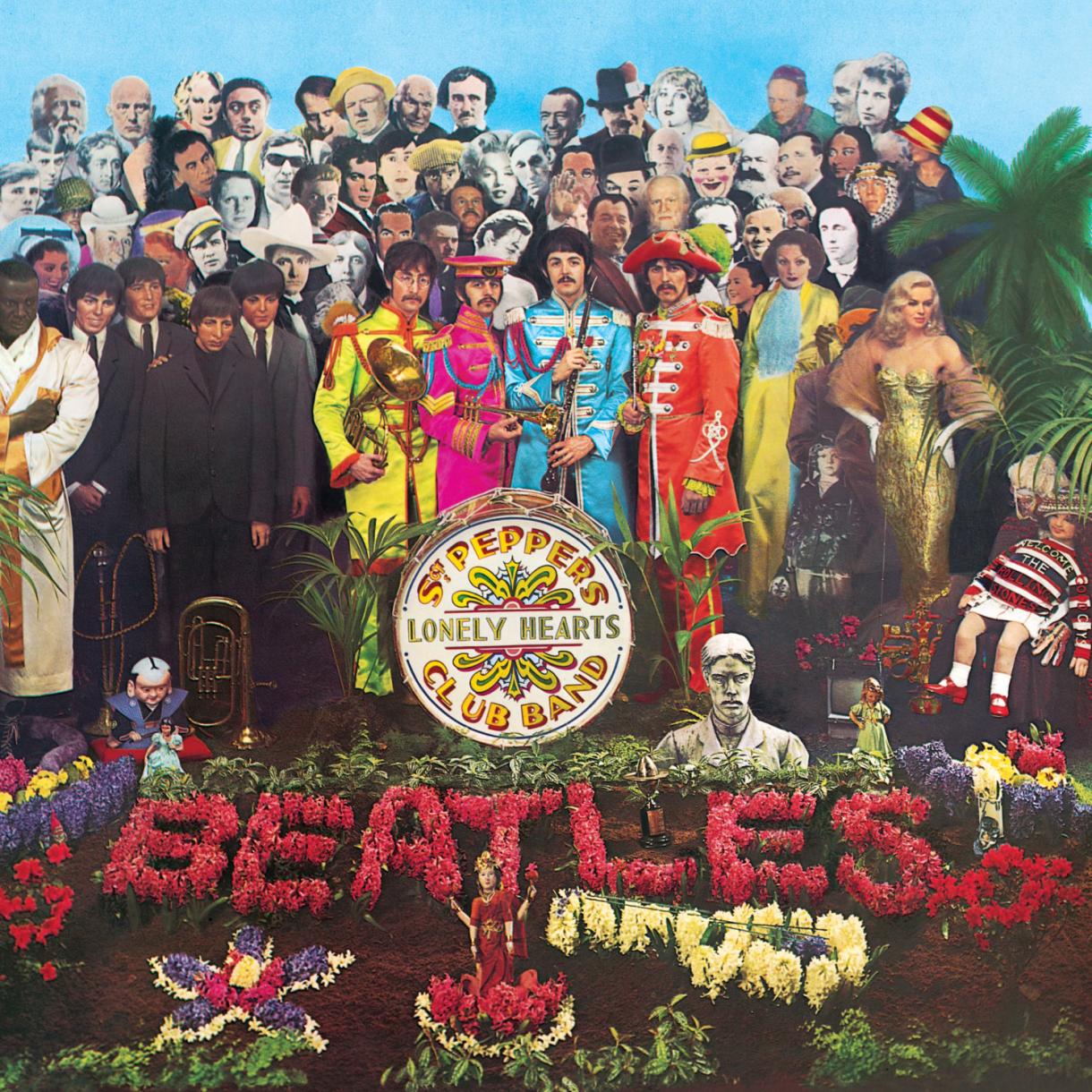
For the postwar generation that came of age in the 1960s, there was no more influential band than The Beatles. The most iconic of their works, the 1967 Sgt. Pepper’s Lonely Hearts Club Band album, forever altered the content and style of rock and pop music. Not coincidentally, Peter Blake and Jann Haworth’s Grammy-award-winning album cover was also a breakthrough in terms of launching the popular trend of “concept cover” art.
The cover was conceived by art director Robert Fraser in collaboration with Paul McCartney, who originally wanted to use a painting entitled The Fool. Fraser persuaded McCartney to abandon the idea, instead proposing that Blake, an acclaimed artist at the time, should design the cover. Blake has recorded that the original concept was to create a scene showing The Beatles as a fictional Sgt. Pepper band performing in a beautiful, flower-strewn setting (photographed by Michael Cooper); this evolved into a view of the group surrounded by an assortment of their heroes (as well as Madame Tussaud’s wax-work versions of their younger selves), as life-size, cutout figures. Ultimately, the collage depicted more than seventy famous people including writers, musicians, film stars, and Indian gurus and, at John Lennon’s insistence, an image of the original Beatles bass player, Stuart Sutcliffe.
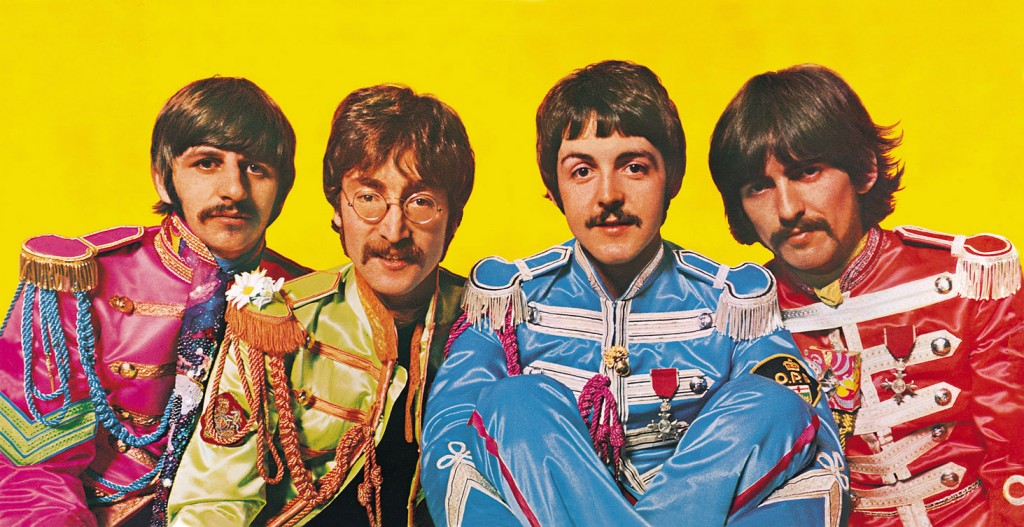
The word “Beatles” in the foreground of the image, spelled out in flowers, simulated a grave, which led to speculation that the biographical tableau symbolized their transition from mop-tops to serious composers. Inside, the album, which was designed as a “gatefold” opened up to reveal a large color photograph of the Beatles as the Sgt. Pepper band against a yellow background, and an additional page of cutouts of Sgt. Pepper regalia. Blake’s imagery drew on the influences of Dada, Surrealism, and of course psychedelia (which was a composite of the two earlier styles).
 Gatefold photograph from Sgt. Pepper's Lonely Hearts Club
The album’s Pop sensibility inspired many subsequent record covers, including The Rolling Stones’ Their Satanic Majesties Request. Years later, it also prompted numerous parodies, such as Ed Lamm’s 1999 New York Times Book Review illustration, entitled “Clinton,” showing all of the players in President Clinton’s Monica Lewinsky scandal.
Jamie Reed
Sex Pistols, God Save The Queen
1977
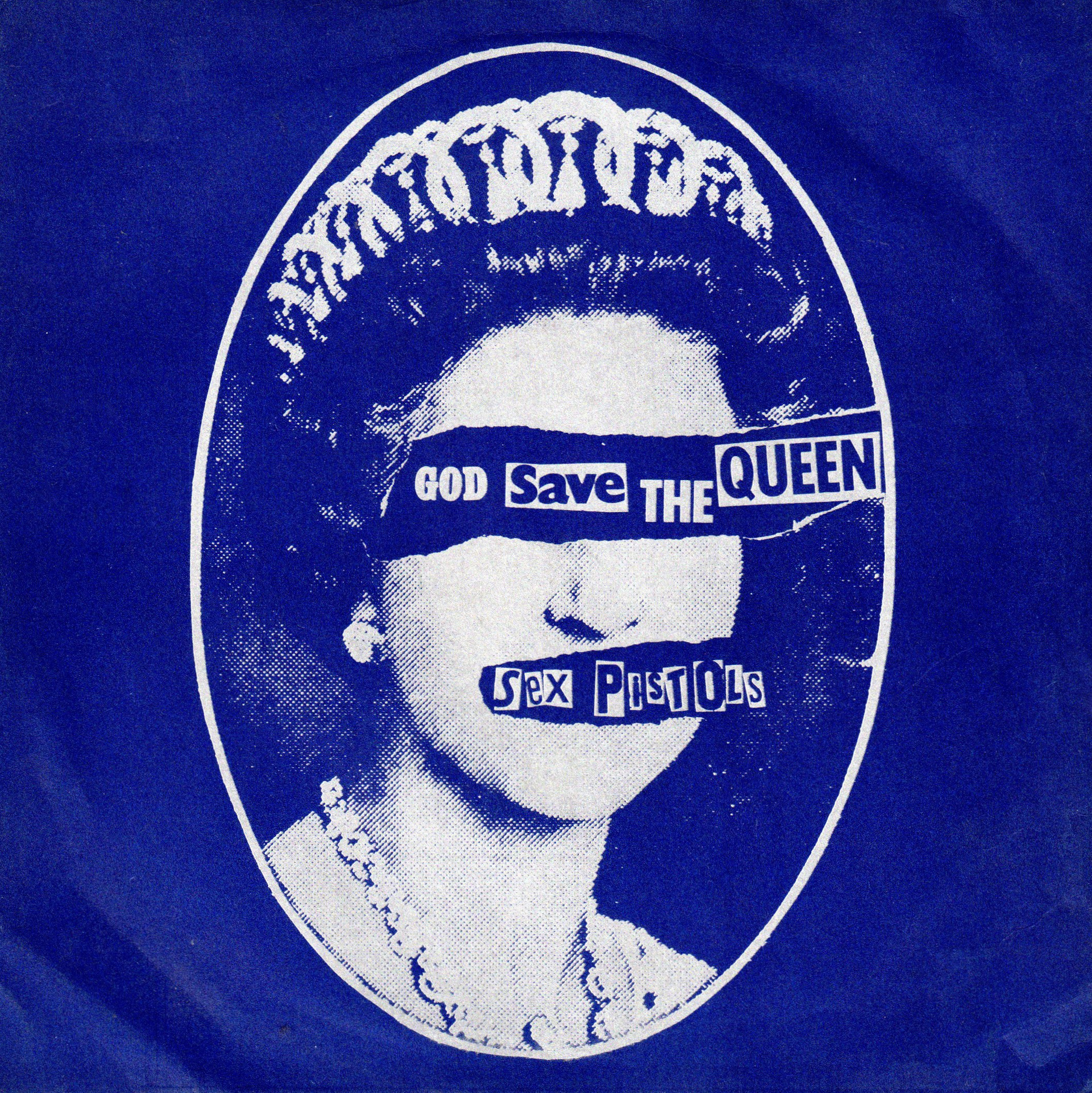
Although the exact genesis of punk music is vague, the enormously provocative work of its most famous graphic artist, Jamie Reid—sometimes lyricist, hanger-on, and designer for the Sex Pistols—represented a major milestone in the history of graphic art.
British and American graphic art of the late 1970s shared the subversive Dada spirit of the early twentieth century, as well as the improvisational approach of its techniques, particularly collage and photomontage. As an untrained designer ignorant of paste-up or typesetting, Reid used methods that were considerably more crude: a Xerox machine and scissors, which he used to cut and paste existing letters on to the page in a style reminiscent of a ransom note in which the author’s handwriting has been deliberately obscured. However, Reid’s deceptively amateurish graphics perfectly reflected the music itself, which was based on simple four-chord progressions and was often played by inexperienced musicians.
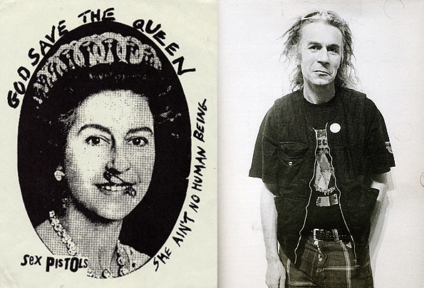 An earlier sketch of the cover alongside a portrait of Jamie Reid
Released in 1977, the year in which England celebrated Queen Elizabeth’s Silver Jubilee, the single “God Save The Queen” not surprisingly created controversy, as much for the graphics of its poster and record cover as for the song itself. Concealing the Queen’s eyes with the title implied her refusal to see or understand the circumstances of an extremely disgruntled youth, and pasting the band’s name across her mouth suggested a sexual assault that reflected punk’s own dalliance with violence and destruction. In just a few simple strokes, Reid’s work succeeded in encapsulating the underlying theme of punk culture: to offend the establishment and draw attention to the dissatisfaction of youth with their social, political, and economic condition.
Peter Saville
Joy Division, Unknown Pleasures
1979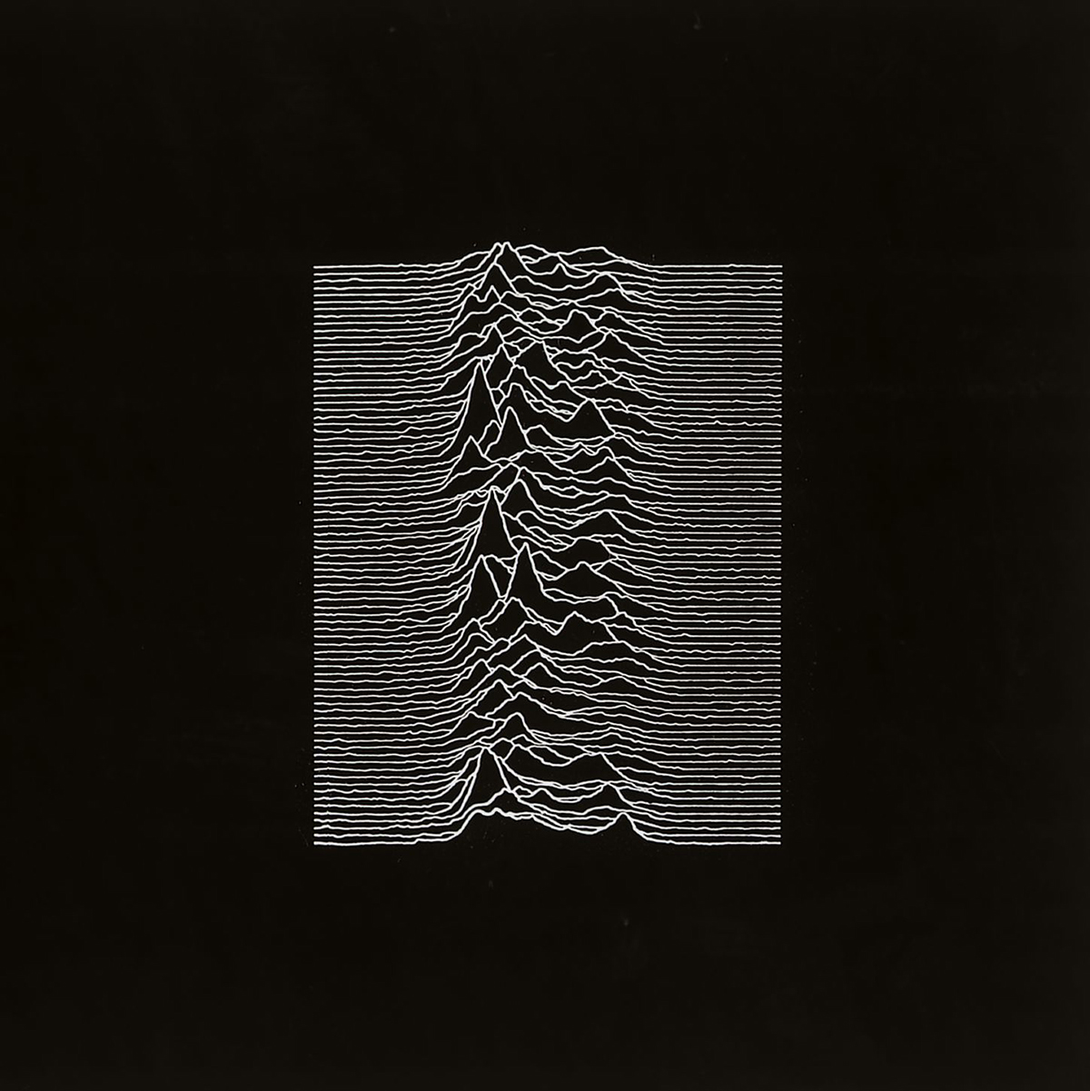
Although seemingly ambiguous, the album sleeve for Unknown Pleasures by Joy Division is, paradoxically, perfectly suited to the music and band it serves. The design was conceived by Peter Saville, art director of Factory Records, for the group’s debut LP after Stephen Morris gave him a selection of images including the one used as the central motif. Chosen by Morris’ fellow band member Bernard Sumner from the Cambridge Encyclopedia of Astronomy, the sharp waves represent the radio pulses transmitted by a collapsing star. With the original colors reversed and surrounded by a large area of black, the radio-wave graphic creates an effect of minimalist elegance and is deliberately enigmatic, interpretable as a mountain landscape, a medical diagram, or the magnified surface of human skin. Inside the sleeve a photograph of a hand reaching for a door handle by the American photographer Ralph Gibson is similarly eerie and evocative.
 Peter Saville later interpreted the album cover as a 3D sculpture, available on Artspace for $6,507
Joy Division was known for such songs as “New Dawn Fades” and “Love Will Tear Us Apart,” and cultivated a dark aesthetic, often captured in black-and-white photographs of the band amid stark surroundings. Before MTV (broadcast from 1981) and the internet, music packaging acted as an important promotional vehicle for recording artists, who were otherwise limited to communicating with their audience through weekly music publications and occasional television appearances. Music graphics provided a way of conveying the atmosphere contained in their music. After the lead singer Ian Curtis committed suicide in 1980, Saville continued to design for the new group, New Order, formed by Curtis’ band members; it also recorded for the Factory label. Along with New Order, Saville continued to work with a diverse range of groups for the next two decades.
Unknown Pleasures served as the opening act of Saville’s career and the development of his unique visual language. The thirty years since the release of the album has seen Saville become one of the most significant figures not only in music graphics but in contemporary design. Yet in the three decades since it was produced, and despite its ambiguous meaning, Unknown Pleasures has retained its fresh and otherworldly appearance, and continues to invite curiosity and fascination—a difficult achievement in the fast-moving and ephemeral universe of pop graphics.
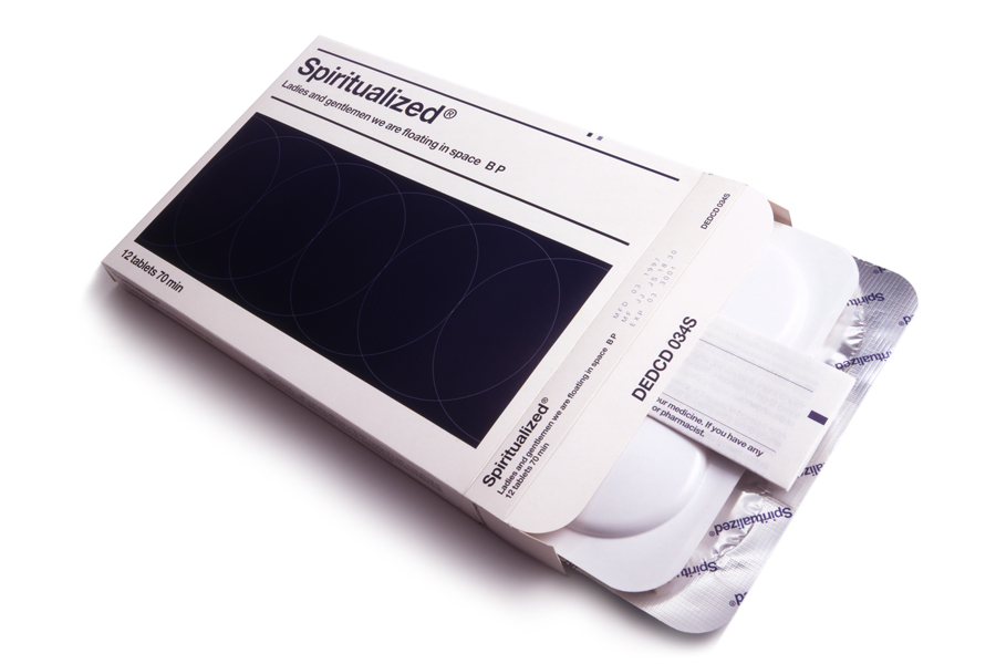
Mark Farrow
Spiritualized, Ladies and Gentlemen We Are Floating in Space
1997
Mark Farrow’s packaging for the limited-edition, boxed version of Ladies and Gentlemen We Are Floating in Space, the third studio album by the British rock band Spiritualized, introduced a completely new artistic and marketing concept. The inspiration was a statement made by the band leader, Jason Pierce, when he and the designer first met: “Music is medicine for the soul.”
In its physical form and graphics, the album’s packaging emulated a medicine packet. The box’s contents were indicated by the text on the front cover, “1 tablet 70 min,” which referred to the disc included inside and the running length of the album as a whole. Pierce purposefully manipulated the later, editing out several minutes of music in order to have a round number for the sake of concise typography. The disc was contained in a blister pack, which had to be pushed through the foil like a pill. As well as being released as a standard-size CD, one thousand extra albums were produced that each held twelve 76-mm CDs.
 The deluxe edition of the album, which featured twelve 76-mm CDs
Imperatives such as “For aural administration only” and “Store out of reach of children” peppered the information enclosed, formatted like a prescription leaflet, and the predominance of white space and sans serif navy blue type emphasized the clinical, sterile tone.
Until this point, there had been few alternatives to the standard plastic packaging of CDs, and none had employed such a strong and inventive metaphor. Although the playback of twelve individual discs was cumbersome, the medicinal packaging altered the way in which the listener related to the record, drawing attention to the act of consumption. It also heightened the meaning of the music itself, suggesting that it had some sort of healing power. The original packaging was produced in a pharmaceutical factory, paid for in part by Pierce, and won several design awards. This was the first of several collaborations between the band and the designer, including the artwork for Let It Come Down, which features a vacuum-formed girl’s face.
Big Active
Beck, The Information
2006

The CD packaging for Beck Hansen’s seventh studio album The Information is distinctive in handing over control of its visual identity to the audience. With increasing access to music online, Beck’s brief to the London-based designers Big Active was to distinguish the pleasures of owning a physical CD album from the experience of simply downloading files. The solution was to present the CD’s front and back cover as gridded graph paper, the back cover bearing a discreet track list, barcode, and copyright information, and the front cover left entirely blank. The clear case bears a single “Beck” logo sticker. Inside, a loose sheet of stickers—one of four possible sets—leaves it to owners to create their own cover art, so that no two copies of The Information are ever the same. A total of two hundred and fifty stickers, commissioned from twenty different artists, provide an eclectic mix of graphics, illustrations, and logos from which each self-appointed designer can choose.
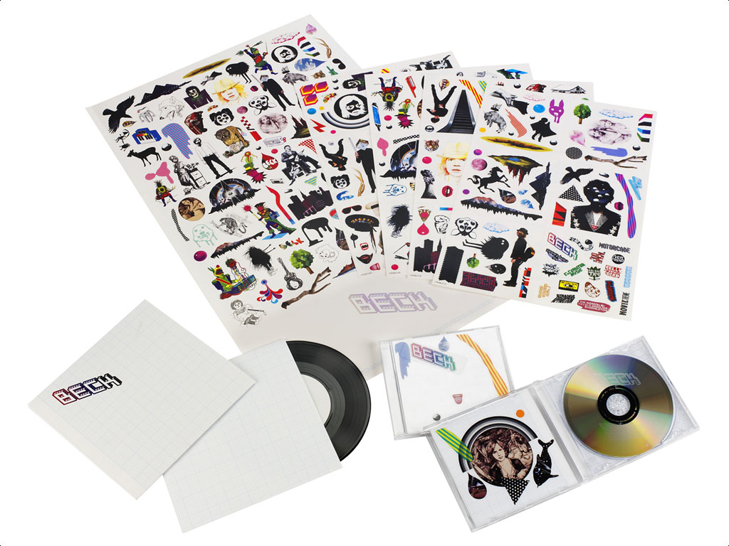
Although playfully undermining the standard cover design elements—images of the artist and band—this novel approach to is also entirely in keeping with Beck’s ethos. With a pedigree in the visual and performing arts (his grandfather is the Fluxus artist Al Hansen), Beck had always been keenly aware of the visual possibilities surrounding the production, performance, and promotion of his work. The packaging kit for The Information mirrors the magpie montage technique of his music, which blends inspirations such as folk, hip-hop and 1970s rock with the aid of loops, samples, and cross-genre references—a style whose often casual air is belied by reports that this album took three years to make. The Information, widely regarded as a successful integration of Beck’s playful dance-inspired music and his more serious and understated work, could be regarded as his own DIY collage of an entire career, presented to his audience for further collaboration.
[related-works-module]